As Painting so is Poetry

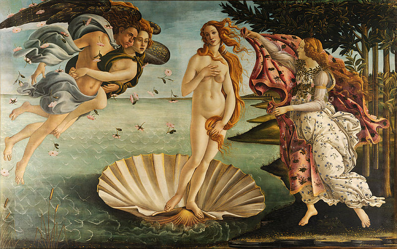
 Nascita di Venere (Birth of Venus), Sandro Botticelli, 1486


XCIX 99

In the stormy Aegean, the genital member is
seen to be received in the lap of Tethys, to drift
across the waves, wrapped in white foam,
beneath the various turnings of the planets;
and within, both with lovely and happy gestures,
a young woman with nonhuman countenance, is
carried on a conch shell, wafted to shore by
playful zephyrs; and it seems that heaven rejoices in her birth.


C 100

You would call the foam real, the sea real, real
the conch shell and real the blowing wind; you
would see the lightning in the goddess’s eyes,
the sky and the elements laughing about her; the
Hours treading the beach in white garments, the
breeze curling their loosened and flowing hair;
their faces not one, not different, as befits sisters.


CI 101

You could swear that the goddess had emerged
from the waves, pressing her hair with her right
hand, covering with the other her sweet mound
of flesh; and where the strand was imprinted by
her sacred and divine step, it had clothed itself
in flowers and grass; then with happy, more than
mortal features, she was received in the bosom
of the three nymphs and cloaked in a starry garment.


CII 102

With both hands one nymph holds above the
spray-wet tresses a garland, burning with gold
and oriental gems, another adjusts pearls in her
ears; the third, intent upon those beautiful
breasts and white shoulders, appears to strew
round them the rich necklaces with which they
three girded their own necks when they used to
dance in a ring in heaven.


CIII 103

Thence they seem to be raised toward heavenly spheres, seated upon a silver cloud:
in the hard stone you would seem to see the air trembling and all of heaven contented;
every god takes pleasure in her beauty and desires her happy bed: each face seems to marvel,
with raised eyebrows and wrinkled forehead…

Angelo Poliziano
Stanze per la giostra
Written between 1475-8


The iconography of Birth of Venus is similar to a description of the event (or rather, a description of a sculpture of the event) in a poem by Angelo Poliziano, the Stanze per la giostra. No single text provides the precise imagery of the painting, however, which has led scholars to propose many sources and interpretations. Art historians who specialize in the Italian Renaissance have found a Neoplatonic interpretation, which was most clearly articulated by Ernst Gombrich, to be the most enduring way to understand the painting. Botticelli represented the Neoplatonic idea of divine love in the form of a nude Venus.

For Plato – and so for the members of the Florentine Platonic Academy – Venus had two aspects: she was an earthly goddess who aroused humans to physical love or she was a heavenly goddess who inspired intellectual love in them. Plato further argued that contemplation of physical beauty allowed the mind to better understand spiritual beauty. So, looking at Venus, the most beautiful of goddesses, might at first raise a physical response in viewers which then lifted their minds towards the Creator. A Neoplatonic reading of Sandro Botticelli‘s Birth of Venus suggests that 15th-century viewers would have looked at the painting and felt their minds lifted to the realm of divine love.

More recently, questions have arisen about Neoplatonism as the dominant intellectual system of late 15th-century Florence, and scholars have indicated that there might be other ways to interpret Botticelli’s mythological paintings. In particular, both Primavera and Birth of Venus have been seen as wedding paintings that suggest appropriate behaviors for brides and grooms.

Venus is an Italian Renaissance ideal: red-haired, pale-skinned, voluptuous. Botticelli has picked out highlights in her hair with gold leaf and has emphasized the femininity of her body (long neck, curviness). The brilliant light and soothing colours, the luxurious garden, the gorgeous draperies of the nymph, and the roses floating around the beautiful nude all suggest that the painting is meant to bring pleasure to the viewer.


So-called “Capitoline Venus”, one of the best preserved copies of Praxiteles’ Cnidian Venus (4th century BC).


The central figure of Venus in the painting is very similar to Praxiteles‘ sculpture of Aphrodite. The version of her birth, is where she arises from the sea, already a fully grown woman.


Venus de’ Medici


The pose of Botticelli’s Venus is reminiscent of the Venus de’ Medici, a marble sculpture from classical antiquity in the Medici collection which Botticelli had opportunity to study. Botticelli was commissioned to paint the work by the Medici family of Florence, specifically Lorenzo di Pierfrancesco de’ Medici under the influence of his cousin Lorenzo de’ Medici, close friend to Botticelli. The painting is on display at the Uffizi Gallery in Florence, Italy.

The God of Beginnings and Transitions

Statue depicting Janus Bifrons in the Schönbrunn palace courtyard (Vienna, Austria)


Janus is the god of beginnings and transitions, thence also of gates, doors, passages, endings and time. He is usually depicted as having two faces, since he looks to the future and to the past. The Romans named the month of January (Ianuarius) in his honor.

Janus presided over the beginning and ending of conflict, and hence war and peace. The doors of his temple were open in time of war, and closed to mark the peace. As a god of transitions, he had functions pertaining to birth and to journeys and exchange, and in his association with Portunus, a similar harbor and gateway god, he was concerned with travelling, trading and shipping.

Janus had no flamen or specialized priest (sacerdos) assigned to him, but the King of the Sacred Rites (rex sacrorum) himself carried out his ceremonies. Janus had a ubiquitous presence in religious ceremonies throughout the year, and was ritually invoked at the beginning of each one, regardless of the main deity honored on any particular occasion.

The interpretation of Janus as the god of beginnings and transitions is based on a third etymology indicated by Cicero, Ovid and Macrobius, which explains the name as Latin, deriving it from the verb ire (“to go”).

Another etymology proposed by Nigidius Figulus is related by Macrobius: Ianus would be Apollo and Diana Iana, by the addition of a D for the sake of euphony. This explanation has been accepted by A. B. Cook and J. G. Frazer. It supports all the assimilations of Janus to the bright sky, the sun and the moon. It supposes a former *Dianus, formed on *dia- < *dy-eð2 from Indo-European root *dey- shine represented in Latin by dies day, Diovis and Iuppiter. However the form Dianus postulated by Nigidius is not attested.


Different depictions of Janus from Bernard de Montfaucon’s L’antiquité expliquée et représentée en figures


Janus frequently symbolized change and transitions such as the progress of future to past, from one condition to another, from one vision to another, and young people’s growth to adulthood. He represented time, because he could see into the past with one face and into the future with the other. Hence, Janus was worshipped at the beginnings of the harvest and planting times, as well as at marriages, deaths and other beginnings. He represented the middle ground between barbarism and civilization, rural and urban space, youth and adulthood. Having jurisdiction over beginnings Janus had an intrinsic association with omens and auspices.

In Act I Scene 2 of Shakespeare’s Othello, Iago invokes the name of Janus after the failure of his premiere plot to undo the titular character. As the story’s primary agent of change, it’s fitting that Iago align himself with Janus. His schemes prompt the beginning of each of the main characters’ ends: in his absence, Othello and Desdemona would likely have remained married and Cassio would have remained in his respected position of power. Iago guides (if not forces) the story through inception, climax, and finale. Furthermore, Janus’ common two-faced depiction is the perfect visual metaphor for Iago’s character. Othello’s characters believe him to have only the best of intentions, even going as far as to call him “honest Iago,” completely unaware that he spends every unwatched second plotting their undoing. He appears selfless and compassionate but, in truth, is power-hungry, amoral, and without regard for the well-being of others.

Pilgrimage to India


Baba B.G., Walton Ford, 1997. The reference of this large scale watercolor responds to Microsoft chief Bill Gates’ visit to India in 1997, when Ford and his family were spending an extended time there. It shows “Baba B.G.” as a North American kingfisher holding court to eight other brilliantly plumed birds sitting lower down on the same branch. A large fish, skewered by the branch where it meets the trunk, hangs nearby, spilling smaller fish from its slit gut. Some of those tumbling from its belly are shown in the process of eating even smaller fish. Such is the law of economic imperialism.


The protagonist of Baba goes on a spiritual pilgrimage to India where she encounters a guru who, like many spiritual teachers in India, is referred to as “Baba”. The word “Baba” means “father” in the Hindi language. Alanis Morissette opened most of shows during the Junkie era with the song, and it was featured as an opener during her 2002 tours. It has been seldom played since then. Baba opened Morissette’s performance on the television show MTV Unplugged in 1999, but it was excluded from the CD release Alanis Unplugged. Another live version of “Baba” was released on the No Boundaries: A Benefit for the Kosovar Refugees CD.

Inspired by “The Awakened One”

Supposed Former Infatuation Junkie is the fourth album and second internationally released album by singer-songwriter Alanis Morissette, released by Maverick Records in the United States on November 3, 1998. One line in the song So Pure, inspired its album’s title.

After the massive success of Jagged Little Pill (1995), Morissette was considered one of the biggest music stars in the world, and many fans anxiously awaited a follow-up album. A dark and wandering album, the mystery of Supposed Former Infatuation Junkie began on its cover, with an image of Alanis’s mouth while laughing and the following text printed over that image that refers to The Eight Precepts of Buddhism:


We ask you to abide
by the following
moral code upon
the premises.
Please refrain from
killing
stealing
lying
sexual misconduct
taking intoxicants
playing music, singing
please dress respectfully.


Design of the cover by Stefan G. Bucher


Stefan G. Bucher (born 1973) is an American writer, graphic designer and illustrator. He is the man behind the California design studio 344 Design.

Starting his career in the United States as an art director at Portland, Oregon advertising agency Wieden & Kennedy, Bucher went on to design numerous CD packages including Brand New Day: The Remixes for Sting, the soundtrack for the motion picture The Matrix with Keanu Reeves. His design of the 17th American Photography annual received the 2001 Silver Award for outstanding complete book design by British Design & Advertising. His more recent work for clients ranging from KCRW DJ Jason Bentley to art gallery L.A. Louver, and painter David Hockney makes more frequent use of illustration and hand-lettering.


(2006)


(2011)


(2012)


Bucher created the main title typography and title design for the films The Fall, Immortals, and Mirror Mirror, all directed by Tarsem Singh. He is the author of the book All Access – The Making of Thirty Extraordinary Graphic Designers.

Infatuated with American Bluesmen

“The Stones’ music has inspired me greatly and became a basis for most of the work I’ve done in my movies, going from Mean Streets right the way up to Raging Bull, Goodfellas and Casino. Their music for me is timeless; it helped me form scenes, the energy and the atmosphere of the music, it created images in my mind.”

Martin Scorsese


Photo by Norman Norman Seeff, Los Angeles, 1986


Martin Scorsese has long had a knack for finding the right pop or rock song to kick a scene into the stratosphere. For every time he’s used a Bernard Hermann score or a Johann-Sebastian Bach sonata (“Wir setzen uns und Tranen nieder“, from St Matthew Passion, in Casino), there are a dozen instances when he’s employed vintage R&B, doo-wop, blues or British Invasion numbers – “the music we used to hear in the street,” he’s said – to liven up his films.

Director Scorsese’s relationship with the Rolling Stones and their catalog of songs dates back to his film Mean Streets, which included the Jagger-Richards composition Tell Me in a key scene. Rolling Stones songs Gimme Shelter, Monkey Man and Memo From Turner are heard in Goodfellas while The Departed includes both Gimme Shelter and Let It Loose.


Feel Like Going Home (2003). Scorsese pays tribute to the Delta blues, tracing the roots of the music by traveling through the state of Mississippi with musician Corey Harris and then traveling on to West Africa. Willie King, Taj Mahal, Otha Turner and Ali Farka Toure give performances of early Delta blues songs, along with rare archival film of Son House, Muddy Waters, and John Lee Hooker.


They were a bunch of British kids infatuated with American bluesmen. He was an asthmatic teen surrounded by street-fighters in Little Italy. But there’s something about the volatility of their art that make for an ideal pairing. Scorsese has used so many of their songs in so many of his films, both originals and covers (notably Devo’s take on Satisfaction), that by the time he got around to making a Stones concert film, it almost seemed anticlimactic. But check out the livewire energy he channels in 2008’s Shine a Light – they’re still bringing out the best in each other.


“We tried to get the film as close as possible to the energy of a live concert. For me the Stones are all about energy, that’s why they are still so relevant today. Initially, we did think about a narrative structure for the film. We talked about doing something with the Stones and New York City – we could have had many different scenarios – but quite honestly, after 40-45 years, so many great filmmakers have worked with the Stones, what could I possibly add? “The Rolling Stones in New York”, some clever interstitial moments?”

Not So Unexpected References

The tagline is “Be unexpected.” The fragrance created by perfumer Jacques Polge debuted on fall 2010 preceded by a media campaign which include the short advertisement “Bleu de Chanel” by Martin Scorsese featuring French actor Gaspard Ulliel. Prior to Scorsese, Baz Luhrmann had worked on Chanel No. 5.

The Rolling StonesShe Said Yeah, from band’s 1965 album December’s Children (And Everybody’s),  propels the script of the short film, in which rising international star Gaspard Ulliel plays the role of a young actor whose artistic talent, rebelliousness and good fortune have thrown him into the public eye. However, he refuses to conform to the lifestyle and expectations his newly found fame has placed upon him. As he struggles with new pressures and expectations, he runs into his first love, who for years, supplied him with the passion and turmoil that fueled his work. Faced with a decision, he pushes aside convention to embody the bold energy and elegance of Bleu De Chanel by daring to be unpredictable and refusing to bow down to convention. Scorsese had directed the 2008 Rolling Stones concert film Shine A Light. 

The song She Said Yeah was recorded by the group in September of 1965 at RCA Studios in Hollywood, the very same place where the band’s anthem (I Can’t Get No) Satisfaction had been recorded a few months earlier. She Said Yeah was written by the late Sonny Bono and West Coast rockabilly performer Roddy Jackson, and had been a single for Larry Williams in the late 1950s. Williams became known with such early rock ‘n’ roll hits as Bony Maronie, Dizzy Miss Lizzy and Slow Down, the last two of which were covered by The Beatles.


Still from Mishima, a Life in Four Chapters (Paul Schrader, 1984)


Still from short advertisement “Bleu de Chanel” (Martin Scorsese, 2010). The exploding screen wall seems to be inspired by Ishioka’s set design for Mishima. “We knew the old Hollywood system was gone, so we thought we could get in the cracks somehow. Francis was already at it — he was the big brother…”, Scorsese said about starting out with his friends George Lucas, Steven Spielberg and Francis Ford Coppola. Rolling Stone Magazine 40th Anniversary (2007)


Gaspar Ulliel taking pictures to the woman he was chasing. This scene reminds the famous photo-shoot played by David Hemmings and  sixties model Veruschka in Blown-Up. In a piece called, The Man Who Set Film Free, Scorsese wrote about the sensation of seeing the Italian director’s L’Avventura for the first time, almost 50 years ago.


Movie Poster from Blow-Up (Michelangelo Antonioni, 1966)


Life and Music

“Yet how strange a thing is the beauty of music! The brief beauty that the player brings into being transforms a given period of time into pure continuance; it is certain never to be repeated; like the existence of day flies and other such short-lived creatures, beauty is a perfect abstraction and creation of life itself. Nothing is so similar to life as music.”

Yukio Mishima

The Temple of the Golden Pavilion


Yukio Mishima in New York. Photograph: Carlo Bavagnoli. Life magazine, 1964

The Color Schemes of a Biopic

Eiko Ishioka and Paul Schrader


By the spring of 1984 Eiko Ishioka was one of the most sought after art director/designers in Japan. She hardly needed to throw herself into what was widely expected to be a controversial film project. Moreover, she would be working with a traditional film art director, Kazuo Takenaka, whose feature credits as designer went back to 1960. Mr. Takenaka was to design the biographical parts of the film and Eiko was to design sets and costumes from the three Yukio Mishima novels chosen by Paul Schrader, in scenes that parallel key events from Mishima’s life. What could easily have been both a generational and aesthetic chasm between Eiko’s and Kazuo’s visions became, in fact, a close collaborative bridge across the film’s several styles.

The color scheme of the first novel presented itself easily enough. Eiko explained that the Golden Pavilion of the title was a legendary, but fragile wooden edifice in Kyoto, often rebuilt after periodic fires. The temple was a spiritual idea as much as a physical edifice. The gold leaf that Eiko chose to cover the set walls and floor, stretching around three curved walls and over the floor, created a limbo environment broken up by green walkways and a bamboo garden. The robes of Mizoguchi and fellow acolytes were in black.


The story begins with chapter 1, “Beauty,” where the awkward young boy grows into a man, looking to change his position as a misfit in this world and embrace love and the goodness that life has to offer, the things that are beauty personified. For this section, Schrader chooses to adapt the 1953 novel The Temple of the Golden Pavilion, the story of a Buddhist acolyte (Yasosuke Bando) with a severe stuttering problem whose “deformity” prevents him from finding love, forcing him to always remain separate. He fixates on the golden temple where he is studying and eventually becomes intent on its destruction. Turning it to rubble blots out the false promise he can never fulfill. This action actually teaches him something about beauty, about how it’s best to halt it at its apex rather than let age diminish its luster.


Kyoko’s House takes place in the 1950s, a period still very much under the cultural influence of the American Occupation. Eiko offered us a palette of 50s pastels that also featured pink and black. Think of the trope of fuzzy dice that hung from the dashboard rear view mirrors of Detroit cars, and of the stripped down aesthetic of Scandinavian interior design. John Bailey thought also of the color palette that designer Nando Scarfiotti had shown John Schlesinger for Honky-Tonk Freeway (a splayed roll of Necco wafer candies). Eiko promoted the idea of these pastel colors; she knew also the high regard that Paul had for Nando. (Bailey had by then done three films with Nando, two of them directed by Schrader.)


From there, Schrader moves to chapter 2, “Art,” where Mishima, tasting his first blush of success, begins to ponder how to resolve the false and finite nature of beauty and realize the artist’s purpose of preserving said beauty. In his novel Kyoko’s House a young actor turned body builder (Kenji Sawada) realizes that despite his personal perfection, bodies decay. Art is nice, but it requires no sacrifice. He enters into an abusive relationship with a female gangster (Setsuko Karasuma) who begins to use his body as a living sculpture. Real blood is a greater expression of true beauty and art than the false blood spilled on a theatrical stage.


Searching for a way to separate these fictional scenes of the novels from the events of the last day (since both were to be done in color) Paul, Eiko, Tom Luddy and John Bailey met with engineers from Sony who had recently developed an analog HD video system. Photographing the scenes from the novels in HD video seemed a natural way to establish a “look” different from the 35mm. color scenes of the last day. It was quickly obvious that the intense chromatic density and subtlety of Eiko’s sets and costumes would be poorly served by the limitations of this cutting edge but still embryonic  video medium. They resolved to shoot the novels on film as well—but with mostly undiffused and harder edged light to preserve the rich blacks that only film could capture, a lighting style Paul and John had chosen for American Gigolo; it was by then a retrograde style in an age of  increasing soft light. Eiko presented the physical design of the sets to them  in near schematic sketches that defined the lines and bones of the sets. The final sets proved to be every bit as reductive, even elemental, with geometric forms and saturated colors creating a stage-like theatricality as the set pieces and walls shift, even collapse.

In one scene, the light on a large Eugene Delacroix wall painting dims to reveal a Beckett-like woods outside: an unlikely mash-up, but pure Eiko. The final scene of Runaway Horses unfolds on an actual beach in pre-sunrise light. Eiko transposed blood red painted rocks from the stage set to the location in order to introduce theatrical artifice into the real world. Here, at a cliff edge, facing the rising sun, the cadet Isao commits seppuku.


Chapter 3, “Action,” where Mishima begins to question his role in the world. Words can express ideas, but like how beauty without art fades, so too do ideas go nowhere without action to back them up. The novel for this section is Runaway Horses, a later work about a young soldier (Toshiyuki Nagashima) who forms a cabal of like-minded youths to stage a revolution and restore Japan’s honor. As his plan falls apart, he tries one last action before turning his sword on himself. Here the fiction dovetails nicely with the reality, as we go into chapter 4, “Harmony of Pen and Sword,” which concerns itself entirely with Mishima’s last day on Earth, along with commentary taken from his last book of personal writing, Sun and Steel. (Again, fiction gives way to reality–though reality as seen by Yukio Mishima.)

A Concept Built from Three Novels

Eiko at work on stage floor for set of the Golden Pavillion


Never before Eiko Ishioka had worked as a film production designer, but at Cannes she received a best artistic contribution prize, along with the film’s cinematographer, John Bailey, and its composer, Philip Glass. Ishioka, whose late father was a noted pioneering graphic designer, combined a free, ever-questing imagination with traditional Japanese diligence. “He (Paul Schrader) gave me the second-draft scenario to read, and basically the structure of the movie seemed fresh for me,” said Ishioka.


Ishioka and George Lucas, executive producer of the movie


“I asked him two questions before I decided to do the film. I asked him, ‘Why do you need me as an artist for your movie?’ Then I said that I wasn’t a fanatic fan for Mishima, that I was like an ordinary Japanese audience for Mishima: ‘Is this OK?–It means I’m not an expert on Mishima.’

“He said that this movie was to be made in a very innovative style. He had tried to find a production designer in America but decided he wanted to choose someone outside the film field. He wanted a fresh concept. I told him that I didn’t have enough knowledge of technology for the job. He said it was not so difficult to find technical people–‘We can find find someone to help you as a partner.’

Ishioka gave her final decision only after Schrader selected veteran art director Kazuo Takenaka as her partner. “It was like an arranged marriage,” she said. “If one of us doesn’t want to work with the other, then we have an out. Takenaka wanted to work on the realistic and documentary parts of the film, and I wanted to work on the novels. But he has his pride; he’s an older man and wanted to be more than just a partner. I understood that.” (Takenaka’s credit reads executive art director.

At first, after intensive discussions with Schrader, Ishioka was intent on carrying out his ideas, but Takenaka told her that she must have her own concept. ” ‘Don’t worry about describing Schrader’s images,’ he told me. It was very strong, very important advice. I was so shocked, but it opened my eyes, my mind–my spirit. Paul said, ‘OK, try it.’


Eiko at her desk reviewing classic woodblock prints for Mishima


“My concept was built from the three novels, not from the scenario,” said Ishioka, who was soon turning out scores of sketches. “I wanted to do a big presentation. I told Paul, ‘If you don’t like it, there is no meaning for me to continue.’ I built a model for ‘The Temple of the Golden Pavilion’ at 1/50th scale. Then there were many, many discussions with Schrader and Bailey–talk, talk; talk many, many times.”

Into this project Ishioka said she poured her “body and spirit. Almost 20 years as a graphic designer and art director, a designer in the theater, publishing, advertising and designing corporate identities.

“I built my own philosophy as an artist. I care about the relationship between the artist and the audience. Eiko is on the stage, but she’s also in the audience. I want to judge my work from the audience. Eiko is my best audience. I’m like a commercial artist, not a fine artist who cares about patrons. I’m relating to the whole media. It comes from my training”

Although Takenaka did much of the rest of the picture, Ishioka had the overall responsibility as production designer and was deeply involved in re-creating Mishima’s Western-style home, which was cluttered with European and American reproduction kitsch.

Beyond Our Grasp

“Dreams, memories, the sacred–they are all alike in that they are beyond our grasp. Once we are even marginally separated from what we can touch, the object is sanctified; it acquires the beauty of the unattainable, the quality of the miraculous. Everything, really, has this quality of sacredness, but we can desecrate it at a touch. How strange man is! His touch defiles and yet he contains the source of miracles.”

Yukio Mishima
Spring Snow


The Power of Knowledge

“What transforms this world is — knowledge. Do you see what I mean? Nothing else can change anything in this world. Knowledge alone is capable of transforming the world, while at the same time leaving it exactly as it is. When you look at the world with knowledge, you realize that things are unchangeable and at the same time are constantly being transformed.”

Yukio Mishima

The Golden Pavillion


A Life in Four Chapters and Many Colors

“Life is a moderately good play with a badly written third act”
Truman Capote


Mishima: A Life in Four Chapters is an American/Japanese film co-written and directed by Paul Schrader in 1985. Francis Ford Coppola and George Lucas served as executive producers. As the title indicates, Mishima is divided into four chapters, each encapsulating a different aspect of the man’s spirit, three of which include condensed adaptations of his most famous novels. The film is based on the life and work of Japanese writer Yukio Mishima, interweaving episodes from his life with dramatizations of segments from his books The Temple of the Golden Pavilion, Kyoko’s House, and Runaway Horses.


Although Mishima only visualizes three of the writer’s novels by name, the film also uses segments from his autobiographical novel Confessions of a Mask. At least two scenes, showing the young Mishima being aroused by a painting of the Christian martyr Sebastian, and his secret love for a fellow pupil at school, also appear in this book. The use of one further Mishima novel, Forbidden Colors, which describes the marriage of a homosexual man to a woman, was denied by Mishima’s widow.


The film sets in on November 25, 1970, the last day in Mishima’s life. He is shown finishing a manuscript. Then, he puts on a uniform he designed for himself and meets with four of his most loyal followers from his private army.


As Schrader wanted to visualize a book illustrating Mishima’s narcissism and sexual ambiguity, he chose the novel Kyoko’s House (which Mishima had translated for him exclusively) instead. Kyoko’s House contains four equally ranking storylines, featuring four different protagonists, but Schrader picked out only the one which he considered convenient.

Mishima uses different colour palettes to differentiate between frame story, flashbacks and scenes from Mishima’s novels: The (1970) contemporary scenes are shot in subdued colours, the flashbacks in black-and-white, the The Temple of the Golden Pavilion-episode is dominated by golden and green, Kyoko’s House by pink and grey, and Runaway Horses by orange and black.

Schrader considers Mishima the best film he has directed. “It’s the one I’d stand by – as a screenwriter it’s Taxi Driver (Martin Scorsese, 1976), but as a director it’s Mishima.”

Mishima earned Eiko Ishioka the Best Artistic Contribution award the 1985 Cannes Film Festival.

Without Meaning

“Soon after the suicide of the esteemed Japanese writer Yukio Mishima, whom I knew well, a biography about him was published, and to my dismay, the author quotes him as saying “Oh yes, I think of suicide a great deal. And I know a number of people I’m certain will kill themselves. Truman Capote, for instance.” I couldn’t imagine what had brought him to this conclusion. My visits to Mishima had always been jolly, very cordial. But Mishima was a sensitive, extremely intuitive man, not someone to be taken lightly. But in this matter, I think his intuition failed him; I would never have the courage to do what he did…”

Truman Capote
Nocturnal Turnings, or How Siamese Twins Have Sex


Truman Capote. Photo: Robert Mapplethorpe, 1981


In the late 1970s, Capote was in and out of rehab clinics, and news of his various breakdowns frequently reached the public. In 1978, talk show host Stanley Siegal did an on-air interview with Capote, who, in an extraordinarily intoxicated state, confessed that had been awake for 48 hours and when questioned by Siegal, “What’s going to happen unless you lick this problem of drugs and alcohol?” Capote responded with “The obvious answer is that eventually, I mean, I’ll kill myself … without meaning to”. Capote died in Bel Air, Los Angeles, on August 25, 1984, aged 59 from liver cancer. According to the coroner’s report the cause of death was “liver disease complicated by phlebitis and multiple drug intoxication.” He died at the home of his old friend Joanne Carson, ex-wife of late-night TV host Johnny Carson, on whose program Capote had been a frequent guest.

The Strange Predicament

“He found himself in the strange predicament all sailors share: essentially he belonged neither to the land nor to the sea. Possibly a man who hates the land should dwell on shore forever. Alienation and the long voyages at sea will compel him once again to dream of it, torment him with the absurdity of longing for something that he loathes…”

The Sailor Who Fell from Grace with the Sea

Yukio Mishima


Yukio Mishima and Henry Scott Stokes on the beach

Good-Bye, Men of Nippon!

Tamotsu Yato (矢頭 保 Yatō Tamotsu, 1928(?) – May 1973) was a Japanese photographer and occasional actor responsible for pioneering Japanese homoerotic photography and creating iconic black-and-white images of the Japanese male. He was a friend and collaborator of the writer Yukio Mishima and the film critic Donald Richie, as well as a long-term romantic partner of Meredith Weatherby, an expatriate American publisher and translator of Mishima’s works into English. Yato completed three volumes of photography:

Taidō: Nihon no bodibirudā-tachi (体道:日本のボディビルダーたち). Tokyo: Weatherhill, 1966; English version: Young Samurai: Bodybuilders of Japan, New York: Grove Press, 1967. With an introduction by Yukio Mishima.

Hadaka matsuri (裸祭り). Tokyo: Bijutsu Shuppansha, 1969; English version: Naked festival: A Photo-Essay, New York/Tokyo: John Weatherhill, 1968. With an introduction by Yukio Mishima and essays by Tatsuo HagiwaraMutsuro Takahashi, and Kozo Yamaji. Translated and adapted for Western readers by Meredith Weatherby and Sachiko Teshima.

Otoko: Photo-Studies of the Young Japanese Male, Los Angeles: Rho-Delta Press, 1972. Dedicated to the memory of Yukio Mishima.

Even though Yato’s work received only a limited public distribution, it has attained a cult following and has been acknowledged as a major influence by a number of artists working with male erotica. Thus, Sadao Hasegawa remarks in his Paradise Visions: “Tamotsu Yato achieved fame by creating Otoko (Man) a picture book. He photographed Yukio Mishima, nude. His subjects: traditional, muscular, unsophisticated countryside men, are mostly extinct today. Otoko was valuable because you could see these long-bodied, stout-legged, cropped hair, square-jawed men… Good-bye, men of Nippon!”