An Interest in Music and Art


George Underwood (born Richard George Underwood, 28 January 1947, Bromley, Kent) is an artist and musician. He is best known for designing album covers for numerous bands in the 1970s.

George Underwood attended Bromley Technical School where he developed an interest in music alongside classmates David Bowie and Peter Frampton. Underwood and Bowie’s band, George and the Dragons was short-lived due to Underwood punching Bowie in the left eye while wearing a ring on his finger, during a fight over a girl, causing paralysis in Bowie’s left pupil and his distinctive mismatched appearance. But the injury did not affect their friendship in the end, and Underwood went on to record one album with Bowie (in their band The King Bees) and also a solo record under the name Calvin James.

After deciding that the music business was not for him, Underwood returned to art studies and worked in design studios as an illustrator. Initially, he specialized in fantasy, horror and science fiction book covers, but as many of his colleagues were in the music business, they began asking him to do various art works for them. This led to him becoming a freelance artist. Underwood established himself as a leading art illustrator doing album covers for such artists as Tyrannosaurus Rex (Futuristic Dragon), The Fixx (Phantoms, Reach the Beach and Calm Animals), Procol Harum (Shine On Brightly), Mott the Hoople (All the Young Dudes) and David Bowie (Hunky Dory and The Rise and Fall of Ziggy Stardust and the Spiders from Mars). Over this period, he produced hundreds of book covers, LP and CD covers, advertisements, portraits and drawings.

He appears in the 2012 documentary David Bowie & the Story of Ziggy Stardust (BBC Cymru Wales).

To watch an album about George Underwood’s artwork, please take a gander at The Genealogy of Style‘s Facebook page:https://www.facebook.com/The-Genealogy-of-Style-597542157001228/?ref=tn_tnmn

Reflektor

“The Orpheus myth is the original love triangle, Romeo and Juliet kind of story. Lyrically, it’s not literally about my life. I feel like I’m kind of a bit of a sponge in a way. Like, if people around me are going through things, I find it very hard not to be empathetic.”
Win Butler


Reflektor is the fourth studio album by the Canadian indie rock band Arcade Fire, released on October 28, 2013.

The album’s artwork features an image of Auguste Rodin’s sculpture of Orpheus and Eurydice


A poster for Arcade Fire’s “not-so-secret” secret show as The Reflektors at Salsatheque in Montreal


Influenced by Haitian rara music, the film Black Orpheus (Marcel Camus, 1959) and Søren Kierkegaard‘s essay, The Present Age, Reflektor‘s release was preceded by a guerrilla marketing campaign inspired by veve drawings, and the release of a limited edition single, Reflektor, credited to the fictional band, The Reflektors, on September 9, 2013.

The eponymous first single was produced by James Murphy, Markus Dravs and the band itself, and features a guest vocal appearance by David Bowie and was released on a limited edition 12″ vinyl credited to the fictional band, The Reflektors. The music video was directed by Anton Corbijn.


The music video can be seen on The Genealogy of Style‘s Facebook Page:https://www.facebook.com/pages/The-Genealogy-of-Style/597542157001228

A is for Apple


The Beatles‘ accountants had informed the group that they had two million pounds which they could either invest in a business venture or else lose to the Inland Revenue, because corporate/business taxes were lower than their individual tax bills. According to Peter Brown, personal assistant to Beatles’ manager Brian Epstein, activities to find tax shelters for the income that the Beatles generated began as early as 1963–64, when Dr Walter Strach was put in charge of such operations. First steps into that direction were the foundation of Beatles Ltd and, in early 1967, Beatles and Co.

The Beatles’ publicist, Derek Taylor, remembered that Paul McCartney had the name for the new company when he visited Taylor’s company flat in London: “We’re starting a brand new form of business. So, what is the first thing that a child is taught when he begins to grow up? A is for Apple”. McCartney then suggested the addition of Apple Core, but they could not register the name, so they used “Corps” (having the same pronunciation).

The Belgian Beatles Society page says that in an interview with Johan Ral in 1993, Paul McCartney recalled:

“….I had this friend called Robert Fraser, who was a gallery owner in London. We used to hang out a lot. And I told him I really loved Magritte. We were discovering Magritte in the sixties, just through magazines and things. And we just loved his sense of humour. And when we heard that he was a very ordinary bloke who used to paint from nine to one o’clock, and with his bowler hat, it became even more intriguing. Robert used to look around for pictures for me, because he knew I liked him. It was so cheap then, it’s terrible to think how cheap they were. But anyway, we just loved him … One day he brought this painting to my house. We were out in the garden, it was a summer’s day. And he didn’t want to disturb us, I think we were filming or something. So he left this picture of Magritte. It was an apple – and he just left it on the dining room table and he went. It just had written across it “Au revoir”, on this beautiful green apple. And I thought that was like a great thing to do. He knew I’d love it and he knew I’d want it and I’d pay him later. […] So it was like wow! What a great conceptual thing to do, you know. And this big green apple, which I still have now, became the inspiration for the logo. And then we decided to cut it in half for the B-side!”


Le Jeu de la Mourre, René Magritte, 1966


Taking Magritte for inspiration, the Apple record labels were designed by a fellow named Gene Mahon, an advertising agency designer. The Beatles Collection website has a great summary of how this all came about:

“[It was Gene Mahon who] proposed having different labels on each side of the record. One side would feature a full apple that would serve as a pure symbol on its own without any text. All label copy would be printed on the other side’s label, which would be the image of a sliced apple. The white-colored inside surface of the sliced apple provided a good background for printing information.
The idea of having no print on the full apple side was abandoned when EMI advised Apple that the contents of the record should appear on both sides of the disc for copyright and publishing reasons. Although Mahon’s concept was rejected for legal (and perhaps marketing) reasons, his idea of using different images for each side of the record remained. Mahon hired Paul Castell to shoot pictures of green, red and yellow apples, both full and sliced. The proofs were reviewed by the Beatles and Neil Aspinall, with the group selecting a big green Granny Smith apple to serve as the company’s logo. A sliced green apple was picked for B side. Alan Aldridge provided the green script perimeter print for labels [on UK, EU and Australian releases – this does not appear on US labels] and, in all likelihood, the script designation on the custom record sleeve.”

Artist’s Guts

“Art – my slats! Guts! Guts! Life! Life! I can paint with a shoe-string dipped in pitch and lard.”
George Luks


Campaign for the MASP Art School in São Paulo, Brazil. It shows the organs of Salvador Dalí, Vincent Van Gogh and Pablo Picasso and dissected them to show their inside illustrated in the same style as their famous artworks.

I’m Loving Moschino

Ad Campaign: Moschino F/W 2014-15


The Moschino first advertising campaign with Jeremy Scott as the brand’s new creative director, Scott call upon some of the top names in the business; Linda Evangelista, Stella Tennant, Carolyn Murphy, Saskia de Brauw, Karen Elson and Raquel Zimmerman whom pose in black and white imagery by Steven Meisel. Make-Up by Pat McGrath, Hair by Guido Palau, Styled by Carlyne Cerf De Dudzeele

.

The Sense of Breaking Through Something

 Photo credit: New York Times


For eight consecutive seasons, Stefano Pilati released a Yves Saint Laurent Manifesto, distributed across cities globally. Working with photographers Inez van Lamsweerde & Vinoodh Matadin, Pilati’s Manifesto is intended to ‘bring the brand back to the streets’.An innovative initiative, which continues the succession of revolutionary moves Mr Saint Laurent made: he was the first French couturier to release a ready-to-wear line.


Daria Werbowy photographed by Inez van Lamsweerde & Vinoodh Matadin. YSL by Stefano Pilati Fall/Winter 2010-2011 collection.


The YSL Manifesto is much more than an en masse distribution of the seasonal campaign shots. Staying true to the idea of a ‘manifesto’ – a public written declaration of the intentions, opinion, or motives of a leader – it is a powerful, multi-layered message which goes a long way to explain Pilati’s thinking and visual iconography for the season.

“I fell in love with the idea of manifestos and with the term itself, because the word ‘manifesto’ implied a sense of breaking through something while still being connected to and aware of how things are today. In terms of the format, I didn’t really relate to any historical manifestos I’ve seen because my medium is fashion… There is fashion photography in the manifesto so even the idea of showing the pictures larger than they appear in normal magazines was part of the act of manifesting. First of all you need to question whether it’s interesting or not to be political about fashion, or instead you wish to reinforce a message to people that is simply about looking good and projecting a positive energy about yourself. I was no longer interested in thinking of fashion in an elitist way. Everything I picked up from the manifestos in the past suggested that they were trying to create energy around an ideology that was considered, in its time, underground. So I thought for today I would offer another perspective of a luxury brand to a broad demographic that doesn’t necessarily relate to fashion in the way that a more privileged layer of people do. I wanted to create a wider influence for the message that was being sent from the catwalk, by taking imagery of a collection and giving it to people on environmentally friendly paper in the street without targeting a specific demographic. One of my visions for Saint Laurent is about giving back, so that even if you can’t afford it, you can still pick up the essence of the message, the elements of fashion that might be considered increasingly irrelevant but remain for me its main aspects: the silhouette, the way the clothes are cut, the fabrics, a special pattern. It’s to say – “These are my thoughts and this is my message – you can pick up something from this and do it yourself. The Yves Saint Laurent manifestos are against aggressively, against exclusivity, against classification, against isolation, against introversion, against always looking at oneself. This is what it comes to in the end. Fashion can give rise to all of these things and it shouldn’t, especially today.”


To watch Manifesto Edition VII (Fall/Winter 2010-2011 collection), please take a gander at The Genealogy of Style’s Facebook page: https://www.facebook.com/pages/The-Genealogy-of-Style/597542157001228?ref=hl

Stamped Lips

Stamped Lips, Andy Warhol, 1959


Yves Saint Laurent Spring Summer 1971


 “ Lips print dress from Yves Saint Laurent Rive Gauche, Harpers & Queen, early April 1971. Model Viviane Fauny. Photo Helmut Newton.Lips print dress from Yves Saint Laurent Rive Gauche, Harpers & Queen, early April 1971. Model: Viviane Fauny. Photo: Helmut Newton


Dresses Yves Saint Laurent,  Vogue Italia, February 1971, Photo By Chris Von Wagenheim


YSL 1973


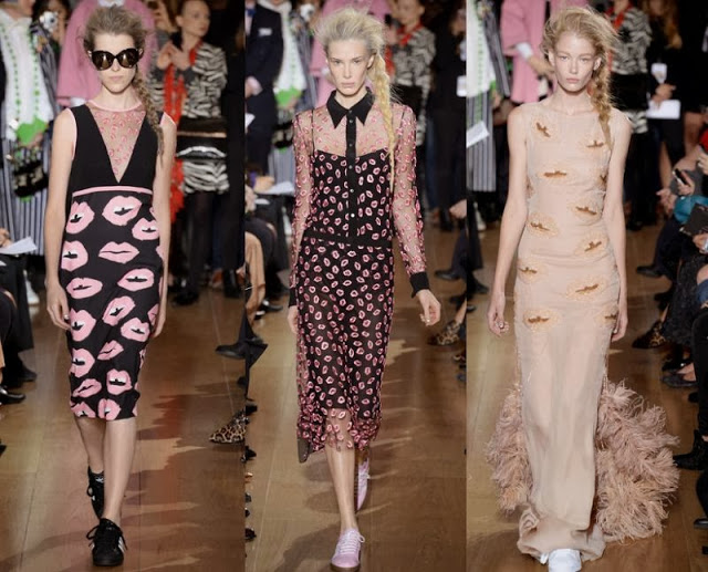
Zooey Deschanel for ELLE in Saint Laurent by Slimane Lip Print dress, Spring 2014


Rihanna wearing the sequined one shoulder top, also by Slimane. Vogue, March 2014. Photo: David Sims


Kristen Stewart on the cover of Marie Claire UK, May 2014


Marc Jacobs cosmetic bag


Lulu Guiness lips clutch


Sonia by Sonia Rykiel, 2014


Peter Jensen SS 2014


Giles Deacon SS 2014


Alice and Olivia, Resort Collection 2014


Prada Spring Summer 2000 ad campaign


Michelle Williams on  the cover of ELLE, December 2011 wearing a Prada dress


Prada Resort Collection 2012 ad campaign

Raggedy Andy and the Cockroach

“Andy Warhol was reasonably well-known by the time he came to see me, although he was still being called Raggedy Andy, not because his work was sloppy, but because of his appearance. He’d had success with book-jacket designs for such publishers as New Directions and with his drawings and paintings for I. Miller shoe ads – and I knew I. Miller – but stories about his mishaps were making the rounds. When he’d zipped open his portfolio to show his work to the art director at Harper’s Bazaar, a cockroach had crawled out. Poor boy, that Raggedy Andy. But Harper’s had given him assignments. He won awards for his work, for his ‘commercial’ art, and he never pretended a difference between what he did to survive and what he called his art. To his credit, I think it was all the same to him. He was a very busy young man. I used Warhol’s art in several of my perfume windows at Bonwit’s. In July 1955, just before my work began at Tiffany’s, I made some wooden fences, and he covered them with graffiti for a series of windows. They were fun, full of a childish playfulness.”

Gene Moore


Photo by Leila Davies Singelis, 1950


In the summer of 1955 Andy Warhol‘s career as a commercial artist took a new turn when Gene Moore hired him to provide artwork for the windows of the Bonwit Teller department store. Moore had arrived in New York in 1935, hoping to become a fine artist, and had ended up a window dresser. One of the jobs Moore took to support himself in New York was making paper mache flowers for the Bob Smith Display Company. When one of Smith’s customers, Jim Buckley, was made the display director of I. Miller Shoes in approximately 1937, he hired Moore to be his assistant. By the following year, Moore was also doing window dressing for Bergdorf Goodman’s and Delman’s department stores. In 1945 he was appointed the display director for Bonwit Teller. Moore often modeled his mannequins on Hollywood stars like Vivien Leigh and Audrey Hepburn, and was responsible for introducing the belly button on mannequins.

The cockroach story became part of Warhol’s legend. It was repeated in The Philosophy of Andy Warhol (From A to B and Back Again). However, according to the painter Philip Pearlstein, the incident had actually happened to him, not to Warhol.

Warhol wasn’t the only artist working for Moore. He was also using Robert Rauschenberg and Jasper Johns, who were window dressing under the combined pseudonym, Matson Jones. According to Moore, James Rosenquist, Andy Warhol, Robert Rauschenberg and Jasper Johns all worked with him during the same period. Rauschenberg and Johns continued to do windows for him when, in July 1956, Moore also started doing windows for Tiffany’s in addition to his continued involvement with Bonwit Teller.

Fascinated by the Shape of Butterflies

“….I was practically born holding a pen between my fingers, I started tracing shapes which recalled women’s legs at an age when female anatomy was not at all interesting to me. Probably I was not more than five or six years old. I think that it all came from the fact that when I was a child I loved to leaf through the Paris fashion magazines my mother left scattered around the house: of course they had illustrations of women sometimes wearing lingerie or see-through negligées (…) I was fascinated by shapes, lines, graphic signs which lured my observing and precocious eye…”

Renè Gruau
1994


Undated Gruau’s illustrations


Eisenberg Originals Butterfly-Printed Tulle Stole, Evening Gown, 1951


Crescendoe Gloves Advertisement, circa 1954


Advertising for Cori, 1959


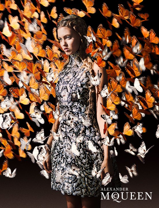
“A butterfly surrounded with a thick tissue of the Maison Givenchy, thus creating a beautiful costume especially for Audrey Hepburn.” International Textiles, edition of December 1966. The actress Audrey Hepburn portrayed by René Gruau in Paris (France), after the filming of How to Steal a Million (William Wyler, 1966), in November 1965. This illustration is also known as Lady Butterfly

A Floral Fairy-Tale

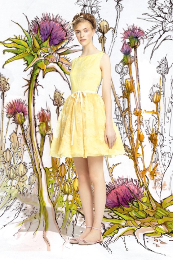
RED Valentino Spring/Summer 2014 Collection. Photos courtesy of Women’s Wear Daily


Creative directors Maria Grazia Chiuri and Pierpaolo Piccioli made a floral fairy-tale theme set the tone at RED Valentino.There were also macro floral prints on flirty tops and dresses framed by black-and-white gingham, and a butterfly motif in yellow or pink on button-up shirting and full skirts.

Special Tribute to Liz Tilberis

Harper’s Bazaar, July 1999 issue. Tom Cruise’s cover was the last cover approved by Liz before her death just 3 months prior. All ad revenue went to the Ovarian Cancer Research Fund. Models, photographers, stylists, make-ups artists, etc., donated their time for free. There are no editorials. It is the one issue which features the solidarity of the fashion industry for an icon.


Illustrations by Karl Lagerfeld


Obituary by Cartier


Christy Turlington photographed by Patrick Demarchelier


Guinevere Van Seenus photographed by Craig McDean, clothes by Yohji Yamamoto


Naomi Campbell photographed by David Bailey clothes by Versace


Left: Linda Evangelista illustrated by Mats Gustafsson; Guinevere Van Seenus photographed by Richard Burbridge


Nikki Uberti photographed by Terry Richardson, clothes by Dolce and Gabbana


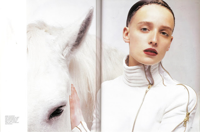
Anne Catherine Lacroix photographed by Inez van Lamsweerde and Vinoodh Matadinanne, clothes by Balenciaga


Erin O’Connor photographed by Patrick Demarchelier., clothes by Calvin Klein


Natalie Portman photographed by Robert Bromann, clothes by Moschino; Cindy Crawford photographed by Mary Ellen Mark, clothes by Malo; Rita Wilson photographed by Sante D’Orazio; Milla Jovovich photographed by Cliff Watts, clothes by Tommy Hilfiger

The Most-Sought-After Title of the Nineties

Linda Evangelista. Art Direction: Fabien Baron. Photo by Patrick Demarchelier. It was the first issue from Liz Tilberis at Harper’s Bazaar. September 1992


Sex and design, not that long ago, were total strangers—at least in magazines. You could have sex and fashion, as Helmut Newton had memorably proved in Vogue, and you could have fashion and design, as Alexey Brodovitch, Harper’s Bazaar’s legendary art director from 1934 to 1958, had shown. But Fabien Baron’s remarkable 1992 redesign of Bazaar, under editor Liz Tilberis, brought them together under one elegant, sensuous roof. Baron also introduced art-world and European photographers (Mario Testino, David Sims, Cindy Sherman, Craig McDean, Mario Sorrenti, Raymond Meier, Philip-Lorca diCorcia, Inez van Lamsweerde and Vinoodh Matadin) to the fashion world for the first time, permanently altering our perception of what a fashion photographer does.

Baron grew up in Paris, the son of a magazine art director. He came to New York at 23; his first magazine job was at GQ, in 1982, where Bruce Weber was making his name. By the late eighties, he was multitasking prodigiously, producing Barneys’ famous ads with Linda Evangelista, Christy Turlington, and Naomi Campbell, and working on Franca Sozzani’s Italian Vogue and Ingrid Sischy’s Interview, all at the same time. By 1992, when he landed at Bazaar, he was a ubiquitous design star.

And a new kind of star at that: a “creative director,” which in short order became the most-sought-after (and then clichéd) title of the nineties. “I was the first person to have that title,” he says. “I didn’t want to be just the art director!”

The Concept of Travel in an Emotional Sense

“The Journey of a star, captured in a flash”. Annie Leibovitz and Mikhail Baryshnikov. Annie’s studio, New York


“Is there any greater journey than love?” Steffi Graf and Andre Agassi. New York


“There are journeys that turn into legends”. Sean Connery, Bahamas Islands


“Every journey began in Africa”- Ali and Bono. Uganda


“A journey bring us face to face with ourselves”. Mikhail Gorbachev, Berlin, Germany


“Some stars show you the way”. Muhammad Ali and a rising star. Phoenix, Arizona


“Three exceptional journeys. One historic game”. Pelé, Diego Armando Maradona and Zinadine Zidane. Madrid, Spain


“Some journeys change mankind forever”. Sally Ride, Buzz Aldrin and Jim Lowell. California


“A single journey can change the course of a life”. Angelina Jolie. Cambodia


“Inside every story, there is a beautiful journey”. Sofia Coppola and Francis Ford Coppola. Buenos Aires, Argentina


Louis Vuitton Core Values campaigns revisit the brand’s heritage with a completely fresh interpretation of the concept of travel in an emotional sense, viewed as a personal journey, a process of self-discovery. The campaign debuted in September 2007 in major international titles featuring no other but the former Soviet statesman Mikhail Gorbachev, the French movie siren Catherine Deneuve, the founding member of The Rolling Stones Keith Richards and the tennis power couple Andre Agassi and Steffi Graf, among many other influential and famous people.

Pietro Beccari, Senior VP of Communication explains this shot: “Not only does it capture the unique quality of a father-daughter relationship, in which both are enriched by a shared experience, but it also evokes the heritage of Louis Vuitton with its suggestion of know-how being passed from one generation to the next.”

Celebrating the 40th anniversary of Apollo 11’s first steps on the Moon, the ad features legendary astronauts Sally Ride (first American woman in space), Buzz Aldrin (Apollo 11, first steps on the Moon, 1969) and Jim Lovell (Apollo 13) looking up in the Californian desert night sky.

In 2010 Brazil’s Pelé, Argentina’s Diego Maradona and France’s Zinedine Zidane all won football’s ultimate prize, and all wore the emblematic N°10 shirt. They met up in the Café Maravillas, a typical bar in Madrid, and were tempted into a game of table football. The image leaves the suspense intact, but clearly captures the atmosphere of fun and friendly rivalry.

Given the photographer of all Core Value campaigns personal and financial troubles in 2010, Louis Vuitton wished to offer support in the most positive way and suggested that Annie Leibovitz become the next campaign’s hero. She accepted on the condition that she appears alongside for friend and one of the foremost dancers of the 20th century, Mikhail Baryshnikov.

This is the first time U2 frontman Bono has appeared in an ad sans his bandmates, but instead with his wife Ali Hewson. It’s also the first time that a label other than Louis Vuitton is getting a fashion credit – the pair are wearing their own clothing line Edun, a line of ethical fashion. Proceeds from the sales will go to TechnoServe, which supports sustainable farming in Africa.

As the pioneer of the art du voyage, Louis Vuitton is always on the look out for the exceptional people with extraordinary journeys. The question is who will be next?