The Sense of Breaking Through Something

 Photo credit: New York Times


For eight consecutive seasons, Stefano Pilati released a Yves Saint Laurent Manifesto, distributed across cities globally. Working with photographers Inez van Lamsweerde & Vinoodh Matadin, Pilati’s Manifesto is intended to ‘bring the brand back to the streets’.An innovative initiative, which continues the succession of revolutionary moves Mr Saint Laurent made: he was the first French couturier to release a ready-to-wear line.


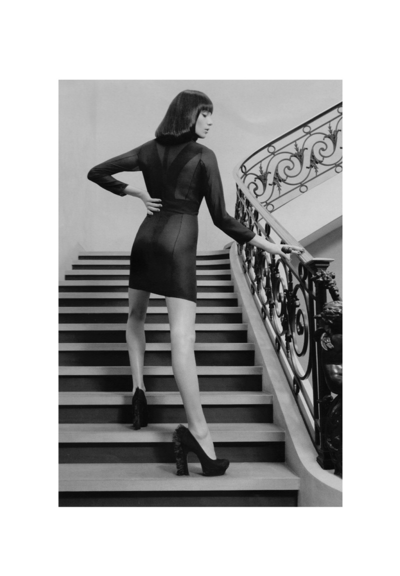
Daria Werbowy photographed by Inez van Lamsweerde & Vinoodh Matadin. YSL by Stefano Pilati Fall/Winter 2010-2011 collection.


The YSL Manifesto is much more than an en masse distribution of the seasonal campaign shots. Staying true to the idea of a ‘manifesto’ – a public written declaration of the intentions, opinion, or motives of a leader – it is a powerful, multi-layered message which goes a long way to explain Pilati’s thinking and visual iconography for the season.

“I fell in love with the idea of manifestos and with the term itself, because the word ‘manifesto’ implied a sense of breaking through something while still being connected to and aware of how things are today. In terms of the format, I didn’t really relate to any historical manifestos I’ve seen because my medium is fashion… There is fashion photography in the manifesto so even the idea of showing the pictures larger than they appear in normal magazines was part of the act of manifesting. First of all you need to question whether it’s interesting or not to be political about fashion, or instead you wish to reinforce a message to people that is simply about looking good and projecting a positive energy about yourself. I was no longer interested in thinking of fashion in an elitist way. Everything I picked up from the manifestos in the past suggested that they were trying to create energy around an ideology that was considered, in its time, underground. So I thought for today I would offer another perspective of a luxury brand to a broad demographic that doesn’t necessarily relate to fashion in the way that a more privileged layer of people do. I wanted to create a wider influence for the message that was being sent from the catwalk, by taking imagery of a collection and giving it to people on environmentally friendly paper in the street without targeting a specific demographic. One of my visions for Saint Laurent is about giving back, so that even if you can’t afford it, you can still pick up the essence of the message, the elements of fashion that might be considered increasingly irrelevant but remain for me its main aspects: the silhouette, the way the clothes are cut, the fabrics, a special pattern. It’s to say – “These are my thoughts and this is my message – you can pick up something from this and do it yourself. The Yves Saint Laurent manifestos are against aggressively, against exclusivity, against classification, against isolation, against introversion, against always looking at oneself. This is what it comes to in the end. Fashion can give rise to all of these things and it shouldn’t, especially today.”


To watch Manifesto Edition VII (Fall/Winter 2010-2011 collection), please take a gander at The Genealogy of Style’s Facebook page: https://www.facebook.com/pages/The-Genealogy-of-Style/597542157001228?ref=hl

A Statement About the Transience of Life and Fashion

“Visionaire first featured the designs of Lee Alexander McQueen in 1996 and since that time, he has been a continuous inspiration and a presence in Visionaire. McQueen’s special commissions are among our most treasured contributions. His daring designs and challenging ideas of fashion have consistently excited and provoked us.”

Stephen Gan, Cecilia Dean and James Kaliardos

Magazine’s founders


Visionaire 58 SPIRIT, a limited-edition of 1500 numbered copies


Protected in a modernly-chic white box, the tri-annual fashion and art publication Visionaire has released its tribute to the life and work of late fashion designer and icon Lee Alexander McQueen. The issue includes a collection of photographs by Nick Knight, Lady Gaga, Steven Klein, Steven Meisel, Inez van Lamsweerde & Vinoodh Matadin, Mario Testino, Mario Sorrenti and more, each printed on a piece of pulp paper embedded with wildflower seeds that will actually blossom if you plant them, water them and give them enough sun. However, with its striking images and homage to a true fashion legacy, we don’t intend to plant the pages anytime soon. Plus, the case features a metalized brocade detail from the designer’s final collection. All in all, a very romantic collector’s piece.

Several years before issue 58 came to be (2003), Alexander “Lee” McQueen came to the Visionaire office to discuss collaborating on an issue that ultimately never happened. One day, the staff was discussing a potential issue printed on seeded paper, and the next day, news came that McQueen, one of the most brilliant creative minds of our time, had passed away. The team took this as a sign and dedicated SPIRIT to him. The issue set out to commemorate McQueen’s life and career by publishing the imagery that had defined it.


Alexander McQueen by Steven Klein


Illustration by François Berthoud


Mert Alas and Marcus Piggott for Visionaire 29 WOMAN


Mert Alas and Marcus Piggott for Visionaire 26 FANTASY


Horst Diekgerdes and Camille Bidault Waddington for Visionaire 25 VISIONARY


Alexander McQueen and Phil Pointer for Visionaire 24 LIGHT


Nick Knight for Visionaire 20 COMME DES GARÇONS


Steven Klein for Visionaire 18 FASHION SPECIAL

Special Tribute to Liz Tilberis

Harper’s Bazaar, July 1999 issue. Tom Cruise’s cover was the last cover approved by Liz before her death just 3 months prior. All ad revenue went to the Ovarian Cancer Research Fund. Models, photographers, stylists, make-ups artists, etc., donated their time for free. There are no editorials. It is the one issue which features the solidarity of the fashion industry for an icon.


Illustrations by Karl Lagerfeld


Obituary by Cartier


Christy Turlington photographed by Patrick Demarchelier


Guinevere Van Seenus photographed by Craig McDean, clothes by Yohji Yamamoto


Naomi Campbell photographed by David Bailey clothes by Versace


Left: Linda Evangelista illustrated by Mats Gustafsson; Guinevere Van Seenus photographed by Richard Burbridge


Nikki Uberti photographed by Terry Richardson, clothes by Dolce and Gabbana


Anne Catherine Lacroix photographed by Inez van Lamsweerde and Vinoodh Matadinanne, clothes by Balenciaga


Erin O’Connor photographed by Patrick Demarchelier., clothes by Calvin Klein


Natalie Portman photographed by Robert Bromann, clothes by Moschino; Cindy Crawford photographed by Mary Ellen Mark, clothes by Malo; Rita Wilson photographed by Sante D’Orazio; Milla Jovovich photographed by Cliff Watts, clothes by Tommy Hilfiger

The Most-Sought-After Title of the Nineties

Linda Evangelista. Art Direction: Fabien Baron. Photo by Patrick Demarchelier. It was the first issue from Liz Tilberis at Harper’s Bazaar. September 1992


Sex and design, not that long ago, were total strangers—at least in magazines. You could have sex and fashion, as Helmut Newton had memorably proved in Vogue, and you could have fashion and design, as Alexey Brodovitch, Harper’s Bazaar’s legendary art director from 1934 to 1958, had shown. But Fabien Baron’s remarkable 1992 redesign of Bazaar, under editor Liz Tilberis, brought them together under one elegant, sensuous roof. Baron also introduced art-world and European photographers (Mario Testino, David Sims, Cindy Sherman, Craig McDean, Mario Sorrenti, Raymond Meier, Philip-Lorca diCorcia, Inez van Lamsweerde and Vinoodh Matadin) to the fashion world for the first time, permanently altering our perception of what a fashion photographer does.

Baron grew up in Paris, the son of a magazine art director. He came to New York at 23; his first magazine job was at GQ, in 1982, where Bruce Weber was making his name. By the late eighties, he was multitasking prodigiously, producing Barneys’ famous ads with Linda Evangelista, Christy Turlington, and Naomi Campbell, and working on Franca Sozzani’s Italian Vogue and Ingrid Sischy’s Interview, all at the same time. By 1992, when he landed at Bazaar, he was a ubiquitous design star.

And a new kind of star at that: a “creative director,” which in short order became the most-sought-after (and then clichéd) title of the nineties. “I was the first person to have that title,” he says. “I didn’t want to be just the art director!”

After Manet’s Masterpiece

Le déjeuner sur l’herbe, with Gustave Courbet, Claude Monet, 1865-1866


Manet’s painting inspired Picasso to a cycle of 27 paintings, 140 drawings, 3 linogravures and cardboard marquettes for sculpture carried out between 1949 and 1962


Le Déjeuner sur l’herbe (Picnic on the Grass), a 1959 film directed by Jean Renoir


Jim Lee’s version for Cosmopolitan, June 1974


Déjeuner sur l’herbe, a photograph by Jonathan Charles, 1974


Title, and features similar front cover art, of British bigband the New Jazz Orchestra on Verve Records,1969


See Jungle! See Jungle! Go Join Your Gang, Yeah! City All Over, Go Ape Crazy! (1981) is the second studio album by pop rock group Bow Wow Wow. The album was the first release by the group to chart, at #192 on the Billboard 200. Posing nude is lead singer Annabella Lwin, who was fifteen at the time of the album’s release. The Andy Earl cover caused outrage that led to an investigation by Scotland Yard, instigated by Lwin’s mother and never appeared on UK and US releases.


Still from The Simpsons


Yves Saint Laurent Spring Summer 1999 ad campaign photographed by Mario Sorrenti


Untitled (after Manet’s Dejeuner sur L’Herbe), Julie Rrap, 2002


Star Wars Le déjeuner sur l’herbe, after Manet, by Philip Bond, 2009


Babar the Elephant after Manet, possibly by the fictional character’s author, Jean de Brunnhoff


Graphic art by Stano Masar


Les Trois Femmes Noires, Mickalene Thomas, 2010


Secret Garden II: Versailles. Dior Fall-Winter 2013 ad campaign by Inez Van Lamsweerde y Vinoodh Matadin

Poetic Seduction

Vespertine (2011)


Björk‘s artistic incarnations seem very intentional, well thought out. Vespertine, her fifth studio album was released on August 27, 2001. The initial title for the album was Domestika. A song titled Domestica (originally titled Lost Keys) was included as a B-side on the Pagan Poetry single. Björk has stated that she decided to call the album Vespertine instead of Domestika because the new title dealt with the prayer aspect of the album, which she wanted to note, while she felt that calling the album Domestika would have been “too much”, because Björk felt that the songs on the album were already “domestic” enough. She felt the need to call the album after another aspect of itself. The word Vespertine also relates to nighttime, for example things that come out at night, and the title was also partly inspired by that.

Although one of Vespertine’s themes is the night time, the frontal artwork designed by studio M/M Paris and photographed by Inez van Lamsweerde & Vinoodh Matadin highlights a sunny time. It might be because the song, Sun in my Mouth, was a single from that album. Björk adapted the lyrics of Sun in My Mouth from the poem I Will Wade Out by E. E. Cummings. The word “sea-girls” is changed to “seagulls”, and the last few lines of the poem are omitted.

The recipe for success was ready to be mixed: ornithology, poetry and Greek mythology. Björk used metaphors taken from nature to describe Vespertine: “is little insects rising from the ashes.”

The ancient Greeks thought that ποίησις (poiesis), with a broad meaning of a “making”, was also the “joint of everything”, the amalgamating element of the world. So, maybe that was the ideal concept for Björk.

On the cover of Vespertine she can be seen wearing the swan dress designed by Marjan Pejoski that caused a stir at the 2001 Academy Awards.

Марјан Пејоски (Маrjan Pejoski) is a Macedonian fashion designer who lives and works in Great Britain. That infamous swan dress put him on fashion’s map. Some people thought Alexander McQueen was the author of that dress due to his previous collaborations with Björk.


Promotional pictures by Inez van Lamsweerde and Vinoodh Matadin


Björk in Oscar 2001 red carpet


Still from Pagan Poetry (Nick Knight, 2001) music video. She’s wearing a dress designed by Alexander McQueen. The music video “is about a woman preparing herself for marriage and for her lover”, Knight said.


Clifton Webb, Marlene Dietrich and Elizabeth Allen


Morocco (Josef von Sternberg, 1930) Promotional pictures


Pejoski’s swan dress has a precedent. In 1935 Marlene Dietrich attended a Halloween party hosted by South African actor Basil Rathbone and his wife Ouida Bergère. It was a party to entertain movie stars. The Person You Admire The Most was the theme. Dietrich chose Leda, the mytological figure seduced by Zeus, and asked Travis Banton, a Paramount iconic costume designer, to make her dress. Elizabeth Allen was going to accompany Dietrich. Allen’s choice was out of her reach. She wore an androgynous outfit, actually a copycat from Morocco’s costumes. And Clifton Webb was disguised as Fu Manchú.

Björk Show Us the Future

Björk in the cover of the Dazed and Confused 200th issue (August 2011), wearing a metallic paper top by Paco Rabanne


Jumpsuit Crystalline by Stefano Pilati


Biophilia (2011) artwork by M/M Paris, Inez van Lamsweerde and Vinoodh Matadin


Rod Stanley, editor of Dazed and Confused, went to New York to meet Björk before Biophilia was released. He asked her to be the cover girl of the 200th issue, which would be dedicated mostly to the scientists, musicians, engineers, designers, artists and any other collaborators from her ambitious multimedia project. From the aesthetic aspect: Three as four (they designed the harp-shaped belt she wears in the sleeve of the album). The brand Paco Rabanne and Stefano Pilatti, the-then artistic director from Yves Saint Laurent did lend some outfits. Katy England was the stylist and Sam Falls signed the photographic document inspired by the lyric abstractionism from Wassily Kandisnky.

“Punctuation is: Pretty Much Everything”

“The stop point out, with truth, the time of pause
A sentence doth require at ev’ry clause.
At ev’ry comma, stop while one you count;
At semicolon, two is the amount;
A colon doth require the time of three;
The period four, as learned men agree”

Cecil Hartley


“On the page, punctuation performs its grammatical function, but in the mind of the reader it does more than that. It tells the reader how to hum the tune.”

Lynn Truss

Eats, Shoots and Leaves


Punctuation is historically an aid to reading aloud (vis George Bernard Shaw). Quite so, punctuation marks are symbols that indicate the structure and organization of written language, as well as intonation and pauses to be observed when reading aloud. The rules of punctuation vary with language, location, register and time and are constantly evolving. Certain aspects of punctuation are stylistic and are thus the author’s (or editor’s) choice.


In 2010, photographers Inez van Lamsweerde and Vinoodh Matadin collaborated with artists M/M Paris (an art and design partnership consisting of Mathias Augustyniak and Michael Amzalag) on a series of collages featuring various celebrities as punctuation marks as part of their Pretty Much Everything retrospective.


Asterisk ( * )


From Greek: ἀστερίσκος, asteriskos, “little star”. The asterisk  is a typographical symbol or glyph derived from the need of the printers of family trees in feudal times for a symbol to indicate date of birth. This symbol is used to call out a footnote, especially when there is only one on the page. Less commonly, multiple asterisks are used to denote different footnotes on a page (i.e., *, **, ***). Typically, an asterisk is positioned after a word or phrase and preceding its accompanying footnote. Asterisks are sometimes used as an alternative to typographical bullets to indicate items of a list. Asterisks are sometimes used as an alternative to typographical bullets to indicate items of a list.


Lewis Carroll‘s looking-glass world is divided into sections by brooks or streams, with the crossing of each brook usually signifying a notable change in the scene and action of the story: the brooks represent the divisions between squares on the chessboard, and Alice’s crossing of them signifies advancing of her piece one square. Most editions of the book visually represent the crossings by breaking the text with several lines of asterisks ( * * * ).


Björk


Slash ( / )


The slash goes back to the days of ancient Rome. In the early modern period, in the Fraktur script, which was widespread through Europe in the Middle Ages, one slash (/) represented a comma, while two slashes (//) represented a dash. The two slashes eventually evolved into a sign similar to the equals sign (=), then being further simplified to a single dash or hyphen (–). Is a sign used as a punctuation mark and for various other purposes. It is often called a forward slash (a retronym used to distinguish the slash from the backslash, “\”), and many other alternative names. The slash is most commonly used as the word substitute for “or” which indicates a choice (often mutually-exclusive) is present. The slash is also used to indicate a line break when quoting multiple lines from a poem, play, or headline; or in an ordinary prose quotation, the start of a new paragraph.


Vanessa Redgrave


Period ( . )


A full stop (British English, Hiberno-English, Australian English, and New Zealand English) or period (American English and Canadian English) is the punctuation mark placed to indicate the end of sentences. In the context of web addresses and computing in general, it is typically called a dot. In conversation, as opposed to linguistics, the term is often used to mean “the end of the matter” (for example, “We are calling a full stop to discussions on this subject” or “We will not do it. Period!”).


The full stop symbol derives from Aristophanes of Byzantium who invented the system of punctuation where the height of placement of a dot on the line determined its meaning. The high dot (˙) was called a “periodos” and indicated a finished thought or sentence, the middle dot (·) was called a “kolon” and indicated part of a complete thought, while the low dot (.) was called a “telia” and also indicated part of a complete thought.


Mickey Rourke


Comma ( )


Is used in many contexts and languages, principally for separating things. It has the same shape as an apostrophe or single closing quotation mark in many typefaces, but it differs from them in being placed on the baseline of the text. Some typefaces render it as a small line, slightly curved or straight but inclined from the vertical, or with the appearance of a small, filled-in number 9. It is used to separate parts of a sentence such as clauses and lists of three or more things.


In the 3rd century BC, Aristophanes of Byzantium invented a system of single dots (distinctiones) that separated verses (colometry), and indicated the amount of breath needed to complete each fragment of text, when reading aloud.


Jim Jarmusch


Open bracket ( (  )


Close bracket ( ) )


Brackets are tall punctuation marks used in matched pairs within text, to set apart or interject other text. Used unqualified, brackets refer to different types of brackets in different parts of the world and in different contexts. Erasmus of Rotterdam coined the term lunula to refer to the rounded parentheses (), recalling the round shape of the moon.


Bill Murray


Open guillemets ( « )


Also called angle quotes or French quotation marks, are polylines, pointed as if arrows (« or »), sometimes forming a complementary set of punctuation marks used as a form of quotation mark. They are used in a number of languages to indicate speech. They resemble (but are not the same as) the symbols for lesser than (<), greater than (>), and for left and right bit shifts in some programming languages, as well as rewind and fast forward on various media players, such as VCRs, DVD players, and MP3 players. The word is a diminutive of the French name Guillaume (the equivalent of which in English is William), after the French printer and punchcutter Guillaume Le Bé (1525–98).


Daniel Day-Lewis


Colon ( : )


The colon is a punctuation mark consisting of two equally sized dots centered on the same vertical line.English colon is from Latin colon (plural cola), itself from Greek κῶλον “limb, member, portion”, in rhetoric or prosody especially a part or section of a sentence or a rhythmical period of an utterance. In palaeography, a colon is a clause or group of clauses written as a line. Use of the : symbol to mark the discontinuity of a grammatical construction, or a pause of a length intermediate between that of a semicolon and that of a period, was introduced in English orthography around 1600.


Mia Farrow photographed for a Gap Ad


Semicolon ( ; )


It is a punctuation mark with several uses. The Italian printer Aldus Manutius the Elder established the practice of using the semicolon to separate words of opposed meaning and to indicate interdependent statements. Modern uses of the semicolon relate either to the listing of items or to the linking of related clauses. A semicolon is used when a sentence could have been ended, but it wasn’t.


Juliette Binoche


Exclamation ( ! )


The exclamation mark is a punctuation mark usually used after an interjection or exclamation to indicate strong feelings or high volume (shouting), and often marks the end of a sentence. One theory of its origin is that it was a Latin exclamation of joy (io), written with the I above the o. The exclamation mark was first introduced into English printing in the 15th century, and was called the “sign of admiration or exclamation” or the “note of admiration” until the mid-17th century;  admiration referred to its Latin sense of wonderment.


Clint Eastwood


Question mark ( ? )


Also known as an interrogation point, interrogation mark, question point, query, or eroteme), is a punctuation mark that replaces the full stop (period) at the end of an interrogative sentence in English and many other languages. The question mark is not used for indirect questions. The question mark character is also often used in place of missing or unknown data.


The symbol is sometimes thought to originate from the Latin quaestiō (that is, qvaestio), meaning “question”, which was abbreviated during the Middle Ages to qo. The lowercase q was written above the lowercase o, and this mark was transformed into the modern symbol. However, evidence of the actual use of the Q-over-o notation in medieval manuscripts is lacking; if anything, medieval forms of the upper component seem to be evolving towards the q-shape rather than away from it.


Natalie Portman


Ampersand ( & )


It’s a logogram representing the conjunction word “and”. This symbol is a ligature of the letters et, Latin for “and”. The word ampersand is a corruption of the phrase “and (&) per se and”, meaning “and (the symbol &) intrinsically (is the word) and”. In film credits for stories, screenplays, etc., & indicates a closer collaboration than and.

Fashionable Bunnies

Dorian Leigh in a hat by Paulette. Harper’s Bazaar, October, 1949


Halston black velvet dress with mink trim, 1966. Collection Museum of The City of New York


Alber Elbaz


Stella Tenant and Charles Guislain, photographed by Tim Walker, Tim Walker


Candice Bergen at Truman Capote’s Black-and-White Ball. The Plaza Hotel, New York. November 28, 1966


Liza Minnelli, Truman Capote and Studio 54 owner, Steve Rubell


Andy Warhol and Eddie Sedgwick


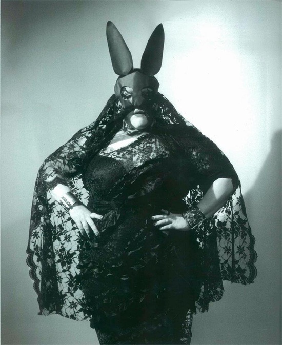
Elsa Peretti in a Halston-designed Bunny costume, photographed by Helmut Newton in New York City, 1975


Lauren Hutton


Playboy-inspired logo bathing suit


 Yasmin Le Bon for Ralph Lauren Fall 1985 “Rabbit Hole” ad campaign


Betsey Johnson


Reese Whiterspoon in a still from Legally Blonde (Robert Luketic, 2001)


Hilary Swank. Photo: Inez van Lamsweerde and Vinoodh Matadin, 2007


Marc Jacobs. Photo: Craig McDean for the CFDA


Madonna. Louis Vuitton, 2009 Fall-Winter ad campaign photographed by Steven Meisel.

Lady Gaga in the cover of Neo2 Magazine. September 2009 issue. Photo: Olivier Rauh


Dita Von Teese


Beth Ditto


Emma Watson for Elle UK. November 2011. Photo: Rankin


Ewan McGregor. Photo: Alexi Lubomirski


Helena Bonham Carter. The Sunday Times, April 2012


Carolina Herrera’s Bunny Print dress 2013 Resort Collection

Coming Out of the Cocoon

Dedicated to my boyfriend Paul


It was the third and final single off Björk’s Vespertine. The music video was as controversial as the previous one for Pagan Poetry (Nick Knight). Cocoon video was directed by Japanese multi-disciplinary artist Eiko Ishioka. Björk wrote the lyrics along Danish electronic musician Thomas Knak. In some verses there are sexual-erotic euphemisms and metaphors depicting how a girl is feeling since love took has taken her by surprise.


Front and back cover from Björk’s Volumen Plus (2002).