

The Beatles‘ accountants had informed the group that they had two million pounds which they could either invest in a business venture or else lose to the Inland Revenue, because corporate/business taxes were lower than their individual tax bills. According to Peter Brown, personal assistant to Beatles’ manager Brian Epstein, activities to find tax shelters for the income that the Beatles generated began as early as 1963–64, when Dr Walter Strach was put in charge of such operations. First steps into that direction were the foundation of Beatles Ltd and, in early 1967, Beatles and Co.
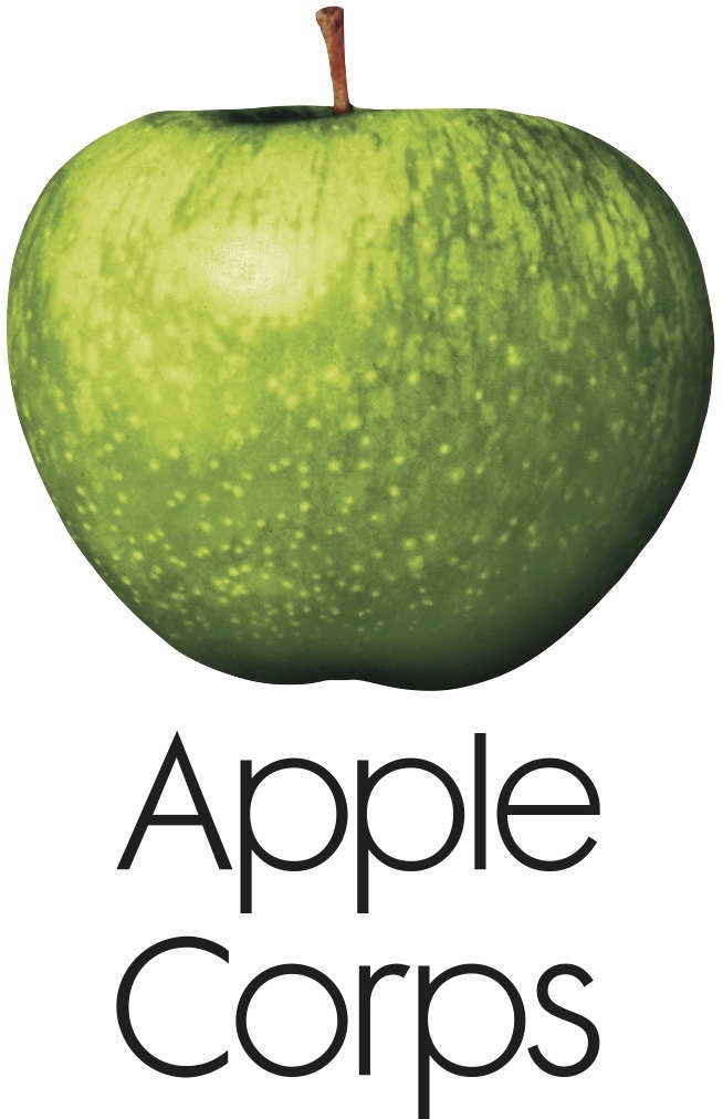
The Beatles’ publicist, Derek Taylor, remembered that Paul McCartney had the name for the new company when he visited Taylor’s company flat in London: “We’re starting a brand new form of business. So, what is the first thing that a child is taught when he begins to grow up? A is for Apple”. McCartney then suggested the addition of Apple Core, but they could not register the name, so they used “Corps” (having the same pronunciation).
The Belgian Beatles Society page says that in an interview with Johan Ral in 1993, Paul McCartney recalled:
“….I had this friend called Robert Fraser, who was a gallery owner in London. We used to hang out a lot. And I told him I really loved Magritte. We were discovering Magritte in the sixties, just through magazines and things. And we just loved his sense of humour. And when we heard that he was a very ordinary bloke who used to paint from nine to one o’clock, and with his bowler hat, it became even more intriguing. Robert used to look around for pictures for me, because he knew I liked him. It was so cheap then, it’s terrible to think how cheap they were. But anyway, we just loved him … One day he brought this painting to my house. We were out in the garden, it was a summer’s day. And he didn’t want to disturb us, I think we were filming or something. So he left this picture of Magritte. It was an apple – and he just left it on the dining room table and he went. It just had written across it “Au revoir”, on this beautiful green apple. And I thought that was like a great thing to do. He knew I’d love it and he knew I’d want it and I’d pay him later. […] So it was like wow! What a great conceptual thing to do, you know. And this big green apple, which I still have now, became the inspiration for the logo. And then we decided to cut it in half for the B-side!”
 Le Jeu de la Mourre, René Magritte, 1966
Taking Magritte for inspiration, the Apple record labels were designed by a fellow named Gene Mahon, an advertising agency designer. The Beatles Collection website has a great summary of how this all came about:
“[It was Gene Mahon who] proposed having different labels on each side of the record. One side would feature a full apple that would serve as a pure symbol on its own without any text. All label copy would be printed on the other side’s label, which would be the image of a sliced apple. The white-colored inside surface of the sliced apple provided a good background for printing information.
The idea of having no print on the full apple side was abandoned when EMI advised Apple that the contents of the record should appear on both sides of the disc for copyright and publishing reasons. Although Mahon’s concept was rejected for legal (and perhaps marketing) reasons, his idea of using different images for each side of the record remained. Mahon hired Paul Castell to shoot pictures of green, red and yellow apples, both full and sliced. The proofs were reviewed by the Beatles and Neil Aspinall, with the group selecting a big green Granny Smith apple to serve as the company’s logo. A sliced green apple was picked for B side. Alan Aldridge provided the green script perimeter print for labels [on UK, EU and Australian releases – this does not appear on US labels] and, in all likelihood, the script designation on the custom record sleeve.”


