Homage to Delacroix

Study for Homage to Delacroix


When Eugène Delacroix died on August 13, 1863, the modesty of his funeral was seen as an insult by all those who considered him to be one of France’s greatest artists. Henri Fantin-Latour, especially, was outraged that no official tribute had been made. As it was common in the 19th century to celebrate prominent figures, he wanted to raise this monument himself with a manifesto painting that reunited the tenants of the modern movement, which he exhibited at the Salon of 1864. This sketch bears witness to the first project, in which six artists are gathered around the bust of Delacroix, crowned by one of them.


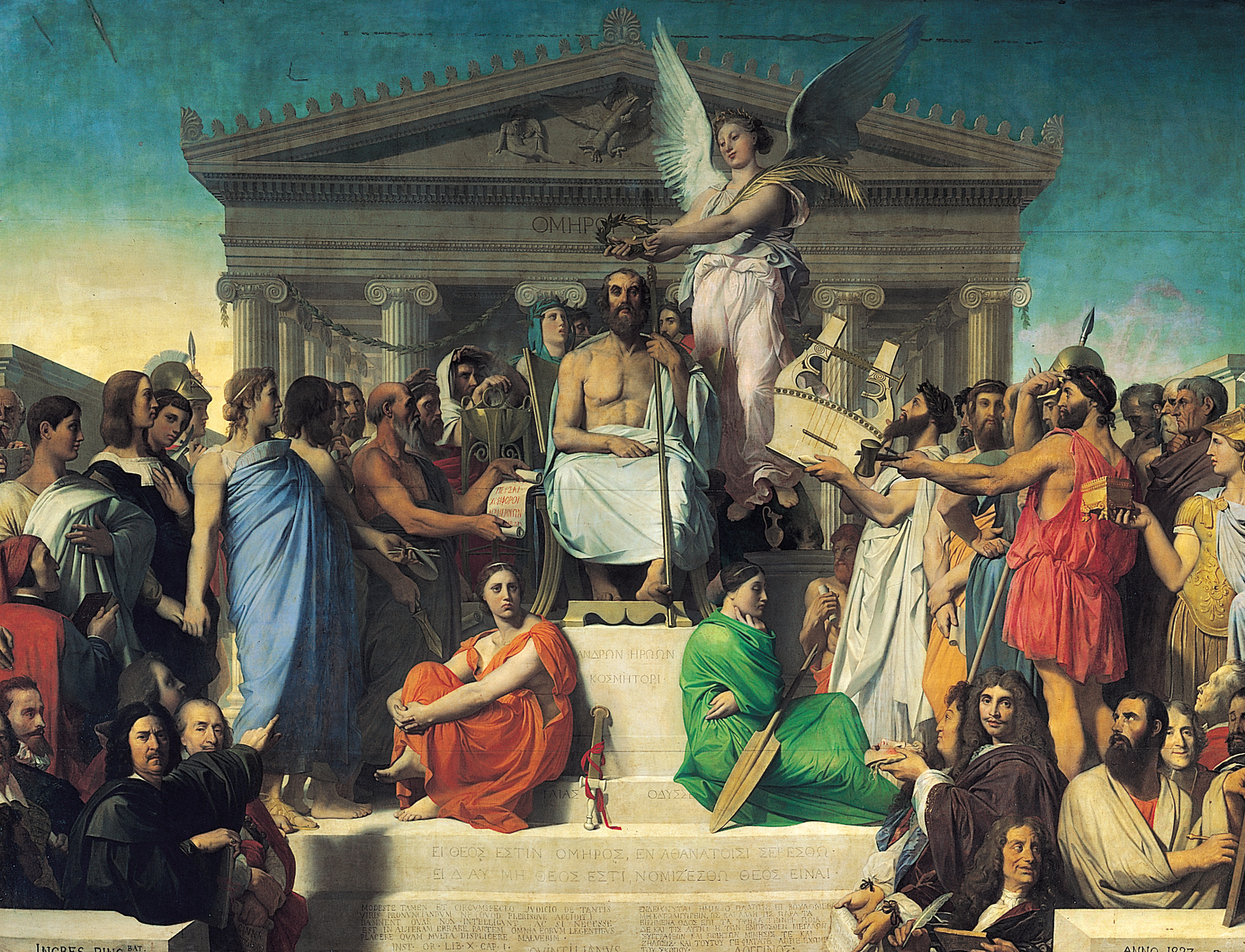
The Apotheosis of Homer


While it is clear that Fantin made deliberate reference to the coronations of the great men of theater on stage, the most striking source of inspiration for this artwork remains the 1827 painting by Jean-Auguste-Dominique Ingres, Apotheosis of Homer. The artist made use of the same pyramid composition, with the bust of Delacroix placed in the center. Fantin, who depicts himself in the lower right of the composition with his palette and painter’s smock, draws the viewer’s eye to the object of veneration. By making reference to the painting by Ingres, he thus renders the significance of his work more easily understood: Delacroix, like Homer, embodies the genius that will be passed on to the next generations. The identities of the other figures in the sketch are more difficult to ascertain. They can nonetheless be deduced from the first list on a preparatory drawing with the names Legros, Whistler, Manet, Bracquemond, Duranty, Cordier, Myrionnet, and Régamey.

After producing a number of sketches for this painting, Fantin eventually decided on a final version that is housed at the Musée d’Orsay and far removed from this drawing. The final composition removes Myrionnet and Régamey, replacing them with Baudelaire, Champfleury, and Balleroy. The contemporaries are now positioned around a painted portrait of Delacroix, and no longer a bust.


Homage to Delacroix

Seated: Louis Edmond Duranty, Fantin-Latour himself, Champfleury et Charles Baudelaire.

Standing: Louis Cordier, Alphonse Legros, James Whistler, Édouard Manet, Félix Bracquemond et Albert de Balleroy.

Lips of Vermouth

“Yes, good folk, it is I who direct you to roast upon a red-hot shovel, with a little brown sugar, the duck of doubt with lips of vermouth, which, in a melancholy struggle between good and evil, shedding crocodile tears, without an air-pump everywhere brings about the universal vacuum. That is the best thing for you to do.”

Comte de Lautréamont
Les Chants de Maldoror (The Songs of Maldoror)


A l’heure de l’observatoire, les Amoureux (Observatory Time – The Lovers), Man Ray, 1934


One of Man Ray’s most memorable paintings, Observatory Time, is featured in this black-and-white photograph taken in 1936, along with a nude. It includes a depiction of the lips of his departed lover, Lee Miller, floating in the sky above the Paris Observatory. In the photograph, the nude is lying on her side on a sofa underneath the painting, with a chessboard at her feet. Observatory Time hints at what the woman might be dreaming: a nightmare or an erotic fantasy.

Observatory TimeThe Lovers, or as it has become more familiarly known, The Lips, has been described as the quintessential Surrealist painting, a supreme example of isomorphism, the use of organic forms oddly and obliquely referring to man, in a kind of fastidious, realistic illusionism – the unifying theme in mainstream Surrealist art in the heyday of the 1930s. Its title exemplifies Gertrude Stein‘s insistence upon embodying “time in the composition”. The canvas was eight feet long and over three feet high, and it took Man Ray two years of meticulous, daily work to get it right.

The Lips relied on a reference central to Surrealist philosophy, the devouring woman. It was the latest in a distinct series of big paintings, stretching back to MCMXIV of the Ridgefield period and The Rope Dancer and anticipating by a half dozen years Le beau temps. Every time Man Ray reached for the dramatic, grand statement in his paintings, he succeeded. The bigger canvases forced him into deliberateness of gesture and drew him away from the slapdash approach that ultimately (permanently, some critics would say) undermined his reputation as a painter.


Man Ray’s complete absorption in the task of painting The Lips also enabled him to forget his deepening hatred of photography and to escape into the preferred “high and exacting plane of Surrealist activity.” Surely it is no accident that Lee’s lips in the painting are flying through the air – reveling in sublime height, set in a faint smile, redder than any lipstick-reddened lips could possibly be. Indeed, the color of The Lips is as emancipated as its subject: the woman gone, the woman flown.


Hattie Carnegie against Man Ray’s painting Observatory Time – The Lovers


It is not known whether Man Ray was also recalling the evil lips of Maldoror, the “sapphire lips” of Lautreamont’s poem, that satanically lyric work that had made such an enduring impression upon him in his American Dada period. The monumental painting is – like Lautreamont’s poem – truly startling in its impact. Once again, as he had done so often in his photographs, making him the darling of the Surrealist writers, Man Ray set out to reinvent the female anatomy, in much the same manner as one of his earliest exemplars, Jean-Auguste-Dominique Ingres. He wanted to prove himself with The Lips, to demonstrate that he could take on a vast terrain and keep control of it. The work figurative, yet mystifying.

A Novelty Cover

Their Satanic Majesties Request is the sixth British and eighth American studio album by The Rolling Stones, released on 8 December 1967 by Decca Records in the United Kingdom and the following day in the United States by London Records. Its title is a play on the “Her Britannic Majesty requests and requires…” text that appears inside a British passport. Their Satanic Majesties Request was the Stones’ only self-produced album, which Mick Jagger admitted was not for the best.

There’s a lot of rubbish on Satanic Majesties. Just too much time on our hands, too many drugs, no producer to tell us, “Enough already, thank you very much, now can we get just get on with this song?” Anyone let loose in the studio will produce stuff like that. There was simply too much hanging around. It’s like believing everything you do is great and not having any editing.

The working title of the album was Cosmic Christmas. In the hidden coda titled “Cosmic Christmas” (following “Sing This All Together (See What Happens)”), Wyman tells “it’s slowed-down: ‘We wish you a merry Christmas, we wish you a merry Christmas, and a happy New Year!'” Some of the album’s songs were also recorded under various working titles, some appearing rather non sequitur and radically different from the final titles. These working titles include: Acid in the Grass (In Another Land), I Want People to Know (2000 Man), Flowers in Your Bonnet (She’s a Rainbow), Fly My Kite (The Lantern), Toffee Apple (2000 Light Years from Home), and Surprise Me (On with the Show).


One proposed cover-a photograph of Mick Jagger naked on a cross-was scrapped by the record company for being “in bad taste”. Initial releases of the album featured a three-dimensional picture of the band on the cover by photographer Michael Cooper. When viewed in a certain way, the lenticular image shows the band members’ faces turning towards each other with the exception of Jagger, whose hands appear crossed in front of him.


Looking closely on its cover, one can see the faces of each of the four Beatles, reportedly a response to the Beatles’ inclusion of a doll wearing a “Welcome the Rolling Stones” sweater on the cover of Sgt. Pepper. Later editions replaced the glued-on three-dimensional image with a photograph, due to high production costs. A limited edition LP version in the 1980s reprinted the original 3D cover design; immediately following the reissue, the master materials for reprinting the 3D cover were intentionally destroyed. The 3D album cover was featured, although shrunk down, for the Japanese SHM-CD release in 2010.

The original cover design called for the lenticular image to take up the entire front cover, but finding this to be prohibitively expensive it was decided to reduce the size of the photo and surround it with the blue-and-white graphic design.


The entire cover design is elaborate, with a dense photo collage filling most of the inside cover (along with a maze) designed by Michael Cooper, and a painting by Tony Meevilwiffen on the back cover depicting the four elements (Earth, Water, Fire, and Air). In some editions the blue-and-white wisps on the front cover are used in a red-and-white version on the paper inner sleeve. The inner-cover collage has dozens of images, taken from reproductions of old master paintings (Ingres, Poussin, DaVinci, among others), Indian mandalas and portraits, astronomy (including a large image of the planet Saturn), flowers, world maps, etc.

It was the first of four Stones albums to feature a novelty cover (the others were the zipper on Sticky Fingers, the cut-out faces on Some Girls, and the stickers on Undercover). The maze on the inside cover of the UK and US releases cannot be completed: a wall at about a half radius in from the lower left corner means one can never arrive at the “It’s Here” in the centre of the maze.

The Devil is in the Detail


The creator of the cover of Dangerous was the artist Mark Ryden. It took six months to end in. Much of the life of Michael Jackson is reflected in it both in pictures as symbols. This artist was born on 20 January 1963, in Medford, Oregon, California. In 1987 he received the School of Design in Pasadena. Among his clients include Stephen King, Leonardo Di Caprio, Robert De Niro, etc …  Jackson asked very specific things, he told to Ryden that “the design should be mysterious, that people will interpret in their own way …”So, as that famous idiom which refers to a catch or mysterious element hidden: the devil is in the detail.

Account Mark Ryden, artist of the cover of Dangerous that had previously worked with the Art Director for Sony, Nancy Donald in many other projects and when the project was commissioned by Michael Jackson she thought of him. A Michael Jackson’s friend showed him a book with their jobs and liked a lot. Ryden was thus that he met with the King of Pop in his study where he could hear some of his new music and talked about the idea. He then had a week to create some strokes, doing 5 pencil drawings. Only one was elected, the current draft of the lid. The other four sketches were not accepted by Michael Jackson, but had the same general style that the cover of Dangerous. One was a circus poster with a skeleton jumping from the innards of a clown, another was focused on a girl in her hand she held a skull, another idea was very similar to the final cover, but the scene was set outdoors and the Michael Jackson’s eyes were mixed with clouds over the chimp Bubbles which was standing on a pile of animals. Mark Ryden also note that for the first sketches of the cover of Dangerous drew heavily on the video for the song Leave Me Alone found in the feature film Moonwalker, saying that  “it was the image, design and the items were great.”

Although the original painting is very large, the great challenge of the artist was that by reducing the size of a cover of a compact disc detail and the concept did not disappear. One of its inspiration to the many details was listening to the tracks on the album as Michael Jackson was finishing his recording and song titles also served to introduce certain concepts. And so the album title and the song Dangerous provided a starting point for the base of the drawing. Mark Ryden said that despite the great advances in digital technology, the drawing is not supported by computers, only brush with acrylics on a panel, which still remains in its original study.  As for the freedom to create his work, Ryden had the opportunity to draw without pressure, except for some very specific added that Michael Jackson asked himself near the end of the work. For example he wanted the actor Macaulay Culkin was in one of the cars that pull out of the tunnel on the right and placed the pin “1998″ on the lapel of P. Barnum, creator of the world’s most famous circuses. The image of Afghan dog on his throne is inspired by an oil,  Napoleon on his Throne, painted by artist Jean-Auguste Ingres in 1806.

A Shift Toward Exotic Romanticism

La Grande Odalisque, Jean Auguste Dominique Ingres, 1814


This painting depicts  an odalisque, or concubine. Jean Auguste Dominique Ingres‘ contemporaries considered the work to signify his break from Neoclassicism, indicating a shift toward exotic Romanticism.


PRECEDENT:


Dresden Venus or Sleeping Venus, Giorgione, 1508-10


Venere di Urbino (Venus of Urbino), Titian, 1538


Portrait of Madame Récamier,  Jacques-Louis David, c. 1800


The painting was commissioned by Napoleon’s sister, Queen Caroline Murat of Naples, and finished in 1814. Ingres drew upon works such as Dresden Venus by Giorgione, and Titian’s Venus of Urbino as inspiration for his reclining nude figure, though the actual pose of a reclining figure looking back over her shoulder is directly drawn from the 1809 Portrait of Madame Récamier by Jacques-Louis David.

Ingres portrays a concubine in languid pose as seen from behind with distorted proportions. The small head, elongated limbs, and cool color scheme all reveal influences from Mannerists such as Parmigianino, whose Madonna with the Long Neck was also famous for anatomical distortion.

This eclectic mix of styles, combining classical form with Romantic themes, prompted harsh criticism when it was first shown in 1814. Critics viewed Ingres as a rebel against the contemporary style of form and content. When the painting was first shown in the Salon of 1819, one critic remarked that the work had “neither bones nor muscle, neither blood, nor life, nor relief, indeed nothing that constitutes imitation”. This echoed the general view that Ingres had disregarded anatomical realism. Ingres instead favored long lines to convey curvature and sensuality, as well as abundant, even light to tone down the volume. Ingres continued to be criticized for his work until the mid-1820s.


SUCCESSOR:


Julianne Moore, after Ingres’s La Grande Odalisque. By Michael Thompson, 2000; Vanity Fair, April 2000

The Peacock Enthroned

Earthquake Damage. Lily Cole photographed by Tim Walker in Whadwhan Palace, Gujarat (India), 2005


La Grande Odalisque, 1814,  Jean AugusteDominique Ingres


The Peacock Room, 1876-7, James McNeill Whistler


The Peacock Throne is the most notable piece of furniture of the Moorish Kiosk, a building located at Linderhoff Palace in Bavaria, Germany. It’s the smallest of the three palaces built by King Ludwig II of Bavaria


Illustration of Sir Vane Peacock, JJ Grandville, 1852


The Kiss, 1896 Will Bradley


Aubrey Beardsley


Alphons Mucha


Kimono by Iida Takashimaya. Circa 1904-1908


Erté


George Barbier


bilibinIllustration to a Russian fairy tale about Жар-птица (The Firebird), 1899, by Ivan Bilibin


Walter Crane


Orson Lowell


The Majestic Peacock, by Elisabeth Sonrel


Vogue Cover , March 18, 1909 as illustrated by James St. John


George Wolf Plank, 1911


Frank Xavier Leyendecker, 1921


Page from Winter 1965 Lanctan catalogue, illustration by Paul Christadoulou


Flapper style headdress


Photo credit: Art Kane


Katharine Hepburn. Photo: Cecil Beaton, 1961


Gabrielle Coco Chanel. Photo by Boris Lipnistki


Natasha Khan (Bat for Lashes)


Michael Jackson’s Dangerous. Cover by Mark Ryden