Isn’t It a Pity


Isn’t It a Pity is a song by English musician George Harrison from his 1970 solo album All Things Must Pass. It appears in two variations there: one the well-known, seven-minute version; the other a reprise, titled Isn’t It a Pity (Version Two). Harrison wrote the song in 1966, but it was rejected for inclusion on releases by The Beatles. In many countries around the world, the song was also issued on a double A-side single with My Sweet Lord.

An anthemic ballad and one of Harrison’s most celebrated compositions, Isn’t It a Pity has been described as the emotional and musical centrepiece of All Things Must Pass and “a poignant reflection on The Beatles’ coarse ending”. Co-produced by Phil Spector, the recording employs multiple keyboard players, rhythm guitarists and percussionists, as well as orchestration by arranger John Barham. In its extended fadeout, the song references the closing refrain of the Beatles’ 1968 hit Hey Jude. Other musicians on the recording include Ringo Starr, Billy Preston, Gary Wright and the band Badfinger, while the reprise version features Eric Clapton on lead guitar.

While no longer the “really tight” social unit they had been throughout the chaos of Beatlemania – or the “four-headed monster”, as Mick Jagger famously called them – the individual Beatles were still bonded by genuine friendship during their final, troubled years as a band, even if it was now more of a case of being locked together at a deep psychological level after such a sustained period of heightened experience. Eric Clapton has described this bond as being just like that of a typical family, “with all the difficulties that entails”. When the band finally split, in April 1970 – a “terrible surprise” for the outside world, in the words of author Mark Hertsgaard, “like the sudden death of a beloved young uncle” – even the traditionally most disillusioned Beatle, George Harrison, suffered a mild bereavement.

Life in Photographs

Jimi, Central Park, New York, 1967


Jim Morrison, Robby Krieger and Ray Manzarek, New York City, 1967


Brian Jones and Mick Jagger, New York, 1966


Paul and Michael, Sussex, 1981


Paul, Stella and James, Scotland, 1982


My Love, London, 1978


Self-portrait, Bathroom, London, date unknown


John Lennon In Colour, London, 1969


Johnny and Kate, London, 1995


Allen Ginsberg, Sussex, 1995


Intimate, personal, and without pretense is probably the best way to describe Linda McCartney’s style of photography. Having been a photographic enthusiast for years before that fateful Beatles album launch in 1967, she used her talent to capture images others could only dream of. An all-access pass to the world of rock ‘n’ roll over three decades allowed her to shoot the likes of Jim Morrison onstage, Allen Ginsberg over a drink and conversation, pre-Thriller Michael Jackson on a farm and Johnny Depp with Kate Moss hanging out on a porch in the midst of young love.

Near the Stairways

When celebrity photographer Mark Seliger acquired the old brick building at the corner of Charles Street and the West Side Highway (New York City) in 1997, his friends couldn’t understand why he wanted a place in such an unfashionable area, across the street from rotting piers on the Hudson River and not far from the infamous meat-packing district. The building had been built as a factory in 1852, and Seliger had it gutted and rebuilt (an immensely expensive job) but a little over a year after buying it he had it operating as a state-of-the-art studio. Today the meat-packing district is filled with fashion boutiques, chic restaurants, and upscale hotels. Across the street from the studio, a luxury apartment development designed by Richard Meier is going up. “I went from being the stupidest person on earth to being the smartest,” shrugs Seliger.

During the remodeling, an old elevator was disassembled and taken out, leaving an empty shaft that, to the photographer’s delight, was topped with a 20×30-foot skylight. Seliger had a wooden platform built into the shaft, creating a private space upstairs from the main studio — a small, quiet place defined by the texture of its brick walls and flooded with creamy light. Inevitably, he began taking his celebrity subjects into the rebuilt space, now part of a stairwell, to photograph them.

“Every time I had a session where there was time to shoot someone in there, I’d do it,” says Seliger. “It became another option — when I would run out of ideas for what I was going to do with someone in the studio, I would take them upstairs.”


Manon


Julia Roberts


Heidi Klum


Iman


David Bowie


Mick Jagger


Lou Reed


Chris Martin


Paul McCartney


Luciano Pavarotti


Mihail Baryshnikov


Muhammad Ali and Michael J. Fox


Mel Brooks using a comb to make a Hitler moustache


Adrien Brody


Liam Neeson


Lenny Kravitz


To watch more pictures taken by Mark Seliger (and Lenny Kravitz’s I Belong to You music video, also directed by Seliger), please take a gander at The Genealogy of Style‘s Facebook page: https://www.facebook.com/pages/The-Genealogy-of-Style/597542157001228?ref=hl

Who the Fuck is Pierre Laroche?

Pierre Laroche photographed by Brian Duffy, 1973


Tim Curry and Peter Robb-King (assistant makeup artist to Pierre La Roche on The Rocky Horror Picture Show). In the stage productions, actors generally did their own makeup. However, for the film, the producers chose Pierre La Roche, who had previously been a makeup artist for Mick Jagger, to redesign the makeup for each character. Production stills were taken by rock photographer Mick Rock, who has published a number of books from his work.


The astral sphere make-up on Bowie’s forehead was designed by Laroche for the Ziggy Stardust persona. Ziggy’s make up on stage also had a lot of Kabuki influences.


David Bowie, rare outtake from Aladdin Sane photo session by Brian Duffy, 1973


Make-up for Life on Mars? music video (Mick Rock, 1971)


Pin Ups (1973), the seventh album by David Bowie, containing cover versions of songs. The woman on the cover with Bowie is 1960s supermodel Twiggy in a photograph taken by her then-manager Justin de Villeneuve. It was taken in Paris for Vogue magazine, but at Bowie’s request, used for the album instead


Mick Jagger put himself on the hands of Laroche during the Rolling Stones Tour of the Americas, 1975. Photo: Christopher Simon Sykes


Mick Jagger leans on his stylist Pierre Laroche during the Rolling Stones Tour of the Americas, 1975. Laroche wears a t-shirt with the slogan ‘Who the Fuck is Mick Jagger?’ Photo by Christopher Simon Sykes


Following a lonely childhood in exotic Algiers, Pierre Laroche moved to France and then England, where he became the star make-up artist at Elizabeth Arden in London. Quitting after five years when the company insisted he become more conservative, Laroche went freelance and was soon contracted by rock stars David Bowie and Mick Jagger, who drew upon Laroche’s talent while he continued to do make-up for British fashion magazines, celebrities, and movie stars. During the sixties, inspired by the Arab women of his homeland who painted their eyes black with khool, Laroche popularized black eye-shadow and originated the glitter look. Later, he moved to America, where he reorganized his professional approach to include make-up for all kinds of women—and men. Though he recently did Bianca Jagger’s make-up for the cover of People magazine, Elsa Peretti’s make-up for Helmut Newton’s photograph of her in the April 4 issues of Newsweek, and has worked with Nona Hendryx on major make-up projects, Laroche is equally interested in designing make-up for the “average woman”. Intent on contributing to the American chic, Laroche asserts, “I have lived through the sixties in England. Now I’m getting ready to face the eighties in America.”

Portraits of Wild Young Artists and Their Seniors

Jeannette Montgomery Barron was born in 1956 in Atlanta Georgia and studied at the International Center of Photography in New York. She became known for her portraits of the New York art world in the 1980s.

Her works are in numerous public and corporate collections, including The Museum of Fine Arts, Houston, The High Museum of Art, Atlanta, Kunsthaus, Zurich and The Andy Warhol Museum, Pittsburgh. She has shown internationally at Galerie Bruno Bischofberger, Zurich, Scalo, New York and Zurich, Jackson Fine Art, Atlanta, ClampArt, New York and Magazzino D’Arte Moderna, Rome.


John Lurie


Stuart Pivar


Salomé, one of the members of the art group Junge Wilde (Wild Youth)


Rainer Fetting and Desmond


Willem Dafoe


Cindy Sherman


Robert Mapplethorpe


Bianca Jagger


Ryuichi Sakamoto


John Waters


William S. Burroughs


Vincent Gallo


Keith Haring


Francesco Clemente


Julian Schnabel


Matt Dillon and Dennis Hopper


Jean-Michel Basquiat and Andy Warhol


Jean-Michel Basquiat

Portrait of One of the Jewish Geniuses

Franz Kafka, from Ten Portraits of Jews of the Twentieth Century, Andy Warhol, 1980


In October 1980, an exhibit featuring portraits of “famous Jews” opened at the Jewish Museum in New York; in June of the following year, a scaled-down version of the show had its “West Coast Premiere” at the Judah Magnes Museum in Berkeley, California. Entitled Andy Warhol: Ten Portraits of Jews of the 20th Century, the exhibit featured silk-screen prints and acrylic paintings — the Berkeley museum showed only the serigraphs — based largely on known photographs of a variety of Jewish figures no longer alive. In 1979, reviewers disliked his exhibits of portraits of 1970s personalities and celebrities, calling them superficial, facile and commercial, with no depth or indication of the significance of the subjects. They also criticized his 1980 exhibit of 10 portraits at the Jewish Museum in New York, which Warhol —who was uninterested in Judaism and Jews— had described in his diary as “They’re going to sell.” In hindsight, however, some critics have come to view Warhol’s superficiality and commerciality as “the most brilliant mirror of our times,” contending that “Warhol had captured something irresistible about the zeitgeist of American culture in the 1970s.”

Andy Warhol became fascinated with a group of influential Jewish figures – a pantheon of great thinkers, politicians, performers, musicians and writers including French actress Sarah Bernhardt (1844-1923); the first Jewish judge of the United States Supreme Court, Louis Brandeis (1856-1941); renowned philosopher and educator Martin Buber (1878-1965); the theoretical physicist, Albert Einstein (1897-1955), widely regarded as the greatest scientist of the twentieth century; the hugely influential founder of the psychoanalytic school of psychology, Sigmund Freud (1856-1939); vaudeville, stage and film comedians, the Marx Brothers: Chico (1887-1961), Groucho (1890-1977), and Harpo (1888-1964); Israel fourth Prime Minister and one of the founders of the State of Israel, Golda Meir (1898-1978); distinguished American composer George Gershwin (1898-1937); the eminent novelist, Franz Kafka (1883-1924); and avant-garde American writer, poet and playwright Gertrude Stein (1874-1946). The collective achievements of this group changed the course of the twentieth century and may be said to have influenced every aspect of human experience.

For the most part, Warhol’s standard techniques of cropping photographs, outlining faces and figures, and overlaying collage-like blocks of color onto them seem to have little specific connection with the particular character or significance of either the portraits or the represented figures. The multicolored, fragmented surfaces Warhol applied in the 1960s and 1970s to portraits of celebrities in the world of entertainment and politics usually complemented or enhanced the poses and public images of those represented — think of his portraits of Marilyn Monroe, Mick Jagger, Mao Tse-tung, or Richard Nixon.

With the possible exception of the Marx Brothers, the “famous Jews” display none of the star quality of many of Warhol’s other portraits; yet the cliché seems to rule in a similarly superficial, commercialized effort to lend the portraits a veneer of flamboyance or “modern” hip. In a rather quirky review of the New York exhibit, Carrie Rickey found in the paintings of Jews “an unexpected mix of cultural anthropology, portraiture, celebration of celebrity, and study of intelligentsia,” but she also observes that “Warhol had recast their visages to make them fit his pop iconology.” Roberta Bernstein, who has a fine critical appreciation of Warhol’s artistic abilities, notes in a discussion of his printmaking that, though his talent as portraitist functioned primarily to reveal only the surface and therefore was “entirely suitable for his portraits of glamorous celebrities and socialites, its appropriateness for historical figures of the type in this portfolio [of the ten twentieth-century Jews] is questionable,” and, she adds, his “unique ability to make insightful selections is not as apparent here as it is in other works.”

Musical Metamorphosis

The album’s cover art alludes to Franz Kafka‘s The Metamorphosis. Illustration by Linda Guymon. Artwork concept by Glenn Ross


Metamorphosis is the third compilation album of The Rolling Stones music released by former manager Allen Klein‘s ABKCO Records (who usurped control of the band’s Decca/London material in 1970) after the band’s departure from Decca and Klein. Released in 1975, Metamorphosis centres on outtakes and alternate versions of well-known songs recorded from 1964 to 1970.

In 1974, to give it an air of authority, Bill Wyman involved himself in compiling an album he entitled Black Box. However, Allen Klein wanted more Mick Jagger/Keith Richards songs in the project for monetary reasons, and Wyman’s version remained unreleased. Metamorphosis was issued in its place.

While the critical reaction was lukewarm (many felt some of the songs were best left unreleased), Metamorphosis still managed to reach No. 8 in the US, though it only made No. 45 in the UK. Two singles, Out of Time (featuring Jagger singing over the same backing track used for Chris Farlowe‘s 1966 version) and a cover of Stevie Wonder‘s I Don’t Know Why briefly made the singles charts.

Glamouflage at Glastonbury

On 2013 Mick Jagger called on the help of his long-term partner L’Wren Scott to create his glittering outfits for The Rolling Stones’ Glastonbury and Hyde Park performances. Ensembles include a big gorilla coat covered in hand-embroidered ostrich feathers, and a black jacket decorated with colourful butterfly motifs, a reference to the hundreds of cabbage white butterflies that were released at the band’s first Hyde Park concert in 1969 – in memory of guitarist Brian Jones who died two days before the show. For Glastonbury, the annual music festival in the Somerset countryside, which the Stones played for the first time in June, Scott and Jagger took a more pastoral turn.


Sketch for Mick Jagger by L’Wren Scott


Jagger performing in the oak-leaf-inspired jacket


“We started to think about the Glastonbury show and I said to her that [I wanted] something very English — an oak leaf. That’s where we started from in the Glastonbury show, nobody [in the audience] realized they were really oak leaves [on the jacket] — but I did,” said Jagger.

Even if Glastonbury’s crowd of thousands didn’t (or couldn’t) notice every detail on the jacket, the design meant a lot to Jagger. “Yes, it’s important. Most people just think it’s a bright green jacket, but if you look you can see. Glastonbury is an essentially English event,” he said.

Scott said she had originally wanted to do something around a leaf motif for Glastonbury. “So I did some tests of embroidery of leaves and I showed [Mick] a drawing with an embroidery or visual attached,” she said. “He loved the leaf idea, and I said it’s kind of like a ‘glamouflage.’

“We were joking about the glamouflage at Glastonbury, and he said ‘Well I want it to be oak leaf.’ So if you look at it closely you see the oak leaves — it’s quite cool,” said Scott of the sequin-embroidered jacket in emerald green, khaki and black. “It just felt very right for Glasto, to open the show with a very outdoorsy feel — and the crowd was incredible.”

An Elegy on the Death of Keats and Brian Jones

Adonaïs: An Elegy on the Death of John Keats, Author of Endymion, Hyperion, etc. /ˌædɵˈneɪ.ɨs/, also spelled Adonaies, is a pastoral elegy written by Percy Bysshe Shelley for John Keats in 1821, and widely regarded as one of Shelley’s best and most well-known works. The poem, which is in 495 lines in 55 Spenserian stanzas, was composed in the spring of 1821 immediately after 11 April, when Shelley heard of Keats’ death (seven weeks earlier). The title of the poem is likely a merging of the Greek “Adonis”, the god of fertility, and the Hebrew “Adonai” (meaning “Lord”). Most critics suggest that Shelley used Virgil‘s tenth Eclogue, in praise of Cornelius Gallus, as a model.


Dressed in a gender-bending white poet’s robe, Jagger quoted Shelley in memory of bandmate Brian Jones at the Stones in the Park concert in 1969. Photo by Mike Randolph


Before an audience estimated at 250,000 to 300,000, Jagger read the following verses from Adonais:


“Peace, peace! he is not dead, he doth not sleep
He hath awakened from the dream of life
‘Tis we, who lost in stormy visions, keep
With phantoms an unprofitable strife,
And in mad trance, strike with our spirit’s knife
Invulnerable nothings. — We decay
Like corpses in a charnel; fear and grief
Convulse us and consume us day by day,
And cold hopes swarm like worms within our living clay.

The One remains, the many change and pass;
Heaven’s light forever shines, Earth’s shadows fly;
Life, like a dome of many-coloured glass,
Stains the white radiance of Eternity,
Until Death tramples it to fragments. — Die,
If thou wouldst be with that which thou dost seek!
Follow where all is fled!”

More Delight than Fifty Common Years

“I almost wish we were butterflies and liv’d but three summer days – three such days with you I could fill with more delight than fifty common years could ever contain.”

John Keats
Bright Star: Love Letters and Poems of John Keats to Fanny Brawne


Mick Jagger of the Rolling Stones at the Brian Jones memorial concert at London’s Hyde Park on 5 July 1969


Jones, founder and guitarist of the Stones, had drowned 3 July 1969 in his swimming pool. Mick Jagger read a short eulogy on stage before the Stones’ set began, reading two stanzas of Percy Bysshe Shelley‘s poem on John Keats’s death, Adonaïs, from a calf-bound book.

After this recital, several hundred cabbage white butterflies were released, despite the Royal Parks authority having stipulated before the concert that any butterflies released by the Stones should be sterilized and should certainly not be of the voracious cabbage white genus. 2,500 butterflies were due to be released, but due to the hot weather, many of them died from lack of air in storage. Charlie Watts later said that the butterflies “were a bit sad, there were casualties. It was like the Somme.”

Lost and Found Session

“They knew exactly where they were all the time, and were simply waiting to be found!”

Peter Webb, on his lost Sticky Fingers session negatives.


The big yawn (above), shown alongside a contact strip of three negatives, showing its place in the sequence. Note Peter Webb’s excited handwritten confirmation that the original negative of his classic album sleeve image has been found again.


It’s a story that would give any photographer sleepless nights. A classic photo-session for one of the biggest bands on the planet, The Rolling Stones, for the cover of one of their most critically acclaimed albums. Anyone who owns the Sticky Fingers LP ( the one with the Andy Warhol zipper sleeve) will recognise Peter Webb’s black and white image, which Peter calls The Big Yawn, from the inner sleeve. What people don’t realise is that this photograph is one from a complete lost session that came to light after a gap of almost 40 years (negatives went missing soon after the shoot, on may 1971).

Peter made a name for himself in the seventies as a multi-award winning advertising photographer, and was then head-hunted as a director for Ridley Scott’s commercials company. He later established his own company Park Village Productions, based in the magnificent Victorian Riding School and Stables in Regents Park, lovingly restored and converted by Webb himself. Park Village remains a leading production company, with Webb and his colleagues having set the bar by winning all the premier awards in the business over the years, including the Palme D’Or at Cannes as the top Commercials company worldwide twice. His 1971 session to photograph the Stones for their Sticky Fingers album took place at his Park Village Studios.

After graduating from university in the mid sixties, Peter took an extended trip to New York. During his stay, Webb’s brother-in-law, Bill Pierce, (himself a NYC based photographer) taught him enough of the rudiments of photography for Webb to blag his way into a job assisting the legendary photographer and director Howard Zieff. It was while he assisted Zieff, that he was entrusted with the construction of an extraordinary 20 foot “walk-in” strobe lighting bank, the concept of which Zieff had conveniently borrowed from his good friend Irving Penn. It was this enormous lighting bank that Peter would later employ himself in the intricate construction of his 1971 session with the Stones.

Webb returned from the USA, and subsequently was introduced to the Rolling Stones by David Puttnam, in his previous incarnation as a photographers’ agent in the early 1970’s. Puttnam had seen Peter’s plate camera portraits and had mistakenly thought they must be the work of Penn or Zieff, little realizing they were produced by a then unknown UK photographer who had assisted Zieff in New York some years before. Puttnam said the band were “looking to do some shots for a forthcoming album”, and that Webb should set up a meeting at their office in town. He duly appeared at the Stones office and was ushered in to meet Jagger, a daunting milestone in itself.

Peter explains: “I presented my concept for the session, based around the ‘surrealist’ type of advertising work I was in to at the time, heavily influenced by Magritte. I envisaged the band dressed in Victorian boating attire, posed with oars primed in a beautiful wooden rowing boat. However the boat would not be on any river, it would be in a Victorian Photography Studio, with an elegantly painted backdrop of a period Henley, their oars resting on a wooden studio floor. Alarmingly however, during the course of my presentation, Jagger produced a series of wide-mouthed yawns and seemingly by way of dismissal suggested I pitch my ideas to Charlie Watts in the next door office, and who was “into Art”. I was duly ushered in to meet Watts, whose monosyllabic responses made Jagger’s seem wholly enthusiastic in comparison.”

Webb duly retired to lick his creative wounds, and to consider another option ASAP. He had been hugely impressed by Irving Penn’s classic B/W studio portraits of Haight-Ashbury hippy families and Hell’s Angels for Life Magazine some years earlier, and decided he would photograph the band “as they were” on a suitably neutral studio constructed backdrop.

Webb continues: “I had also been advised by a photographer friend that the band “were trouble” to photograph and could end up throwing “V” signs etc. to the camera – an attitude I thought I would encourage with a moody distressed grey-toned backdrop, to capture the brooding streetwise image I presumed the band would like to project.”

Webb spent many days extensively testing both lighting and background tones. He adapted an extended ‘walk in’ lighting bank similar to the one that he had constructed for Zieff, and constructed of a large hand-painted backdrop. With the preparation all in place, the Stones showed up on the appointed day at Webb’s studios, the converted Victorian Riding School and Stables next to Regent’s Park in central London.

“They immediately registered disappointment that they were going to be photographed in their own clothes, and that there was no “idea” anywhere in sight. And far from being “trouble”, the band stood like lost schoolboys on the over-scaled backdrop, and were not only compliant to my instructions in arranging them, but even seemed somewhat camera shy – which was totally unexpected.”

Andy Warhol and his Factory designer Craig Braun came up with the Sticky Fingers “Zipper” concept, which relegated Webb’s intended album cover image to a grainy dupe on an inside sleeve. Despite the shoddy reproduction on the sleeve, it is instantly recognisable as a classic Stones group portrait, showing Jagger standing to the left of the frame, yawning, while the other four Stones gather on the right, Bill Wyman scratching his nose. Webb christened the image “ The Big Yawn”.


Falling Stones, a colour portrait shot by Peter on Kodak Ektachrome 120 transparency film, is one of the most famous photographs from the Sticky Fingers session – and this image, kept separately from the black and whites, has its own unique survival story. At some point in the shoot, Webb asked the Stones to act a little more threateningly, and Mick, Keith and the band duly obliged. Finally things loosened up to a degree, and as a one-off idea he lined up the band shoulder-to-shoulder, like a younger Dad’s Army, and encouraged them to lean sideways. Thankfully the 1,000th second exposure time-captured this one-off event, and the resulting image was “Falling Stones”.

Falling Stones survival is thanks to a completely random two frame laboratory exposure ‘clip test’. Peter explains: “I forwarded the bulk of my (relatively few) colour shots from the shoot to the Stones office, and onwards to my good friend Braun at Andy Warhol’ s Factory. I never saw them again, and as far as I was concerned, these colour images were truly lost and gone forever. However the procedure of taking a random two frame “clip test” from an unprocessed roll (to adjust the processing of the remainder), meant some unnamed and forever heroic lab technician had sliced the obligatory two plus inches from the tail of the exposed roll, a mere half an inch clear of this shot. And so it was saved – but only just!”


After the group session was completed, Webb invited the band individually to an upstairs studio set up with a 5×4 Sinar plate camera, whose depth of field was so slight that a wooden rod had to be placed at the back of each band member’s head, so there would not be the slightest movement backwards.

After more searching enquiries from the various band members as to the purpose of the portraits – “Passports, is it now mate?” – Webb photographed Jagger in a number of extreme close ups, with and without a stylish Irish cap and a long-collared paisley shirt, fashionable at the time. In between another serial attack of yawns, Mick enquired politely, “So… what happened to that great idea about the boat?”


In early 1972 Peter entrusted his photographer brother-in-law with the safe keeping of an unmarked folder of negatives, which was, as Peter recalls now, “…an essential detail which I had conveniently forgotten, in the excitement of being hired by Ridley Scott to direct commercials, and the dark room became a cutting room overnight.”

Webb continues “Bill stored them in the attic along with his own negatives, and only revisited them recently while hunting for negatives of a portrait of Joan Didion he had shot in the early ‘50’s. He called me to say he had found an unmarked bag of negatives amongst his own which “…could be the Rolling Stones” …

“I made him lock the doors and not let anyone in the house, and then I asked him to look for someone who could be shouting or yawning, standing aside from a group of four, one of whom was scratching his nose. After an anxious half hour, an email popped up, I opened the attachment, and as if in slow motion the group of four were revealed, with Bill Wyman adjusting his nasal passages, and Jagger standing apart from the group with a wide mouthed yawn. Eureka!! The Prodigal Stones had returned to the fold after an absence of almost forty years”

Contained in their pristine negative sleeves, were the strip containing the actual album sleeve image, all the best group shots from the session, and also an unexpected further delight: some individual plate camera portraits of Jagger and Richards which had never been seen before.

Now almost 40 years on, and with the Stones still touring, Webb has been persuaded by a younger generation of photographers, musicians and Stones fans alike, that photographing the Stones “as they were” at that exact moment of time, free from any overriding “concept”, was the best idea he never had.

Ten Screen Printed Variations of a Rock Star

Mick Jagger was painted while he was at the height of fame.  Andy Warhol and Jagger first met in 1963, when the band the Rolling Stones were not well known in the United States. Warhol was spent a lot of time with Jagger and his wife Bianca, but was closest to their daughter, Jade, whom Andy remembers teaching to paint.  Over the years the artistically inclined Jagger kept tabs on the musically inclined Warhol.


By the 1970s Warhol no longer relied on found imagery and had considerably expanded his range of subjects. He often took his own photographs and the ‘hand-made’ look became increasingly evident by additions of collage elements using torn cheap graphic Color Aid papers, which were produced in a seemingly endless array of colours. The series of ten screen prints of Mick Jagger were characteristic of this change in style and the artist used a selection of ten of his own photographs that he had taken of Jagger.

Warhol had designed the band’s provocative album cover Sticky Fingers with its focus on a man’s crotch and a zipper that opened. The album and the design proved to be a huge success and Warhol, ever keen to make money, lamented that he had not been paid enough given the millions of copies that sold. No doubt with an eye for financial success, Warhol turned to the subject of Mick Jagger, now a celebrity friend and part of the New York club scene.

Warhol’s Mick Jagger was published as part of a portfolio of 10 screen printed variations of the star. This interpretation is certainly the most striking due to both the dynamic use of areas of bold colors and the idealized contours of Jagger’s facial characteristics. Warhol’s focus on celebrities ensures the market for his work remains strong.


The Most Amusing Package

Sticky Fingers cover. Front and back cover


When The Rolling Stones were recording material for their ninth studio album in the early days of the 1970s, the anticipation and expectations must have been daunting. The 60s had come to a definitive close for the band at the December 1969 Altamont Free Concert, where a member of the Hell’s Angels (hired by the Stones as security) knifed a fan to death as the band played on. Five months prior, guitarist Brian Jones had overdosed and was found dead in his swimming pool at the age of 27.

Sticky Fingers was to be their first record of the new decade, their first without Jones, and the first for their newly formed label, Rolling Stones Records. The Beatles had just disbanded, leaving the group no serious rival. The band was presumably eager to maintain their bad-boy status, but at the same time distance themselves from the darker side of their image and move towards a more commercially viable controversy: sex.


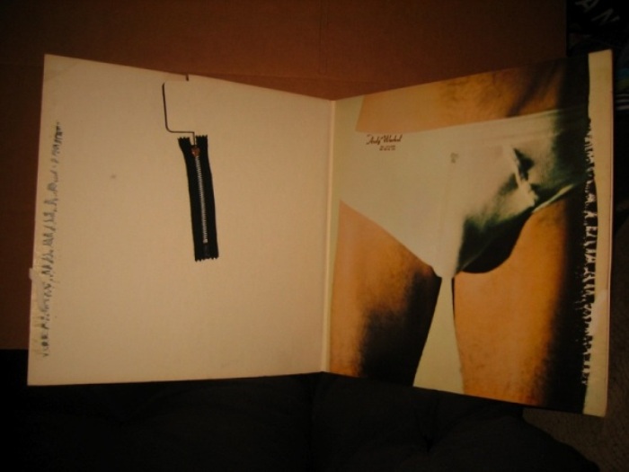
Inside cover (LP format)


Knowing that the design of the album had to reflect this, and finally in control of their own marketing after leaving Decca records, Mick Jagger visited the Royal College of Art in London to find a design student to hire. He attended the degree show of John Pasche, and hired him to create a new logo for the group. The resulting lips and tongue logo, based on Jagger’s large pout, was intended as “a protest symbol and [to] have an anti-authority feel to it really, so that it would work well with them being the bad boys of rock and roll,” Pasche recently told MTV. This being the early days of rock band branding, the iconic logo never appeared on the cover of an album. It did, however, appear on t-shirts, mugs, key chains, buttons, belts and countless other promotional items, including recent urinals at the Rolling Stones Fan Museum in Germany.

The title “Sticky Fingers” was originally a working title for the second Mott the Hoople record. When the band decided on Mad Shadows instead, the Stones took the title, with the blessing of record producer Guy Stephens.

The cover graphic went through a number of possibilities, including having the band dressed in Victorian boating attire. Designer Craig Braun suggested releasing the album in a clear plastic jacket with heat-sensitive liquid crystals inside — “so you could make your own little Joshua Light Show”. Another rejected idea was a mammoth foldout cover of Jagger’s castle in the south of France (where the band had relocated to avoid paying taxes).


Theatrical poster


Then Jagger recalled that Andy Warhol had remarked to him at a party in 1969 that he thought it would be amusing to have an album cover feature a real zipper. There are differing accounts regarding the initial idea. Some credit songwriter Bob Goldstein, claiming that he proposed the idea for the cover of the soundtrack to Warhol’s 1968 film Lonesome Cowboys. Goldstein wrote the title track, which is sometimes credited as being the very first ‘disco’ arrangement, and an entire LP was conceived, but never completed. Singer and Factory Superstar Ultra Violet has suggested that the idea was Warhol’s and was intended for the film’s promotional poster.


The Velvet Underground and Nico. Front cover


The Stones agreed that the image of a pair of jeans and zipper would allow the band to retain their ‘outrageous’ aura, but shift things away from the violent and “satanic” imagery, or what Braun called “the evil thing”.

Warhol is credited with cover concept and photography, though some suggest Billy Name might’ve been behind the camera. Many assumed the cover model was Jagger, which he later denied:

Rolling Stone Magazine: There’s underwear on the back. Is that you?
Mick Jagger: No. It’s one of Andy’s… protégés is the polite word we used to use, I think.


Andy Warhol, Man’s Lower Torso, Clothed, 1971


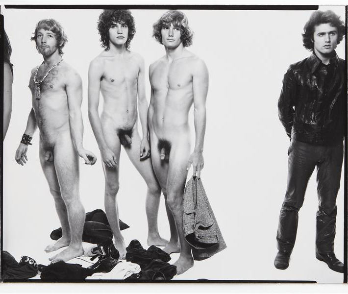
Among the possible candidates, Jed Johnson, Warhol’s lover at the time, denied it was his likeness, although his twin brother Jay was considered a possibility. But according to Warholstars site user, Stylissmo:

“Jay Johnson famously has only one testicle, Jed wasn’t built like that… Corey Tippin was well known for his endowment… and was also known – along with his friend, the illustrator Antonio Lopez, for ‘showing basket’ – a real 70’s kind of gay display that involved bulging crotches in tight jeans. Attendees at the Sticky Fingers release party mention that of the aforementioned possible models for the cover – only Corey Tippin was at the party. At any rate all this has been told to me in various pieces by Jay Johnson, Corey Tippin, Jane Forth, Paul Caranicas (director of Antonio’s estate) and other characters who are still friends and living in and around New York.” Also known as Corey Grant, Tippin was the make-up artist for Andy Warhol’s L’Amour (1973) and Jay Johnson’s best friend.


Warhol with Jay and Jed Johnson


Warhol and Corey Tippin


Factory Superstar Ultra Violet believes that dancer Eric Emerson “who used to walk around the Factory half-naked” is the cover model.


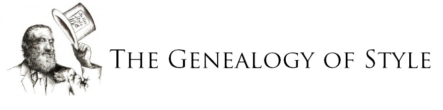
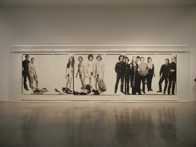
Andy Warhol and members of The Factory, Richard Avedon, New York, October 30, 1969. From left to right: Eric Emerson, actor; Jay Johnson, actor; Tom Hempertz, actor; Gerard Malanga, poet


Art writer and early editor of Warhol’s Interview magazine, Glenn O’Brien’s has also been named as possible model. He recalls:

“I remember Andy shooting me in my underwear at the Interview office for the Sticky Fingers cover. He paid me a hundred bucks. Fred Hughes kept saying, “Can’t you make it any bigger.”” In an introduction to an interview O’Brien conducted with Joe Dallesandro for the magazine a few years ago he wrote:


“I always felt a connection to Joe. We were two Warhol scenesters who liked girls. Also, he filled the jeans on the outside of The Rolling Stones’ Sticky Fingers album, while I filled the briefs inside—our secret connection.”


Without a definitive account of who the front cover model was, Joe Dallesandro seems the most likely. Dallesandro met Andy Warhol and director Paul Morrissey in 1967 while they were shooting Four Stars, and they cast him in the film on the spot. Dallesandro also appeared in Flesh (1968), Lonesome Cowboys (1968), Trash (1970), Heat (1972), Andy Warhol’s Frankenstein and Andy Warhol’s Dracula (both 1974) also directed by Morrissey. Flesh achieved some mainstream crossover success and Dallesandro became one of the most popular of the Warhol stars.

He explained to biographer Michael Ferguson, “It was just out of a collection of junk photos that Andy pulled from. He didn’t pull t out for the design or anything, it was just the first one he got that he felt was the right shape to fit what he wanted to use for the fly.”


Joe Dallesandro photographed by Warhol


The inner underwear photograph was a matter of necessity; designer Craig Braun realized there had to be an extra layer of cardboard to protect the record from the scratching of the zipper. Regardless of this, during shipment the zipper ended up pressing into the album stacked on top of it, invariably damaging the song Sister Morphine. Atlantic Records, whose subsidiary Atco Records were distributing the disk in the US, threatened to sue Braun for all the damage. After getting “very depressed and very high,” he came up with the solution to pull the zipper down before the record was shipped. This way it would only damage the inner label, and not cause any song to skip.


Inside cover


The solution saved Sister Morphine, but not in Spain, where Francisco Franco’s government deemed the song offensive and insisted it be removed from the disk. A Chuck Berry song Let it Rock, originally a b-side from the Brown Sugar single, replaced it. The drug references in the song were not the only concern for the Spanish censors, they also found the cover “too sexually explicit” so it was replaced with the “can of fingers” graphic, severed body parts being more socially acceptable than a man in pants. Many American department stores also found the cover inappropriate and initially refused to stock the disk.


Alternate cover (Spanish version)


For others, the problem with the packaging was not enough package: Wolfgang Fritz Haug, a now-retired professor of philosophy, took issue with the lack of payoff. In his book 1986 book Commodity Aesthetics (Chapter 3: “THE PENIS ENTERS THE COMMODITY ARENA”) he writes:


“whoever buys the record, purchases with it a copy of a young man’s fly, the package identified by the graphic trick which stresses the penis and stylizes the promised content. It is a reversal of the tale of the Emperor’s new clothes: the tale of the buyer’s new bodies. They buy only packages which seem more than they are…..the buyer acquires the possibility of opening the package, and the zip and finds… nothing.”


These criticisms notwithstanding, the graphic is now considered one of the best album covers of all time. A Rolling Stone Magazine readers poll in 2011 voted it the 6th best album cover of all time. Warhol appeared twice in the top ten, the other being the tenth pic for his Velvet Underground and Nico cover. The recording itself made the #63 slot of another Rolling Stones Greatest Albums of All Time list and in 2003 the design was named by VH-1 as the best album cover of all time.

Jagger called the cover “the most original, sexy and amusing package that I have ever been involved with”

Andy Warhol was paid 15 000 pounds remuneration, which (using a crude conversion of currency and inflation) would amount to approximately $126,000 CDN today. The figure seems on the high side for album cover design, but he was apparently dissatisfied. Warhol biographer David Bourdon writes “In April the album sold a half-million copies, and Warhol liked to think that his cover contributed greatly to the success. ‘You know’, he later complained, ‘that became a number one album and I only got a little money for that’.” With the Stones being one of the biggest bands in the world at the time, and the record including the hit songs Wild Horses and Brown Sugar, it is doubtful that Warhol’s cover disproportionately contributed to the financial success of the record. His equally acclaimed peelable banana cover for The Velvet Underground and Nico did not propel that record to any financial success – it spent only a few weeks on the Billboard charts, peaking at #171. It’s influence would not be felt for years to come, leading Brian Eno to quip “The Velvet Underground‘s first album only sold a few thousand copies, but everyone who bought one formed a band.” Warhol also complained about not receiving compensation for his production and cover graphic for that disk (“I never got a penny for that first Velvet’s album”).

The promotional photograph may have inadvertently invented what would later become the Sleeveface internet meme, with fans posing with album covers obscuring parts of their body.


A Wonderfully Relaxed Brief


Dear Andy,

I’m really pleased you can do the art-work for our new hits album. Here are 2 boxes of material which you can use, and the record.

In my short sweet experience, the more complicated the format of the album, e.g. more complex than just pages or fold-out, the more fucked-up the reproduction and agonising the delays. But, having said that, I leave it in your capable hands to do what ever you want………..and please write back saying how much money you would like.

Doubtless a Mr. Al Steckler will contact you in New York, with any further information. He will probably look nervous and say “Hurry up” but take little notice.

Love,
Mick


One is still the singer and creative powerhouse behind one of the most successful band on the globe; the other was the world’s greatest pop artist. Neither could be expected to receive unbidden instruction and so in his letter, dated 21 April 1969, Mick Jagger leaves the question of the band’s cover design in Andy Warhol‘s “capable hands.”

The conversational tone, trust in a fellow artist’s talents, and blasé attitude towards fees all mark Jagger out as a canny operator. In truth, some modesty was justified; Warhol had worked on numerous cover images for the likes of Blue Note Records while employed as a commercial artist, before going onto produce his more famous Peel Slowly and See cover image for The Velvet Underground‘s 1967 début.

What is perhaps more intriguing is that Warhol did not go onto design the band’s “new hits” album, as Mick suggests; the cover image for that LP, Through the Past, Darkly, released in September 1969, was a simple group shot, taken by Californian photographer Ethan Russell.

However, Warhol, did maintain his relationship with the band, and went onto design the image for their following studio album, 1971’s Sticky Fingers. This cover, of a well-endowed man’s crotch in tight jeans, featured a working zip and belt buckle in early pressings, and is now regarded as one of modern music’s more striking pieces of graphic art.

Approaching to Mick Jagger

“Mick Jagger really put Montauk on the map. All the motels were overflowing with groupies. Two girls with no hair and black cats on leashes followed them all the way to Montauk. Mr. Winters – the caretaker of the estate – found them hiding in the bushes!”
Andy Warhol


Mick Jagger, Andy Warhol and Fred Hughes. Photo session documented by Annie Leibovitz, Mountauk, 1975