Hand-painted dress and platforms by special order, Dior Haute Couture
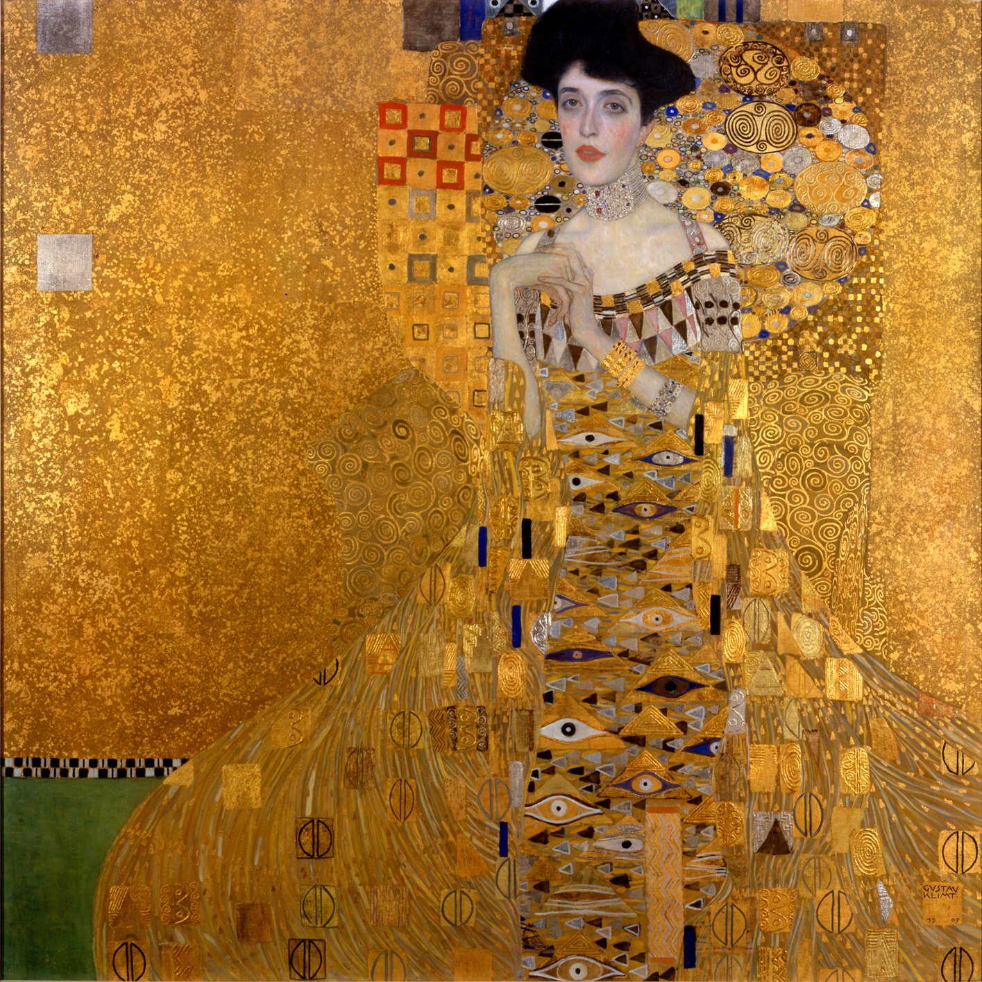
 Portrait of Adele Bloch-Bauer I, Gustav Klimt, 1907
The first of two portraits Gustav Klimt painted of Bloch-Bauer, it has been referred to as the final and most fully representative work of his golden phase. Klimt took three years to complete the painting; preliminary drawings for it date from 1903/4. It is made of oil and gold on canvas, showing elaborate and complex ornamentation as seen in the Jugendstil style. Klimt was a member of the Vienna Secession, a group of artists that broke away from the traditional way of painting. The picture was painted in Vienna and commissioned by Adele’s husband Ferdinand Bloch-Bauer. As a wealthy industrialist who had made his fortune in the sugar industry, he sponsored the arts and favored and supported Gustav Klimt. Adele Bloch-Bauer became the only model who was painted twice by Klimt when he completed a second picture of her, Adele Bloch-Bauer II, in 1912.

Sweater and skirt, Calvin Klein
 Woman with a Fan (Madame Lunia Czechowska), Amedeo Modigliani, 1919
Amedeo Modigliani painted this–one of ten portraits he did of this sitter–one year before his death and three years after he’d met the lovely Lunia Czechowska (1895-after 1970). The Polish woman and her husband, Casimir, were old friends of Modigliani’s patron/dealer Leopold Zborowski. Despite the facts that Lunia was very much married in 1916 and “Modi” would shortly become involved with Jeanne Hébuterne, or that the two women became so friendly that one took care of the other’s out-of-wedlock daughter, only his death caused the artist to cease attempting to seduce Lunia.
Here he shows his firm friend posed gracefully, her seated body in its yellow dress forming lithe curves against the scarlet background. Later in life, Czechowska vividly recalled sitting for Modi as he drank cheap brandy, sang, lapsed into Italian and, eventually, fell so far into the act of painting that he became oblivious to the presence of another human being. And then, there she was on canvas, left with ” … the impression of having the soul laid bare and of being in the strange position of being able to do nothing to disguise her feelings.” In hindsight, it all sounds rather more seductive than a physical seduction.

Corset, Bottega Veneta
 The Cripple, John Currin, 1997
Norman Bryson opens the brilliant, anxious essay he wrote for the lavish book on John Currin with an admission: ‘When I first saw Currin’s The Cripple, what I sensed was not only the cruelty that lay within the construction of the image, but a nasty stickiness in that cruelty, a way it had of making you connive in its own malevolence.’ He goes on to explain that the ‘figure’s misshapen and twisted body evidently originates with the painter, whose attitude towards the deformation he inflicts seems to include enjoyment.’

Silk-organza petal dress with jewel brooch, by special order, Armani Privé

Ballerinas, Edgar Degas, 1884
In this pastel, Edgar Degas revisited a theme he had already tackled in his work in the 1870s – ballerinas resting. He also went back to his regular studies on the effects of contre-jour, lighting which “reduces to silhouette”, suppressing details, erasing the distinctive features of a face or a body, making them anonymous.
But while still employing the old formulae, Dancers was innovative in its size and composition, and without doubt, is the best example of what has been called Degas’ “classical period”. Around 1884, the painter, in fact, simplified his compositions, reduced the depth of his pictorial space, lowered the viewpoint to make it more natural and concentrated on one, single character or group of figures. At the same time, he abandoned the often caricatural approach of his previous works. In doing this, he was responding to a desire expressed by critics and the public: to protest “against the confused mass of colours and the jumble of indecipherable lines that are destroying contemporary painting”. From this point of view, Dancers is effectively a manifesto.
 Sheer dress, slip-dress, hat, mask and belt, Louis Vuitton
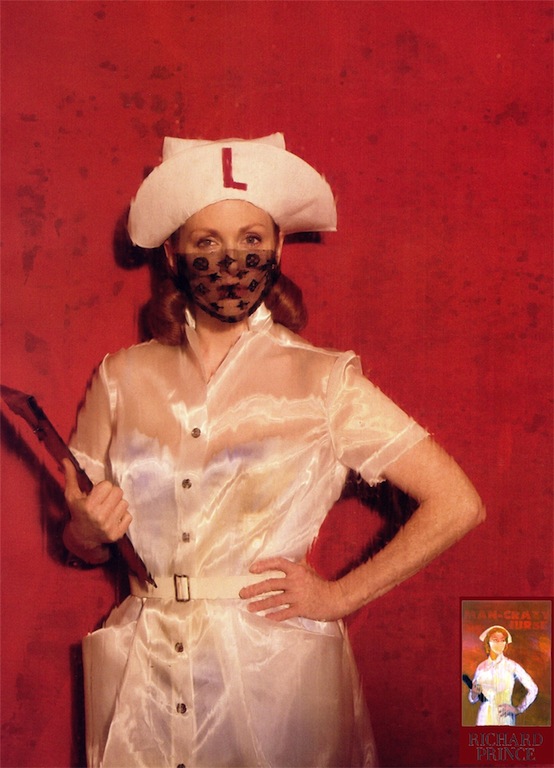
 Man-Crazy Nurse, № 2, Richard Prince, 2003
Man-Crazy Nurse #2 plays the role of the ultimate femme fatale in Richard Prince‘s celebrated series of nurse paintings. Her full-blooded lust barely concealed by her primly buttoned and starched white uniform, she clutches a standard-issue hospital clipboard as if checking off the names of the men she has devoured. Casting a side-long glance, this libidinous nurse seems to have her next patient/victim in sight. Prince’s lushly expressive brushwork, which floods the canvas in shades of fleshy pink and blood red, serves as both a come-on and a warning.
Prince painted Man-Crazy Nurse #2 in 2002, the year he started working on his nurse series, and it was included in his first exhibition of these works at Barbara Gladstone Gallery the following year. In this body of work, Prince appropriated the covers of pulp romance novels from his collection of vintage books and transferred them onto canvas using an ink-jet printer, which he then layered with vigorous skeins of color. He veils his nurses with surgical masks that both add an element of mysterious allure, and turn them into potentially menacing masked bandits. In some cases he retains the original title, while in others he substitutes another novel’s title, and heightens ambiguity by blocking out the elements that provide any narrative mooring for his protagonists. The original covers often included handsome doctors or patients, or scenes of lovers caught in rapt embraces, which Prince subsums into a hazy fog of luridly colored paint.
A voracious bibliophile — an obsession which he has documented in various artist’s books such as American English (2003) — Prince has for years amassed an extensive collection of secondhand books and memorabilia, ranging from titles on film noir and trash literature to letters, manuscripts, publicity pictures, and first editions of favorites such as Lolita.
Photographs by Peter Lindbergh, Harper’s Bazaar, May 2008

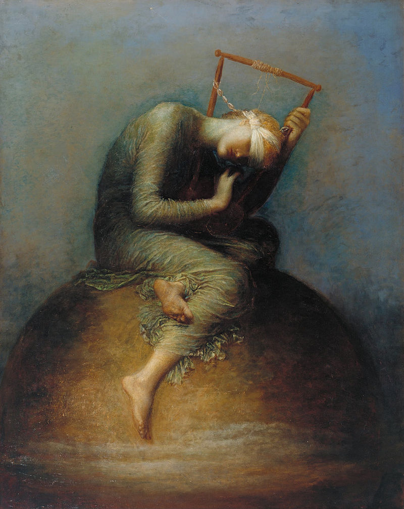 Hope, George Frederic Watts, 1886
 A Sea Spell (1877)
 Dreamers (1882)
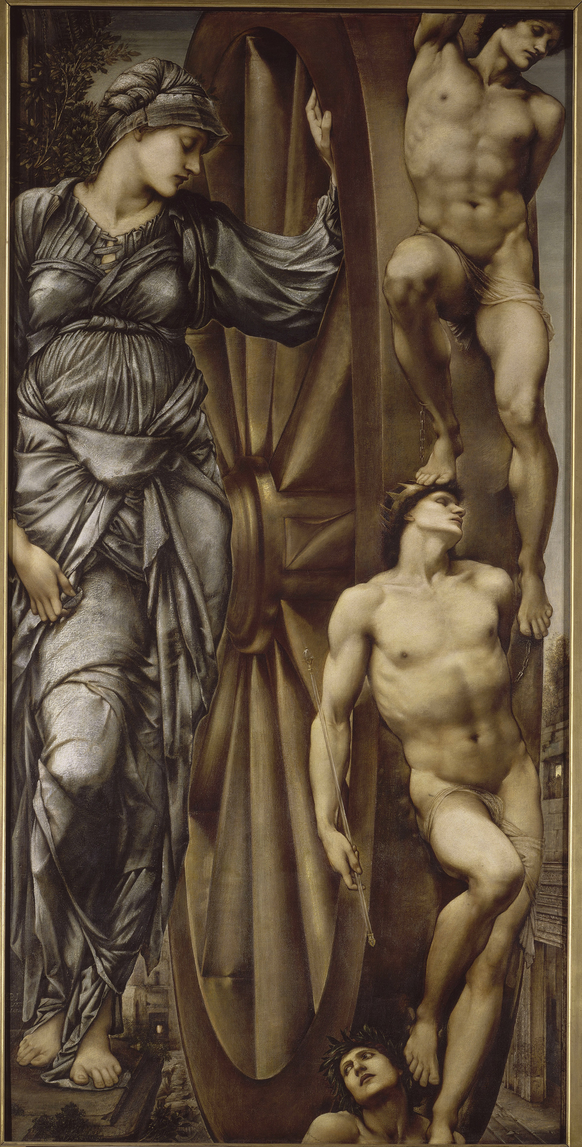 The Wheel of Fortune (1871)