Treatise on The Veil of Orpheus

“Before, I used to smoke and look, because smoking is very conducive to stimulating the mind. Finally I had to stop because it was overstimulating my lungs. I sort of work off and on and I usually paint eight hours and never eat. And I might have some wine to stimulate a free passage of thought. And I used to have always music playing.”

Cy Twombly


Cy Twombly photographed by Robert Rauschenberg, circa 1953


Treatise on the Veil (First Version), Cy Twombly, 1968.


Treatise on the Veil was inspired by Pierre Henry’s 1953 avant-garde musical composition, (Le voile d’Orphée I) The Veil of Orpheus, which records the tearing of a piece of cloth. In his translation of aural to visual phenomena, Twombly reduces his subject matter to its simplest parts, distilling and crystallizing its formal components so as to strengthen its visceral effects.

The first version of Treatise on the Veil is all the more revealing in this light. More succinct and deliberate in his line, Twombly heightens the contrast between form and background. The rectangles spring from the inky sea beneath them, emphasizing the artist’s mille-feuille technique.


Pierre Henry using induction coils to control sound spatially.


Veil of Orpheus, Cy Twombly, 1968


Orpheus, Cy Twombly, 1979


Orpheus, Cy Twombly, 1979


To listen to Pierre Henry’s composition, please take a gander at The Genealogy of Style‘s Facebook page: https://www.facebook.com/pages/The-Genealogy-of-Style/597542157001228

By Personal Choice

“The portraits he (Robert Mapplethorpe) shot by personal choice are a different take from the commercial portraits he did for cash. Let’s say Robert was good at perfecting people in the way that a good courtier perfects his patron, all the while keeping his cynicism cleverly coded even within the art piece.”

Edward Lucie-Smith


Patti Smith


William S. Burroughs


Keith Haring


Andy Warhol


Willem de Kooning


Robert Rauschenberg


Carolina Herrera

Embracing Sunflowers


Joan Mitchell was born in Chicago in 1925 and died in Paris in 1992 at the age of 67. She came to attention in the early 1950s, exhibiting at the Stable Gallery in New York alongside Joseph Cornell and Robert Rauschenberg. In the summer of 1955 she travelled to France, settling there permanently in 1959. There have been numerous gallery and museum exhibitions of Mitchell’s work, including two major shows at the Whitney Museum of American Art in 1974 and 2002, which toured across the United States. Her paintings can be seen in museums and important private collections worldwide.


Sunflower III, 1969


Sunflower, 1972


Untitled (Sunflower), 1987


Sunflowers, 1991


Joan Mitchell’s Sunflower works count amongst the most experimental and vibrant of all her pieces. Hung in the upstairs gallery, six canvases, etchings and drawings dating from the 1960s to the year before her death, host an extraordinary diversity of marks with compositions whose ungovernable vitality refuse to comply to the rules of image making. Mitchell considered sunflowers to be ‘like people’ — subjects to empathise with whose life cycles were played out with exuberance but brutal swiftness. ‘If I see a sunflower drooping, I can droop with it,’ she explained, ‘and I draw it, and feel it until its death.’ Like Vincent van Gogh whose precedent she was brave enough to summon, she embraced sunflowers for their hopefulness as much as for their assertive and undeniable splendour. Her images do not much resemble the plants themselves: they are blue and red as well as golden, erratically dancing sweeps of colour that communicate internal as much as external landscape.

Mitchell began the Sunflower works after relocating from Paris to Vétheuil, a town 60 kilometers north of the capital. They grew out of a particularly difficult time in the artist’s life, following her mother’s death in 1967 after a seven year struggle with cancer. The paintings from this earlier period are dark and foreboding, roiling tempests of paint. In Calvi (1964) named after a Corsican fishing port Mitchell visited on a sailing trip, a central area of densely worked impasto sits on top of a haze of translucent layers of pigment which conjures a landscape distance. The impression of solid weight achieved through the tactile physicality at the heart of this canvas recalls Paul Cézanne, yet rather than suggest the volume of actual objects, Mitchell’s build-up of paint makes emotion palpable.

Untitled, 1968-1969, and the drawing Untitled (1967) convey a different, brighter mood, whilst etchings the artist made in the early ’70s establish a whiplash fluency of line. As the critic and poet John Yau has noted, the works of this period grant the viewer ‘an intimate encounter with a sumptuous but harsh lyricism that constantly courts but never succumbs to chaos.’ In these pieces, Mitchell’s marks possess a fresh looseness, their brio asserted in opposing colours and unexpected positionings. Nature is conjured at its most unruly and oppositional: frenzy co-exists with calm, flux results in disruptiveness.

In Untitled (1969) Mitchell pursues this diversity of painted gesture and unevenness of composition to magnificent extreme. Thick areas of red and yellow paint reveal a frenzy of working whilst elsewhere the canvas is marked only by faint washes of green. Drips slide down the picture and snarls of paint grow glistening and creamy where they collide with white. According to the writer Dave Hickey, Mitchell’s ‘manner is at once too varied and specified to ever be “a style”. She could make any mark but she never fell in love with one, just the speed of it.’ Her works make lasting passion, movement and energy, describing not the appearance of the world nor transcendent revelation, but the nature of being in it, its transient, intense pleasures and pains.

In the final years of her life Mitchell returned to the subject of sunflowers with renewed focus. These often multi-part canvases are assured, employing a carefully edited palette and calligraphic energy conveyed through lavish brush marks. In these, a potential self-containment of individual rosettes is countered by the sideways spreading from one into several canvases allowing for a range of inter-related expressions that are vast and open-ended. ‘I want them to hold one image despite all the activity,’ Mitchell has said of her works. ‘It’s kind of a plumb line that dancers have; they have to be perfectly balanced the more frenetic the activity is.’

Portraits of Marilyn Monroe

Marilyn, Andy Warhol, 1962


Portrait of Marilyn Monroe, Roy Lichtenstein, date unknown


Marilyn Monroe, James Rosenquist, 1962


Marilyn Monroe (Décollage), Mimmo Rotella 1962


Marilyn Monroe (Décollage),Wolf Vostell, 1962


My Marilyn, Richard Hamilton, 1965


Test Stone #1, Robert Rauschenberg, 1967


Marilyn was here, Richard Lindner, 1970


Peek-a-boo Marilyn, Mel Ramos, 2002

Raggedy Andy and the Cockroach

“Andy Warhol was reasonably well-known by the time he came to see me, although he was still being called Raggedy Andy, not because his work was sloppy, but because of his appearance. He’d had success with book-jacket designs for such publishers as New Directions and with his drawings and paintings for I. Miller shoe ads – and I knew I. Miller – but stories about his mishaps were making the rounds. When he’d zipped open his portfolio to show his work to the art director at Harper’s Bazaar, a cockroach had crawled out. Poor boy, that Raggedy Andy. But Harper’s had given him assignments. He won awards for his work, for his ‘commercial’ art, and he never pretended a difference between what he did to survive and what he called his art. To his credit, I think it was all the same to him. He was a very busy young man. I used Warhol’s art in several of my perfume windows at Bonwit’s. In July 1955, just before my work began at Tiffany’s, I made some wooden fences, and he covered them with graffiti for a series of windows. They were fun, full of a childish playfulness.”

Gene Moore


Photo by Leila Davies Singelis, 1950


In the summer of 1955 Andy Warhol‘s career as a commercial artist took a new turn when Gene Moore hired him to provide artwork for the windows of the Bonwit Teller department store. Moore had arrived in New York in 1935, hoping to become a fine artist, and had ended up a window dresser. One of the jobs Moore took to support himself in New York was making paper mache flowers for the Bob Smith Display Company. When one of Smith’s customers, Jim Buckley, was made the display director of I. Miller Shoes in approximately 1937, he hired Moore to be his assistant. By the following year, Moore was also doing window dressing for Bergdorf Goodman’s and Delman’s department stores. In 1945 he was appointed the display director for Bonwit Teller. Moore often modeled his mannequins on Hollywood stars like Vivien Leigh and Audrey Hepburn, and was responsible for introducing the belly button on mannequins.

The cockroach story became part of Warhol’s legend. It was repeated in The Philosophy of Andy Warhol (From A to B and Back Again). However, according to the painter Philip Pearlstein, the incident had actually happened to him, not to Warhol.

Warhol wasn’t the only artist working for Moore. He was also using Robert Rauschenberg and Jasper Johns, who were window dressing under the combined pseudonym, Matson Jones. According to Moore, James Rosenquist, Andy Warhol, Robert Rauschenberg and Jasper Johns all worked with him during the same period. Rauschenberg and Johns continued to do windows for him when, in July 1956, Moore also started doing windows for Tiffany’s in addition to his continued involvement with Bonwit Teller.

Pretentiousness Stripped Away

Self-Portrait


Timothy Greenfield-Sanders, born in Florida on 1952,  is an American documentary filmmaker and portrait photographer, son of Miami musician and teacher Dr. Ruth W. Greenfield. The majority of his work is shot in large format.

Simple yet revealing, his portraits are direct and get right to the heart of the subject. Timothy Greenfield-Sanders prefers to strip away pretentiousness when portraying political figures, entertainers, artists, musicians and other intriguing personalities. His backdrops never distract from the subject, and he often uses a single light source to mimic natural light. His work has elevated him to one of the most acclaimed portrait photographers of our time.

He started out with an interest in filmmaking, and majored in art history at New York’s Columbia University. He later moved to Los Angeles, to study at the American Film Institute. Renowned actors and directors, such as Ingmar Bergman, Orson Welles, and Alfred Hitchcock (“the masters of the cinema”) often made appearances at the school to talk about their work. To document these occasions, AFI sought a volunteer to shoot these visiting celebrities’ portraits. On a whim, Greenfield-Sanders took the challenge and became the school’s photographer.

With these luminaries available to him, Greenfield-Sanders snapped away, and learned much in the process. “Because of AFI, I got tips from celebrities as well as access to them,” he says. Hitchcock once remarked, “Young man, your lights are all wrong,” while Bette Davis criticized him harshly for “shooting from below.” (“She had some great swear words,” he laughs.)

His father-in-law is Joop Sanders, a founder of the abstract expressionist movement in New York, who introduced Greenfield-Sanders to a number of artists. Thus, painters like Willem de Kooning, Larry Rivers and Robert Rauschenberg posed for his camera. Over a 20-year span, he photographed hundreds of artists, dealers, collectors and critics. In 1999, 700 of these images were displayed at the Mary Boone Gallery in New York, and he published an accompanying book, entitled Art World. In the beginning, Greenfield-Sanders’ editorial photos that he shot for clients like Barron’s and SoHo News helped to pay for this project.

Timothy Greenfield-Sanders’ portraits are in the collections of The Museum of Modern Art, The New York Public Library, The Whitney Museum and The National Portrait Gallery among others. In 2004, seven hundred of his art world portraits were accepted into the permanent collections of The Museum of Modern Art and the Museum of Fine Arts, Houston.

A number of books on Greenfield-Sanders’ work have been published: Art World (Fotofolio), Timothy Greenfield-Sanders his first monograph, (Alberico Cetti Serbelloni Editori), XXX: 30 Porn-Star Portraits (Bulfinch Press) “Face to Face” (Skira), Look: Portraits Backstage at Olympus Fashion Week (Powerhouse) The Black List (Atria of Simon and Schuster) The Latino List (Luxury) and The Black List 50 (Luxury).

Greenfield-Sanders produced and directed nine films. His first, Lou Reed: Rock and Roll Heart, was a feature documentary about the legendary rock musician. The film aired in April 1998 on the PBS Series American Masters and premiered in the United States at Sundance Film Festival and in Europe at The Berlin Film Festival. It screened at over 50 film festivals worldwide. Lou Reed: Rock and Roll Heart won a 1999 Grammy Award for best music documentary.

In addition to this once-in-a-lifetime experience, he took the opportunity to build an impressive portfolio of many of the biggest names in Hollywood. His access to these stars bolstered his reputation as a celebrity shooter and he soon got work taking portraits for Interview and People magazines. “I began loving portrait photography more than making films,” he comments. He is also a contributing photographer at Vanity Fair magazine.

Thinking XXX, a film about the making of the XXX book, first aired in October 2004 on HBO. A soundtrack CD was released in November 2004 by Ryko Records. In addition, in October 2004, the XXX portraits were exhibited in New York at the Mary Boone Gallery and subsequently at numerous galleries worldwide including John Berggruen Gallery in San Francisco, Bernd Kluser Gallery in Munich, Berman/Turner Projects in Los Angeles, Paolo Curti Gallery in Milan and Howard Russeck Gallery in Palm Beach.

In 2006, Greenfield-Sanders photographed injured soldiers and marines for HBO’s film, Alive Day Memories. The images were widely published, shown in numerous exhibitions and purchased by The Library of Congress.

Between 2008-2010, Greenfield-Sanders produced and directed The Black List Project: a series of 3 documentaries for HBO, a traveling museum exhibition of portraits organized by the Museum of Fine Arts, Houston, a book with Simon and Schuster’s Atria and DVDs with Target. In addition, the project included an educational initiative in conjunction with The United Negro College Fund.


Alfred Hitchcock


Orson Welles


John Waters


Ethan Hawke


Toni Morrison


Robert De Niro Sr.


Elaine De Kooning


Louise Bourgeois


David Wojnarowicz


Francesco Clemente


Keith Haring


Dennis Hopper


Slash


Lou Reed


Mark Strand


Norman Mailer


William S. Burroughs


David Bowie

The Painted World

In the artist’s studio in Gaeta, a coastal town on the Mediterranean, works related to his Four Seasons series include details of Primavera (left) and Estate (right). The canvases, shown when still in progress in 1994, are nailed


Cy Twombly enjoying local fare at a restaurant in Rome


Another Twombly painting is propped against a wall in the house, where white tiles cover most of the floors


In the bright open Gaeta house, a second version of Inverno from Twombly’s Four Seasons series hangs against a wall for inspection. Books of poetry, postcards, acrylics and oils, crayons and pencils fill a table


Twombly in the terraced garden outside the Gaeta house


A still life in one of the house’s many rooms


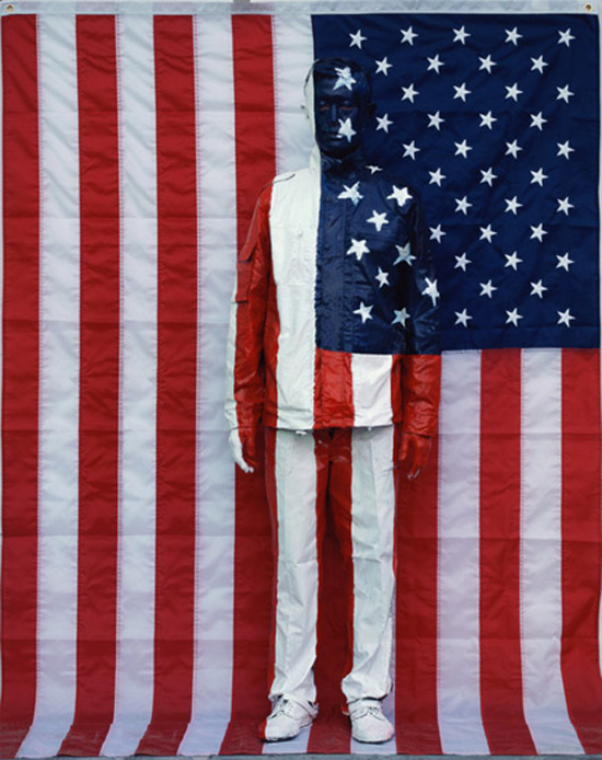
Found frames and French and American flags are propped against the walls in a hallway. Furniture is covered casually in a room behind


A Twombly sculpture and an antique stool and frame in another room in the apartment


The artist in his vast, spare apartment on the via Monserrato in Rome, which house his collection of classical pieces


Photos by Bruce Weber

Text by Dodie Kazanjian

Vogue, 1994


The taxi doesn’t quite make it up the steep hill to Cy Twombly’s house in Gaeta. At the third hairpin turn we get out and walk the remaining 20 yards to a gray steel door embedded in a rough stone wall. Twombly has a little trouble opening it. Tall, lanky, dressed in rumpled white linen pants held up by blue suspenders, he looks more like a provincial winegrower than a famous artist. The door grates on its hinges, and we’re inside a paradise of thick white walls, terraces, ceramic tile floors, and cool interconnecting rooms bare of furniture except for a few striking pieces—bleached Louis XV chairs, a long table piled high with books, blue-and-white fabrics, ornate empty picture frames, Twombly paintings leaning against the walls, and one or two of his little-known, gawky, white-painted sculptures. Twombly throws back the shutters in each room, flooding the house with light and opening up dazzling vistas of the seaside town and the blue Mediterranean.
On the train down from Rome this morning Twombly started telling me and my husband, an old friend of his, about the town as soon as it came into view around the shoulder of a mountain. “Hadrian had a villa here,” he said. “Cicero is buried here, and so is the Roman general who founded Lyon. Catullus had friends here. It was kind of a summer art colony, like East Hampton, but not anymore—that was 2,000 years ago. Gaeta was the name of Aeneas’s wet nurse. She was with him on his return from Troy, and she died here, so he named the place after her. I believe that. Nobody could make that up.” Twombly is full of history, which he relays in the accents of his Virginia childhood. Even his Italian comes out that way—when he says si, si, which he does a lot, it has a southern drawl to it.

Gaeta, 60 miles north of Naples, is where Twombly has done most of his painting in the last few years. Tacked to the wall in the high-ceilinged room he uses as his studio is a large vertical canvas, more than ten feet tall. Titled Summer, it is the last of a series on the four seasons, which will be shown at the Twombly retrospective that opens at the Museum of Modern Art in New York this month and then travels to Houston, Los Angeles, and Berlin. Autumn, Winter, and Spring (in that order) were finished months ago and have already been shipped to the museum. But “I’m having a real bad time with Summer,” he had told me several times when I spoke with him by telephone from New York. The painting is still unfinished, and Twombly is not happy about letting us see it. When we start asking questions about the Four Seasons, he bristles. “It’s not Four Seasons,” he says. “That sounds like the Four Seasons Hotel. I think of them as Quattro Stagioni. Summer isn’t finished yet, as I told you, and that’s all I’m going to say about that. It’s absurd to talk about paintings that you haven’t finished.”
Cy Twombly is the great outsider of contemporary art. In 1957, at the precise moment when the main energy of the art world seemed to have taken up permanent residence in New York, Twombly moved to Rome. Two years later, he married Tatiana Franchetti, a talented portrait painter from a wealthy and aristocratic Italian family, and he has lived in Italy, more or less, ever since. While his fellow southerners Robert Rauschenberg and Jasper Johns were using popular imagery and mundane objects to blaze the trails that would lead to Pop and Minimal art, Twombly chose a different direction entirely. His would lead back through European art and literature to the ancient world of classical mythology, of gods and heroes and the great poetic traditions of the Mediterranean, which in his paintings merges indistinguishably with the modern urban street culture of graffiti, sexual imagery, and raw sensation. His work seems to exist in another time zone.

But Twombly’s work has never been easy to like. The scribbles, smears, blots, and seemingly random markings of his intensely personal style have often evoked the kind of philistine response that says, “My kid could do better than that.” Artists love his work, but will the public come to see it at MoMA? Twombly is definitely “an acquired taste, even within the art world,” says curator Mark Rosenthal, who tried to do a Twombly retrospective a few years ago while at the Philadelphia Museum of Art—Twombly initially agreed but changed his mind in midstream. The National Endowment for the Arts refused to give a grant to the current show, and the Modern was unable to line up a major corporate sponsor.
Twombly is famously difficult and famously elusive, and this has not made his work any easier to see. Ever since the disastrous 1964 show of his Commodus paintings at the Castelli Gallery in New York—their fervid painterliness seemed out of step with the hard-edged commercial imagery of Pop Art, then in ascendance, and nothing was sold—he has shown infrequently in this country. “Cy just evaporated,” according to Leo Castelli. Twombly has avoided exclusive commitments with any dealer, preferring to control the distribution of his rare new paintings through one or two close associates, and much of his major work is in European, not American, collections.
Twombly goes off to another part of the house, leaving us alone with the painting. In addition to Summer, there are three other unstretched canvases nailed to the walls of his studio, part of a second series on the same Quattro Stagioni theme. Twombly often paints a subject more than once: There are four versions of Leda and the Swan, two of the School of Athens, two of Birth of Venus.) His worktables are covered with oil crayons; pencils; tubes of pigment; postcard reproductions of boats and marine scenes; a big Manet art book open to a page that shows a boat painting; stacks of other art books (Ensor, Whistler, Turner); and a book of modern Greek poems in translation, turned to George Seferis’s Three Secret Poems. Several lines of one stanza have been altered by Twombly, with some words inked out. A section of the edited and spliced poem (with a few new words added by Twombly) is written on the canvas of Summer, in Twombly’s inimitable, childish scrawl:

“the shard of white . . .
trembling with white light
with white flat sea
distant in memory
between the deluge of life
our dearest, our white youth
our white, our snow white youth
that is infinity . . .”

Twombly’s paintings often seem to be as much written as painted. His spindly, meandering letters and words can evoke memory and emotion with the power of Chinese calligraphy, but their effect is never literary—the words work within the visual field of a master painter. And Twombly has never painted better than in his Four Seasons series. The paint is luscious, active, full of violent movement. The image of a spectral boat with oars, which recurs throughout the series, is gray in Summer, but hot yellows and reds predominate—sun colors, on a mostly white or unpainted ground. The cut-up lines of poetry appear and disappear, run down one side of the canvas, sometimes partially smudged or painted over. It’s vintage Twombly, aggressive, hesitant, tough, nervous, scatological, poetic, complex, playful, ancient, up-to-the-minute, intensely personal, and grand—a bundle of contradictory impulses that miraculously work together.

Comparisons are inevitable between Twombly’s Four Seasons and Jasper Johns’s four paintings on the same theme, which were done between 1985 and 1986. Twombly had been thinking about the seasons theme for a long time. He played with it in earlier works, such as the 1961 Empire of Flora and the four-panel 1977 Bacchanalia, and in recent years, as the main emphasis in his work has shifted from history and myth to nature, he became drawn to what is, after all, one of the great themes of European art. “All of Jasper’s seasons look like winter,” Twombly says with a sly chuckle. “Mine all look like summer.”

That may have been the way they started, but it’s not true any longer. Autunno is saturated with the deep reds and throbbing purples of the wine harvest; it has the word Silenus, the wine god, written across it, and, near the right edge, the words pure wild sex. This is a long way from the stately black-and-yellow Inverno, and the raspy yellows and reds of Primavera, a raw rite of spring, with jagged boat shapes up and down the middle. The day after he finally finished the last in the series, Twombly told me, “My head is completely burning up. All I’m doing is seeing yellow. I wake up in the morning, and the white walls look yellow. I had a great deal of trouble with Summer. At a certain point I was ready to throw in the brush. But I got crazy in a good way here.” By this time, however, the painting my husband and I had seen no longer existed. Twombly had decided to start over on a fresh canvas. I went to see it the day it arrived in New York. You could still smell the paint. It was simpler than the previous one, and much more liquid, wet and runny, with molten streaks of red and yellow and orange. “High on light” was scrawled on the left side in red, “how the dizziness/slipped away/like a fish in the/sea.”

Two days before the trip to Gaeta, in Twombly’s apartment on the via Monserrato in Rome, we had seen a quartet of paintings on the four seasons by an anonymous seventeenth-century Italian mannerist, part of Twombly’s wide-ranging and eccentric collection. Also two huge dark eighteenth-century landscapes by John Wootton, whom Twombly described as the English artist who introduced the work of Claude Lorrain and Nicolas Poussin to England. “I look at a lot of artists,’ ” he says. “I’m inspired by—I suppose I shouldn’t say ‘inspired,’ but it’s not really influenced. I am inspired. Art comes from art.” Classical busts of Apollo, Venus, Marcus Aurelius, and other worthies stand on pedestals in the rather grandiose, white-walled rooms of the Rome apartment, where the furniture looks as though it never gets much use.

Twombly started buying antiquities on his first visit to Rome, with Robert Rauschenberg, in 1952. “He spent my half of our grant on Roman sculpture,” according to Rauschenberg. “So I had to go off and get a job with Atlas Construction in Casablanca.” Twombly quit buying classical antiquities a few years ago. “New York decorators started putting a classical torso in every room, and it became impossible,” he says. But when we walk with him in Rome, he constantly stops to look at objects in shop windows—a malachite clock, a tiny piano (“It must have been Mozart’s first”), a miniature sarcophagus with a lapis top (“It’s not very good lapis. The best lapis comes from Afghanistan”). His eagle eye for quality deceives some people into thinking of him as a great decorator, but his various domestic interiors, striking as they are, have almost nothing to do with decoration, or with comfort, either. They all have the transient look of spaces that are used primarily for work.

When Twombly and Rauschenberg were together at Black Mountain College, they were exposed to what their fellow student Francine du Plessix Gray describes as a “grab bag” approach to world culture. “We were reading Ezra Pound’s Guide to Kulchur and then Virgil because Pound tells you to read Virgil and Fenollosa on Japanese art and Dostoyevsky’s Notes from the Underground and Leo Frobenius on African rock painting and Pausanias’s Description of Greece. This sort of nativist American grab-bag attitude reminds me very much of the cultural map implied in Cy’s paintings.”
It might also be said to describe the kind of restless life that Twombly has chosen to lead. For years now, he has spent very little time in Rome. He owns a sixteenth-century villa in Bassano, near the gardens of Bomarzo, an hour north of Rome. Many of his paintings and drawings have been done during temporary stays in other places he likes—Sperlonga, Mykonos, the Seychelles, Robert Rauschenberg’s house on Captiva Island in Florida, an Italian friend’s villa in Bolsena. He travels all the time, sometimes with his wife, Tatiana, who nevertheless leads a highly independent life of her own, and whose hobby is collecting old rosebushes—she was on a rose hunt in Turkistan at the time of our visit to Gaeta. (Their 34-year-old son, Alessandro, who is also a painter, collects iris tubers.) “I fall in love with places,” Twombly tells us. He fell in love with Paris a few years back, rented and furnished an apartment there, but never stayed in it; he found he preferred his circular corner room at the Left Bank Hôtel de la Louisiane. “Simone de Beauvoir lived there. Sartre, too, but of course he went home to mama every night, like a good French writer.”

Last year he rediscovered Lexington, Virginia, where he grew up. He recently bought a house in the town and now spends several months a year there. “I’m like an old dog who’s come home to die. I see people I grew up with, but I can’t talk about old times with them. I can’t remember any of that. It’s not a nostalgic trip for me.” His father, a coach and, later, athletic director at Washington and Lee University there, had acquired the nickname Cy (after the legendary pitcher Cy Young) when he pitched for the Chicago White Sox one summer. He passed it on to his only son, who showed no enthusiasm for organized athletics. Cy’s parents came from old-line New England families—as a boy, he used to visit his grandparents in Bar Harbor, Boston, and Palm Beach—and a sense of that old American aristocracy is never far from the surface of his laconic, laid-back personality. “When he moved to Italy, I think he was recovering that aristocracy that he always felt by nature,” says Rauschenberg. “I couldn’t forget that he couldn’t forget it.”

Twombly has always been a loner. Unlike most successful artists these days, he has no studio assistants and wants nobody around when he’s working. This sometimes leads to odd working habits. “One Twombly I really love is called Untitled, 1958,” says cult-film director John Waters. “It’s all on the very bottom of the painting. It looks like the artist climbed up a ladder, but it was hung so high he could only reach the very bottom. He barely managed a scribble, hardly a mark. And then he fell off the ladder and died. I love art that does that, that makes people crazy.” Waters wasn’t just fantasizing, as it turns out. “I just finished a big painting, sixteen meters long and four meters high, that I’ve been working on, off and on, for ten years,” Twombly tells me. “It’s hard for me to get up on a ladder because I’m all alone in the studio. I could fall off and be lying on the floor for days. So most things happen at the bottom of the painting.”

Twombly answers his own phone—when and if he feels like it. Friends used to reach him by letting his number ring twice, hanging up, and dialing again, but that system is no longer operative. He hates being interviewed or photographed, rules out tape recorders or notebooks, and balks at any sort of direct questions about his life or his painting. (He agreed to teach a philosophy seminar at Washington and Lee last spring and chose his own subject: the idea of metamorphosis. But he quit after one session because the students “asked too many questions.”) He’s definitive in his likes and dislikes—good, unpretentious trattorias over four-star showplaces; espresso in a glass (“It tastes much smoother than in porcelain, like tea tastes better from a china than a silver pot”); shirts and underpants from Brooks Brothers; white linen pants from “Banana” (he means Banana Republic); Bass loafers because “they’re the only ones who make the nonshiny kind”; a 1940s white double-breasted whipcord jacket that he found at a thrift shop. He reads for two or three hours every day in his eclectic fashion—history, poetry, travel books, Walter Pater’s essays, Robert Burton’s The Anatomy of Melancholy. He’s never liked the process of printmaking, “because you have to work with all those other people.” He doesn’t want to think of himself as a professional painter (the aristocratic prejudice again), and he works only when he feels like it—sometimes months will go by when he doesn’t paint. He hates to make plans or schedules, moves from place to place on impulse, doesn’t always show up when he’s invited somewhere. “Cy says he’ll be there in half an hour,” Rauschenberg quips, “but he doesn’t say which month.”

Twombly has always been astute about placing his work, and now it is about to become much more visible in the United States, and not just at the Modern. Fifty Days at lliam, his ten-part painting on the theme of the Trojan War, has been on permanent display since 1989, in a space of its own, at the Philadelphia Museum of Art. (Cy is aware that he misspelled Iliam—it should be Ilium. He laughs off the story that he once said, “My painting isn’t getting better, but my spelling is.”) The Menil Collection in Houston is building a special addition that will be, in effect, a one-man Twombly museum, although Twombly, who designed the floor plan in collaboration with architect Renzo Piano, prefers to call it a gallery; the inauguration will be next February, when MoMA’s Twombly show comes to Houston. The Dia Center for the Arts in New York, which has a large collection of Twombly’s work, plans to install most of it in 1996 in a newly created space on West Twenty-second Street. Twombly has been generous with these institutions because they are so obviously dedicated to his work, but there is no doubt who calls the shots and controls the way his work will be seen. Asked whom to go to for a new Twombly painting, he replies, “I have them.”

Twombly is showing us his garden in Gaeta, a terraced landscape on the hill above the house. It’s a series of what he calls stanze segrete, “secret rooms,” each defined by a different tree—pleached lindens, lemon trees, square-and-cone-shaped laurels, orange trees—with hedges of olive and laurel. It’s a green garden with no flowers. “I hate roses,” he says. “Don’t you? It’s all right if you can hide them in a cutting garden, but I think a rose garden is the height of ick.” Each “room” has stunning views of the sea and of the two ancient castles on the next hill. The red-tile roofs of his own house are directly below. “I love that,” he drawls. “It looks like an Arab village.” He is less pleased with the church next door. “It’s a hideous nineteenth- century Victorian church,” he says, “where everybody wants to get married.”

We walk down the hill for lunch at his favorite local trattoria. It’s full of large families enjoying Sunday dinner. “Sit over there,” he tells me, “so you won’t have to look at the babies.” Kids run in and out and between the tables, getting into fights. “Alessandro was such a good child,” Twombly says ruefully. “If you sent him out to play, he’d send back a note saying, ‘I’m in the garden.’ ” I make the mistake of trying to get him to talk about his New England family (without asking any direct questions), and the undercurrent of irritation that has been building up in him suddenly erupts. “I swear if I had to do this over again, I would just do the paintings and never show them. And then after I’m dead, they could talk about them all they want. I’m just not interested in myself that way. I was brought up to think you don’t talk about yourself. I hate all this. Why should I have to talk about the paintings. I do them, isn’t that enough?”
The storm passes, and we finish lunch. Walking through town afterward, along the seawall, Twombly is friendly and conversational, pointing out the thirteenth-century campanile with its Moorish inlaid tiles and saying how much better the town would look if the houses were all painted white. Twombly has made the ancient world of the Mediterranean his own. He likes to say that he has no sense of time. “Sometimes when I’m writing the date on a letter, I have to ask what year it is.” He talks about the illustrated books he wants to do after he gets through the “anguish” of the Modern show. Some years ago, he did illustrations for the Odes of Horace and for Edmund Spenser’s Shepheardes Calender. “I like bucolic poetry,” he says. “Theocritus, Virgil. I’m from an agrarian part of the country. Although I wouldn’t do it if I was in America. When I used to spend time in Bassano, you could still see shepherds tending flocks of goats. Once I actually saw one throw himself down under a tree and play a flute. It still lives here, that Mediterranean world. And nothing that’s living is old to me.”

Twombly’s Venus

Venus, Cy Twombly, 1975.


Cy Twombly often inscribed on paintings the names of mythological figures during the 1960s. Twombly’s move to Gaeta in Southern Italy in 1957 gave him closer contact with classical sources. From 1962 he produced a cycle of works based on myths including Leda and the Swan and The Birth of Venus; myths were frequent themes of Twombly’s 1960s work. Between 1960 and 1963 Twombly painted the rape of Leda by the god Zeus/Jupiter in the form of a Swan six times, once in 1960, twice in 1962 and three times in 1963.


Venus and Adonis, 1978


Pseudo-mathematical equations, hasty doodles, compendiums of graph paper, finger-painting, splotching and erasing (always erasing)–anything Mr. Twombly puts his hand to is reliable in its insouciance and consummately superficial. He can be pretentious, too: In a suite of drawings from the mid-1970′s, Mr. Twombly lists the names of mythical figures (Venus, Apollo, Pan and the like) as if an array of artful scrawls could somehow embody one of humankind’s grander fictions.

Together with Robert Rauschenberg and Jasper Johns, Twombly is regarded as the most important representative of a generation of artists who distanced themselves from Abstract Expressionism.

The Fine Art of the Red Border

At many points in its almost 91-year history, TIME has offered up its iconic red border as a canvas, and asked renowned artists to illustrate the top stories of the day. From the striking Roy Lichtenstein pop art that accompanied a June 21, 1968 cover story on “The Gun in America” (see below) to Marc Chagall’s self-portrait that began our July 30, 1965 issue, readers have become accustomed to seeing cover images that have been painted, sculpted, collaged and transformed by some of the world’s most visionary talents.


December 14, 1936: Surrealist Salvador Dali

Artist: Man Ray


April 12, 1937: Virginia Woolf

Artist: Man Ray


May 7, 1945: Adolf Hitler

Artist: Boris Artzybasheff


April 6, 1962: Sophia Loren

Artist: René Bouché


January 10, 1964: R. Buckminster Fuller

Artist: Boris Artzybasheff


January 29, 1965, Today’s Teenagers

Artist: Andy Warhol


March 5, 1965: Jeanne Moreau

Artist: Rufino Tamayo


March 19, 1965: Martin Luther King

Artist: Ben Shahn


April 16, 1965: Rudolf Nureyev

Artist: Sidney Nolan


July 30, 1965: Marc Chagall

Artist: Marc Chagall


March 3, 1967: Playboy’s Hugh Hefner

Artist: Marisol


September 22, 1967: The Beatles

Artist: Gerald Scarfe


December 8, 1967: Bonnie and Clyde

Artist: Robert Rauschenberg


May 24, 1968:  Robert F. Kennedy

Artist: Roy Lichtenstein


June 21, 1968:  The Gun in America

Artist: Roy Lichtenstein


July 11, 1969: The Sex Explosion

Artist: Dennis Wheeler


November 28, 1969: Raquel Welch

Artist: Frank Gallo


February 16, 1970: Jane, Henry and Peter: The Flying Fondas

Artist: Andy Warhol


November 29, 1976: Rauschenberg by Rauschenberg

Artist: Robert Rauschenberg


March 19, 1984: Michael Jackson

Artist: Andy Warhol


>March 30, 1987: America’s Agenda

Artist: Robert Rauschenberg


March 16, 1992: Jay Leno

Artist: Al Hirschfeld


Source: TIME Turns 90: The Fine Art of the Red Border, from Warhol to Lichtenstein

By: Amy Lombard

The Embodiment of a National Tragedy

Retroactive I, Robert Rauschenberg, 1963


Retroactive I is widely considered one of the finest of Robert Rauschenberg’s silkscreen paintings. Central to the work is an iconic portrait of President John F. Kennedy, a symbol of progress and promise. Ironically, Rauschenberg ordered the silkscreen of this image during the summer preceding the president’s assassination. He overcame his initial reluctance to use it following the trauma of November 1963, in part because he was committed theoretically to a non-hierarchical interest in all phenomena in the world around him. Nothing, however, can separate the power of this image from its emblematic reading as the embodiment of a national tragedy.


Skyway, Robert Rauschenberg, 1964


Signs, Robert Rauschenberg, 1970

Surrounded by Artists

Jasper Johns


James Rosenquist


Roy Lichtenstein


Ed Ruscha


Andy Warhol, Henry Geldzahler, David Hockney and  David Goodman.


Robert Rauschenberg with his tongue stamped “Wedding Souvenir, Claes Oldenburg “. Photo portraits by Dennis Hopper


Dennis Hopper began working as a painter, a photographer, a poet and as well as a collector of art in the 1960s as well, particularly Pop Art. Over his lifetime he amassed a formidable array of 20th- and 21st-century art. Numerous works from his early cohorts, such as Ed Ruscha, Edward Kienholz, Roy Lichtenstein (Sinking Sun, 1964), and Andy Warhol (Double Mona Lisa, 1963); and pieces by contemporary artists such as Damien Hirst and Robin Rhode. He was involved in L.A.’s Virginia Dwan and Ferus galleries of the 1960s, and he was a longtime friend and supporter to New York dealer Tony Shafrazi. One of the first art works Hopper owned was an early print of Warhol’s Campbell’s Soup Cans bought for $75.


Warhol, Irving Blum, Billy Al Bengston and Dennis Hopper at the opening of the Marcel Duchamp Show at the Pasadena Art Museum


Julian Schnabel and Hopper on the set of Basquiat (J. Schnabel, 1996)

Picked Flowers From Neighbor’s Yard

Acetate mechanical for 82-inch Flowers, 1964. Ink on acetate, handwritten ink on Bristol board, overall


Photo of hibiscus flowers by Modern Photography executive editor Patricia Caulfield, published in that magazine in 1964 where it was found and used by Andy Warhol


Warhol in a field of black-eyed Susans with an early Flowers canvas, Queens, New York, 1964. Photo: John William Kennedy


Warhol with his assistants Philip Fagan (left), and poet Gerard Malanga (right). At the Factory, 231 East 47th Street, New York, 1964.


Warhol working on a large Flower painting at the Factory, New York City, March 1965.


Andy Warhol, Flowers, 1964, acrylic and silkscreen on linen, 24 x 24 in. each (16 works shown).


At the 1964 New York World’s Art Fair, the architect Phillip Johnson commissioned 10 artists to make large-scale works to adorn the facade of the State Pavilion—a monument Johnson had designed as a celebration of human advancement. Robert Indiana, Roy Lichtenstein, James Rosenquist, and Robert Rauschenberg were among the Pop artists selected. Andy Warhol was another contributor. However, Warhol’s piece Thirteen Most Wanted Men, which depicted  silkscreened mug shots of real criminals, was censored—covered with silver paint, and never seen by the public.

Was this event the catalyst for Warhol’s transition from felons to florals? The flower, a symbol of fragility and purity, is antithetical to the blunt violence associated with the criminal. The art historian Michael Lobel eloquently explores this collision of themes in Warhol’s work in his essay Andy Warhol Flowers: a fitting accompaniment to the comprehensive survey of Warhols’ Flowers paintings.

Warhol’s flower paintings, created between 1964 and 1965, were initially inspired by a photograph of several hibiscus flowers taken by Patricia Caulfield, then the executive editor of Modern Photography magazine. The foldout article depicted how a new Kodak home color processing system could manipulate color. Warhol appropriated the image without permission, cropped, copied, enhanced the contrast, and eventually settled on a square format that meant the paintings could be viewed from any orientation. Caulfield, by-the-way, sued Warhol for copyright infringement and it was settled out of court. We get to see Caulfield’s original photograph that was printed in Modern Photography magazine along with many of Warhol’s variations on it in paint, silkscreen and collage on a wide range of materials. A collection of these paintings was the focus of Warhol’s first show at the prestigious Leo Castelli Gallery in late 1964, and signaled his ascension into the legitimized art world.


Dress designed by Halston, 1972


Diane Von Fürstenberg Spring Summer 2012 collection

Art, Stars and Stripes

Childe Hassam, The Fourth of July 


Henri Cartier Bresson, Independence Day on Cape Cod, Massachusetts, 1947


Robert Mapplethorpe, American Flag, 1977


Helmut Lang 1998 ad campaign


Jasper Johns


Andy Warhol


Litography by Robert Rauschenberg


Martin Luther King, Jr. photographed by Steve Schapiro


Pictures by Robert Frank


Still from Mr. Freedom (William Klein, 1969)


Photo by Gordon Parks


Poster designed by Seymour Chwast


Photo credit: Art Kane


Liu Bolin


America’s Declaration of Independence from Britain on the 4th July, 1776, resulted in the birth of a new national flag in 1777. The first Flag Act, passed by the Continental Congress, resolved that the flag of the United States be made of thirteen alternate red and white stripes and thirteen white stars on a blue field, in order to represent America’s thirteen states and the country’s democratic Government. The colours red, white, and blue, though clearly derived from British sources, are open to interpretation. George Washington declared: “We take the stars from heaven, the red from our mother country, separating it by white stripes, thus showing that we have separated from her, and the white stripes shall go down to posterity representing liberty.” A book published in 1777 by the House of Representatives stated that “the star is a symbol of the heavens and the divine goal to which man has aspired from time immemorial; the stripe is symbolic of the rays of light emanating from the sun.” Although the first Flag Act specifies no particular symbolism to the flag, white is a colour believed to signify purity and innocence; red, hardiness and valour; and blue, vigilance, perseverance, and justice. The first stirring of the flag’s power was documented at the battle of Fort McHenry in 1814. In a poem that would later become the American national anthem, about the banner that survived British bombardment, the poet Francis Scott Key wrote: “…broad stripes and bright stars, thro’ the perilous fight… Oh, say, does that Star-Spangled Banner yet wave… and the Star-Spangled Banner in triumph shall wave.”

Twombly & Rauschenberg

During the late forties Cy Twombly‘s main interests were German Expressionism, the Dada movement, Kurt Schwitters‘ as well as Chaim Soutine‘s work. Saw for the first time reproductions of works by Jean Dubuffet and Alberto Giacometti which greatly impressed him.

Twombly arrived in Manhattan in 1950 while the New York School painting of Jackson Pollock and Willem de Kooning was in full swing. That same year he continued his studies at the Art Students League in New York City on a tuition scholarship. During the second semester met Robert Rauschenburg who was the first person of his own age to share the same interests and preoccupations as an artist. Upon Robert Rauschenberg’s encouragement, Twombly joined him for the 1951–1952 sessions at Black Mountain College near Asheville, North Carolina – a liberal refuge, a site of free experimentation and exchange in a nation growing increasingly conservative during the Cold War. Among the influential teachers present at this time were Charles Olson, Franz Kline, Robert Motherwell and John Cage. Building on the freedom afforded by the previous generation, the younger artists emphasised libidinal energy integrated through experience.

For eight months spanning 1952–1953 Twombly and Rauschenberg travelled through Europe and north Africa, joined for a while by the writer Paul Bowles. Upon returning to New York, Rauschenberg set up the Fulton Street studio that Twombly sometimes shared. Eleanor Ward invited the two artists to exhibit at her Stable Gallery.


Cy Twombly and Robert Rauschenberg. Robert Rauschenberg, Venice, 1952


Portraits of Cy Twombly by his colleague Robert Rauschenberg