The Piper at the Gates of Dawn

Cover of the first edition


The Wind in the Willows is a children’s novel by Kenneth Grahame, first published in 1908. Alternately slow moving and fast paced, it focuses on four anthropomorphised animals in a pastoral version of England. The novel is notable for its mixture of mysticism, adventure, morality, and camaraderie and celebrated for its evocation of the nature of the Thames valley.

In 1909, Theodore Roosevelt, then President of the United States, wrote to Grahame to tell him that he had “read it and reread it, and have come to accept the characters as old friends”.

In addition to the main narrative, the book contains several independent short-stories featuring Rat and Mole. These appear for the most part between the chapters chronicling Toad’s adventures, and are often omitted from abridgements and dramatizations. The chapter “Dulce Domum” describes Mole’s return to his home, accompanied by Rat, in which, despite finding it in a terrible mess after his abortive spring clean, he rediscovers, with Rat’s help, a familiar comfort. The Piper at the Gates of Dawn tells how Mole and Rat search for Otter’s missing son Portly, whom they find in the care of the god Pan. (Pan removes their memories of this meeting “lest the awful remembrance should remain and grow, and overshadow mirth and pleasure”.) Finally in Wayfarers All, Ratty shows a restless side to his character when he is sorely tempted to join a Sea Rat on his travelling adventures.


Illustration by Arthur Rackham


The book was originally published as plain text, but many illustrated, comic and annotated versions have been published over the years. Notable illustrators include Paul Bransom (1913), Ernest H. Shepard (1933), Arthur Rackham (1940), Tasha Tudor (1966), Michael Hague (1980), Scott McKowen (2005), and Robert Ingpen (2007).

The Wind in the Willows was the last work illustrated by Arthur Rackham. The book with his illustrations was issued posthumously in a limited edition by the Folio Society with 16 color plates in 1940 in the US. It was not issued with the Rackham illustrations in the UK until 1950.


The Piper at the Gates of Dawn, frontispiece to a 1913 edition by Paul Bransom


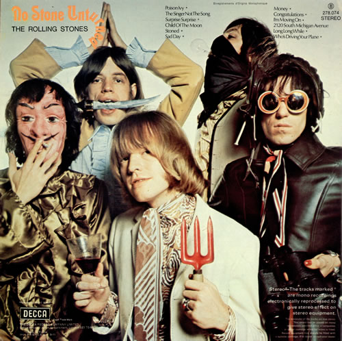
The first album by psychedelic rock group Pink Floyd, The Piper at the Gates of Dawn (1967), was named by former member Syd Barrett after chapter 7 of The Wind in the Willows,which contains a visionary encounter with the god Pan, who plays his pan pipe at dawn. It was one of Barrett’s favourite books, and he often gave friends the impression that he was Pan, that he was the Piper. The moniker was later used in the song Shine On You Crazy Diamond, in which Barrett is called “you Piper”. However, the songs on the album are not directly related to the contents of the book. Barrett came up with the album title The Piper at the Gates of Dawn; the album was originally titled Projection up to as late as July 1967.


Up-and-coming society photographer Vic Singh was hired to photograph the band for the album cover. Singh shared a studio with photographer David Bailey, and he was friends with Beatles guitarist George Harrison. Singh asked Jenner and King to dress the band in the brightest clothes they could find. Vic Singh then shot them with a prism lens that Harrison had given him. The cover was meant to resemble an LSD trip, a style that was favoured at the time.


Syd did his own little drawing on the back cover


The same chapter was the basis for the name and lyrics of Piper at the Gates of Dawn, a song by Irish singer-song writer Van Morrison from his 1997 album The Healing Game. The song The Wicker Man by British heavy metal band Iron Maiden also includes the phrase. British extreme metal band Cradle of Filth released a special edition of their album Thornography, called Harder, Darker, Faster: Thornography Deluxe; on the song Snake-Eyed and the Venomous, a pun is made in the lyrics “… all vipers at the gates of dawn” referring to Chapter 7 of the book.


To listen to Van Morrison’s rendition of this literary classic, please take a gander at The Genealogy of Style‘s Facebook page: https://www.facebook.com/pages/The-Genealogy-of-Style/597542157001228?ref=hl

The Ongoing Conflict of a Voyeur

Le Viol (The Rape), René Magritte, 1934


The Rape, one of Surrealism’s most powerful images — Georges Bataille could never suppress a nervous laugh whenever he was confronted by this painting — likewise works with a subversive idea. The selection of the work’s title indicates the ongoing conflict of a voyeur; René Magritte comes very close here to Hans Bellmer’s erotic perversion, albeit without the latter’s sadness.

In 1935, Andre Breton published his speech Qu’est-ce que le Surrealisme? with Magritte’s drawing, Le Viol on its cover. The image, a view of a woman’s head in which her facial features have been replaced by her torso, was meant to shock the viewer out of complacent acceptance of present reality into “surreality,” that liberated state of being which would foster revolutionary social change. Because Le Viol is such a violently charged image and because of the claims made for it by Magritte for its revolutionary potential, the drawing has been the subject of many arguments, both for and against its effectiveness. The feminist community has had a particular interest in this image (and in Magritte’s work as a whole) not only because of the controversial treatment of the female subject in Le Viol, but also because of the ways in which our culture has been so easily able to strip surrealist images of their political content and subsume them back into mainstream culture for use in those very categories of social practice which Surrealism wanted to eradicate.


Single sleeve


Angie is a song by the rock band The Rolling Stones, featured on their 1973 album Goats Head Soup.

Contrary to popular belief, the song was not about David Bowie‘s first wife Angela or Angie Dickinson; nor was it about Keith Richards‘ first daughter, Dandelion Angela. The song was written before the sex of his upcoming baby was known. He says in his memoir, Life: “I just went, ‘Angie, Angie.’ It was not about any particular person; it was a name, like ‘ohhh, Diana.’ I didn’t know Angela was going to be called Angela when I wrote Angie. In those days you didn’t know what sex the thing was going to be until it popped out. In fact, Anita named her Dandelion. She was only given the added name Angela because she was born in a Catholic hospital where they insisted that a ‘proper’ name be added.”
(Life, p. 323, Ch. 8.)


To listen to this song, please, take a gander at The Genealogy of Style‘s Facebook page: https://www.facebook.com/pages/The-Genealogy-of-Style/597542157001228?ref=hl

The Little Man Who Wasn’t There

Photo by Chema Madoz


ANTIGONISH

Yesterday, upon the stair,
I met a man who wasn’t there.
He wasn’t there again today,
I wish, I wish he’d go away…

When I came home last night at three,
The man was waiting there for me
But when I looked around the hall,
I couldn’t see him there at all!
Go away, go away, don’t you come back any more!
Go away, go away, and please don’t slam the door…

Last night I saw upon the stair,
A little man who wasn’t there,
He wasn’t there again today
Oh, how I wish he’d go away…

Hughes Mearns


Inspired by reports of a ghost of a man roaming the stairs of a haunted house in Antigonish, Nova Scotia, Canada, the poem Antigonish (also known as The Little Man Who Wasn’t There) was originally part of a play called The Psyco-ed which Mearns had written for an English class at Harvard University about 1899. In 1910, Mearns put on the play with the Plays and Players, an amateur theatrical group and, on 27 March 1922, newspaper columnist FPA printed the poem in The Conning Tower, his column in the New York World.

In 1939, Antigonish was adapted as a popular song titled The Little Man Who Wasn’t There by Harold Adamson with music by Bernie Hanighen, both of whom received the songwriting credits. A 12 July 1939 recording of the song by the Glenn Miller Orchestra with vocals by Tex Beneke became an 11-week hit on Your Hit Parade reaching #7. Other versions were recorded by Larry Clinton & His Orchestra with vocals by Ford Leary, Bob Crosby & His Orchestra with vocals by Teddy Grace, Jack Teagarden & His Orchestra with vocals by Teagarden, and Mildred Bailey. Mearns ‘ Antigonish has been used numerous times in popular culture, including Velvet Goldmine (Todd Haynes, 1998) often with slight variations in the lines.

Similar lyrics can be heard in the song The Man Who Sold the World by David Bowie:

“We passed upon the stair
We spoke of was and when
Although I wasn’t there
He said I was his friend…”

Special Tribute to Liz Tilberis

Harper’s Bazaar, July 1999 issue. Tom Cruise’s cover was the last cover approved by Liz before her death just 3 months prior. All ad revenue went to the Ovarian Cancer Research Fund. Models, photographers, stylists, make-ups artists, etc., donated their time for free. There are no editorials. It is the one issue which features the solidarity of the fashion industry for an icon.


Illustrations by Karl Lagerfeld


Obituary by Cartier


Christy Turlington photographed by Patrick Demarchelier


Guinevere Van Seenus photographed by Craig McDean, clothes by Yohji Yamamoto


Naomi Campbell photographed by David Bailey clothes by Versace


Left: Linda Evangelista illustrated by Mats Gustafsson; Guinevere Van Seenus photographed by Richard Burbridge


Nikki Uberti photographed by Terry Richardson, clothes by Dolce and Gabbana


Anne Catherine Lacroix photographed by Inez van Lamsweerde and Vinoodh Matadinanne, clothes by Balenciaga


Erin O’Connor photographed by Patrick Demarchelier., clothes by Calvin Klein


Natalie Portman photographed by Robert Bromann, clothes by Moschino; Cindy Crawford photographed by Mary Ellen Mark, clothes by Malo; Rita Wilson photographed by Sante D’Orazio; Milla Jovovich photographed by Cliff Watts, clothes by Tommy Hilfiger

No Stone Unturned

The Rolling Stones, a group that David Bailey called “the best rock and roll band that ever was,” pictured by him in 1968


Contact sheet from that photo session


No Stone Unturned is a compilation album by The Rolling Stones released in 1973. Eight of the twelve tracks had been previously released on single b-sides in the United Kingdom, and the rest had been released on EPs.

The song Sad Day is released as a single from the LP. Keith Richards said he didn’t mind them repackaging the old stuff but wished they would use a bit more imagination about it. He said that “putting out old flipsides as singles is shit”. He said the record company Decca were supposed to be making records “but they might just as easily be making baked beans.” Keith then bluntly called the record company “the biggest bunch of shits in the world”.

Two Fashion Icons Colliding

Catherine Deneuve and Kate Moss, photographed at the Shangri-La Hotel in Paris


In Vanity Fair February 2014 issue, Catherine Deneuve and Kate Moss appeared in their first portrait together, photographed by Patrick Demarchelier and text by James Fox. It’s hard to believe it hadn’t happened before. Two fashion icons colliding: one French, one British. One actress, one model. One a symbol of 60s and 70s glamour, one of 80s and 90s punk grunge. Yet something inherently stylish and historic draws them together. David Bailey introduced them.

According to the text by Fox, Even for Paris, This Was Impressive:

“They look as if they were emerging at dawn from a party, waiting to go home, these two apparently ageless, beautiful women. Consummate artists in front of a camera, they look at it as if they knew you—with a hint of humor at the imposition of the photograph. It is their first portrait together: Catherine Deneuve at 70 and Kate Moss at 40. Their separate images have illuminated the cultural landscape for decades—Deneuve with her great classic roles in the cinema, from the early Repulsion (Roman Polanski, 1965) and Belle de Jour (Luis Buñuel, 1967) to the more than 100 other films she has made, and also as a living symbol of French style; Moss with her unparalleled domination of fashion, who turned modeling into a high art and became the chief inspiration for 25 years to many of the world’s top designers and photographers. The picture was shot on a Paris balcony; the two women had hooked up in Japan some weeks earlier at a “timeless muses” exhibition, dedicated in part to them. A joint photograph had long been in Moss’s mind. “We’d kind of talked about it before,” she says, “but really I just wanted to meet her. I’d finished a shoot with David Bailey [the photographer, Deneuve’s former husband], and he was speaking about her, and we laughed about that. And we hit it off. She’s amazing, beautiful and chic and everything I want to be, also as a woman growing old gracefully and with such class. So I was over the moon that she liked me and wanted to do the pictures.”


The Widespread Impact of Belle de Jour

Yves Saint Laurent would create some of the most iconic looks of the late 1960s and 1970s. Many were inspired by his designs and how muse Catherine Deneuve magically embodied his style. His “school girl” dress is but one example. At the time, other fashion designers like Mary Quant did their own “school girl” dresses, but it was Yves who somehow made it sophisticated and sexy. The impact of Belle de Jour was widespread, ranging from high fashion to ready-to-wear to sewing patterns for women who wanted to make their own clothing at home. This trickle-down effect from costume design to fashion design is shown below and even includes a dress from a pattern book of the late 1960s. Whether its the dress itself or look of the model, it screams of Belle de Jour style.

Recently the influence is equally extensive. In fashion, design houses such as ValentinoCalvin Klein, and Carven were inspired by Belle de Jour for Fall 2013. Some designers, such as Tommy Hilfiger, adore the movie so much that they continue to reference it in collection after collection. This is especially true of the military-inspired outerwear from the film. Fashionista Alexa Chung has adopted the “school girl” look as part of her personal style, even including the design in her own capsule collections for Madewell.  Modern magazine editors frequently name and style photo shoots after Belle de Jour as well.


Eniko Mihalik for Vogue Spain (September 2012) by Vincent PetersEniko Mihalik modelling for Vogue Spain, September 2012. Photo by Vincent Peters


Tommy Hilfiger, Fall 2012-2013


Burberry, Fall Winter 2013


Maria Grazia Chiuri and Pier Paolo Piccioli for Valentino Fall/Winter 2013-2014


Allure magazine August 2013. Vinyl trench coat by Francisco Costa for Calvin Klein


Alexa Chung by David Vasiljevic for Elle UK. November 2010


NARS Summer 2010  + Belle de Jour Cinema ConnectionNARS Summer 20101 2 + Belle de Jour Cinema ConnectionIn beauty, makeup artist François Nars has had a Belle de Jour shade of lipstick for many years in his eponymous line. He even expanded upon it in 2010 and styled model Amber Valletta to look like Catherine Deneuve for the advertising campaign

The Reverent Tastemaker

Stefano Pilati. Photograph by David Bailey. Published in Vogue, September 2004


Stefano Pilati’s 2004 debut at Yves Saint Laurent (Brand)—hot on the heels of Tom Ford’s sensational departure from the exalted French house—was one of the most anticipated in fashion history. The debonair Italian, then a relative unknown, was the third in a string of designers-cum-dauphins charged with the seemingly impossible task of maintaining a covenant with Saint Laurent’s epic legacy while creating new codes that would give the label contemporary relevance.

“There is nothing that Saint Laurent didn’t think of first,” Pilati said, upping the ante even further.

So how did the Prada– and Ford-trained designer tackle the challenge? With stubborn individuality. In seasons of hypersexed fashion, he showed polka dots and body-enhancing, ruffled dresses that, he said, “came from a memory of Saint Laurent in the late seventies.” Many critics balked, but time proved that Pilati was simply ahead of the curve. Notable case in point: the much-copied tulip skirt, which exerted a major influence on subsequent seasons’ silhouettes. “I think what maybe people objected to was that it was quite extreme,” said Anna Wintour of Vogue. “But you need the extremes to move people’s eye.” That first collection, she said, “didn’t look like anyone else’s.”

Pilati continued to stand apart, a latter-day Don Quixote pursuing a vision of grown-up, very French elegance. The fall 2007 and 2008 collections, particularly, were considered breakthroughs for their clarity of conception and purity of form. Critics occasionally remarked, however, that his work was too reverential to the past, that it relied too heavily on Yves-isms. “To me,” he countered in 2005, “it’s simply newer to be classic than transgressive.”

Shortly before the fall collections were mounted in 2012—and after months of rumors—the Saint Laurent company announced that Pilati was stepping down. Although his tenure was broadly respected and considered a success, he had failed to reach the starry brilliance of his predecessors.

Within a few months, however, the press was abuzz again (if perhaps at a slightly lower decibel level) with the news that he would pilot the Italian menswear label Ermenegildo Zegna and its sister brand, Agnona. Those truly in the know were probably not terribly surprised that Pilati would make this Lazarus-like return: A onetime heroin addict—who got his start as a teenage usher at fashion shows in Milan—the tattooed designer is clearly a man of considerable grit. “Work is my salvation,” he once said.


Source: Voguepedia

Not So Unexpected References

The tagline is “Be unexpected.” The fragrance created by perfumer Jacques Polge debuted on fall 2010 preceded by a media campaign which include the short advertisement “Bleu de Chanel” by Martin Scorsese featuring French actor Gaspard Ulliel. Prior to Scorsese, Baz Luhrmann had worked on Chanel No. 5.

The Rolling StonesShe Said Yeah, from band’s 1965 album December’s Children (And Everybody’s),  propels the script of the short film, in which rising international star Gaspard Ulliel plays the role of a young actor whose artistic talent, rebelliousness and good fortune have thrown him into the public eye. However, he refuses to conform to the lifestyle and expectations his newly found fame has placed upon him. As he struggles with new pressures and expectations, he runs into his first love, who for years, supplied him with the passion and turmoil that fueled his work. Faced with a decision, he pushes aside convention to embody the bold energy and elegance of Bleu De Chanel by daring to be unpredictable and refusing to bow down to convention. Scorsese had directed the 2008 Rolling Stones concert film Shine A Light. 

The song She Said Yeah was recorded by the group in September of 1965 at RCA Studios in Hollywood, the very same place where the band’s anthem (I Can’t Get No) Satisfaction had been recorded a few months earlier. She Said Yeah was written by the late Sonny Bono and West Coast rockabilly performer Roddy Jackson, and had been a single for Larry Williams in the late 1950s. Williams became known with such early rock ‘n’ roll hits as Bony Maronie, Dizzy Miss Lizzy and Slow Down, the last two of which were covered by The Beatles.


Still from Mishima, a Life in Four Chapters (Paul Schrader, 1984)


Still from short advertisement “Bleu de Chanel” (Martin Scorsese, 2010). The exploding screen wall seems to be inspired by Ishioka’s set design for Mishima. “We knew the old Hollywood system was gone, so we thought we could get in the cracks somehow. Francis was already at it — he was the big brother…”, Scorsese said about starting out with his friends George Lucas, Steven Spielberg and Francis Ford Coppola. Rolling Stone Magazine 40th Anniversary (2007)


Gaspar Ulliel taking pictures to the woman he was chasing. This scene reminds the famous photo-shoot played by David Hemmings and  sixties model Veruschka in Blown-Up. In a piece called, The Man Who Set Film Free, Scorsese wrote about the sensation of seeing the Italian director’s L’Avventura for the first time, almost 50 years ago.


Movie Poster from Blow-Up (Michelangelo Antonioni, 1966)


The Color Schemes of a Biopic

Eiko Ishioka and Paul Schrader


By the spring of 1984 Eiko Ishioka was one of the most sought after art director/designers in Japan. She hardly needed to throw herself into what was widely expected to be a controversial film project. Moreover, she would be working with a traditional film art director, Kazuo Takenaka, whose feature credits as designer went back to 1960. Mr. Takenaka was to design the biographical parts of the film and Eiko was to design sets and costumes from the three Yukio Mishima novels chosen by Paul Schrader, in scenes that parallel key events from Mishima’s life. What could easily have been both a generational and aesthetic chasm between Eiko’s and Kazuo’s visions became, in fact, a close collaborative bridge across the film’s several styles.

The color scheme of the first novel presented itself easily enough. Eiko explained that the Golden Pavilion of the title was a legendary, but fragile wooden edifice in Kyoto, often rebuilt after periodic fires. The temple was a spiritual idea as much as a physical edifice. The gold leaf that Eiko chose to cover the set walls and floor, stretching around three curved walls and over the floor, created a limbo environment broken up by green walkways and a bamboo garden. The robes of Mizoguchi and fellow acolytes were in black.


The story begins with chapter 1, “Beauty,” where the awkward young boy grows into a man, looking to change his position as a misfit in this world and embrace love and the goodness that life has to offer, the things that are beauty personified. For this section, Schrader chooses to adapt the 1953 novel The Temple of the Golden Pavilion, the story of a Buddhist acolyte (Yasosuke Bando) with a severe stuttering problem whose “deformity” prevents him from finding love, forcing him to always remain separate. He fixates on the golden temple where he is studying and eventually becomes intent on its destruction. Turning it to rubble blots out the false promise he can never fulfill. This action actually teaches him something about beauty, about how it’s best to halt it at its apex rather than let age diminish its luster.


Kyoko’s House takes place in the 1950s, a period still very much under the cultural influence of the American Occupation. Eiko offered us a palette of 50s pastels that also featured pink and black. Think of the trope of fuzzy dice that hung from the dashboard rear view mirrors of Detroit cars, and of the stripped down aesthetic of Scandinavian interior design. John Bailey thought also of the color palette that designer Nando Scarfiotti had shown John Schlesinger for Honky-Tonk Freeway (a splayed roll of Necco wafer candies). Eiko promoted the idea of these pastel colors; she knew also the high regard that Paul had for Nando. (Bailey had by then done three films with Nando, two of them directed by Schrader.)


From there, Schrader moves to chapter 2, “Art,” where Mishima, tasting his first blush of success, begins to ponder how to resolve the false and finite nature of beauty and realize the artist’s purpose of preserving said beauty. In his novel Kyoko’s House a young actor turned body builder (Kenji Sawada) realizes that despite his personal perfection, bodies decay. Art is nice, but it requires no sacrifice. He enters into an abusive relationship with a female gangster (Setsuko Karasuma) who begins to use his body as a living sculpture. Real blood is a greater expression of true beauty and art than the false blood spilled on a theatrical stage.


Searching for a way to separate these fictional scenes of the novels from the events of the last day (since both were to be done in color) Paul, Eiko, Tom Luddy and John Bailey met with engineers from Sony who had recently developed an analog HD video system. Photographing the scenes from the novels in HD video seemed a natural way to establish a “look” different from the 35mm. color scenes of the last day. It was quickly obvious that the intense chromatic density and subtlety of Eiko’s sets and costumes would be poorly served by the limitations of this cutting edge but still embryonic  video medium. They resolved to shoot the novels on film as well—but with mostly undiffused and harder edged light to preserve the rich blacks that only film could capture, a lighting style Paul and John had chosen for American Gigolo; it was by then a retrograde style in an age of  increasing soft light. Eiko presented the physical design of the sets to them  in near schematic sketches that defined the lines and bones of the sets. The final sets proved to be every bit as reductive, even elemental, with geometric forms and saturated colors creating a stage-like theatricality as the set pieces and walls shift, even collapse.

In one scene, the light on a large Eugene Delacroix wall painting dims to reveal a Beckett-like woods outside: an unlikely mash-up, but pure Eiko. The final scene of Runaway Horses unfolds on an actual beach in pre-sunrise light. Eiko transposed blood red painted rocks from the stage set to the location in order to introduce theatrical artifice into the real world. Here, at a cliff edge, facing the rising sun, the cadet Isao commits seppuku.


Chapter 3, “Action,” where Mishima begins to question his role in the world. Words can express ideas, but like how beauty without art fades, so too do ideas go nowhere without action to back them up. The novel for this section is Runaway Horses, a later work about a young soldier (Toshiyuki Nagashima) who forms a cabal of like-minded youths to stage a revolution and restore Japan’s honor. As his plan falls apart, he tries one last action before turning his sword on himself. Here the fiction dovetails nicely with the reality, as we go into chapter 4, “Harmony of Pen and Sword,” which concerns itself entirely with Mishima’s last day on Earth, along with commentary taken from his last book of personal writing, Sun and Steel. (Again, fiction gives way to reality–though reality as seen by Yukio Mishima.)

Fashion’s Mike Nichols Moment

WORKING GIRL (1988)

“Tess, this is business.” Georgina Chapman as Sigourney Weaver and Keren Craig as Melanie Griffith.


WHO’S AFRAID OF VIRGINIA WOOLF (1966)

“You’re not man enough. You haven’t the guts” Winona Ryder’s Elizabeth Taylor with Marc Jacobs’s Richard Burton


THE GRADUATE (1967)

“Mrs. Robinson, you’re… trying to seduce me”. Prabal Gurung’s Dustin Hoffman with Diane von Furstenberg’s Anne Bancroft


Photos by Mark Seliger. Harper’s Bazaar, February, 2011

Nice Connection

Manolo Blahnik and Anjelica Huston in Nice (France). Photo by David Bailey, circa 1973


Miss (Anjelica) Huston and Miss (Geena) Davis are my two favorite actresses in America at the moment-and Madonna and Ellen Barkin. Those four are the most important click click. Anjelica in The Grifters- God bless her with that wig and my shoes on, too”….

“…Anjelica’s the one. Oh-h-h-h-h-h. She’s the most perfect thing. She’s like a piece of sculpture.”

Manolo Blahnik

Vogue USA. March 1992


Stills from The Grifters (Stephen Frears, 1990). Costume designer: Richard Hornung