 Sticky Fingers cover. Front and back cover
When The Rolling Stones were recording material for their ninth studio album in the early days of the 1970s, the anticipation and expectations must have been daunting. The 60s had come to a definitive close for the band at the December 1969 Altamont Free Concert, where a member of the Hell’s Angels (hired by the Stones as security) knifed a fan to death as the band played on. Five months prior, guitarist Brian Jones had overdosed and was found dead in his swimming pool at the age of 27.
Sticky Fingers was to be their first record of the new decade, their first without Jones, and the first for their newly formed label, Rolling Stones Records. The Beatles had just disbanded, leaving the group no serious rival. The band was presumably eager to maintain their bad-boy status, but at the same time distance themselves from the darker side of their image and move towards a more commercially viable controversy: sex.
 Inside cover (LP format)
Knowing that the design of the album had to reflect this, and finally in control of their own marketing after leaving Decca records, Mick Jagger visited the Royal College of Art in London to find a design student to hire. He attended the degree show of John Pasche, and hired him to create a new logo for the group. The resulting lips and tongue logo, based on Jagger’s large pout, was intended as “a protest symbol and [to] have an anti-authority feel to it really, so that it would work well with them being the bad boys of rock and roll,” Pasche recently told MTV. This being the early days of rock band branding, the iconic logo never appeared on the cover of an album. It did, however, appear on t-shirts, mugs, key chains, buttons, belts and countless other promotional items, including recent urinals at the Rolling Stones Fan Museum in Germany.
The title “Sticky Fingers” was originally a working title for the second Mott the Hoople record. When the band decided on Mad Shadows instead, the Stones took the title, with the blessing of record producer Guy Stephens.
The cover graphic went through a number of possibilities, including having the band dressed in Victorian boating attire. Designer Craig Braun suggested releasing the album in a clear plastic jacket with heat-sensitive liquid crystals inside — “so you could make your own little Joshua Light Show”. Another rejected idea was a mammoth foldout cover of Jagger’s castle in the south of France (where the band had relocated to avoid paying taxes).
 Theatrical poster
Then Jagger recalled that Andy Warhol had remarked to him at a party in 1969 that he thought it would be amusing to have an album cover feature a real zipper. There are differing accounts regarding the initial idea. Some credit songwriter Bob Goldstein, claiming that he proposed the idea for the cover of the soundtrack to Warhol’s 1968 film Lonesome Cowboys. Goldstein wrote the title track, which is sometimes credited as being the very first ‘disco’ arrangement, and an entire LP was conceived, but never completed. Singer and Factory Superstar Ultra Violet has suggested that the idea was Warhol’s and was intended for the film’s promotional poster.
 The Velvet Underground and Nico. Front cover
The Stones agreed that the image of a pair of jeans and zipper would allow the band to retain their ‘outrageous’ aura, but shift things away from the violent and “satanic” imagery, or what Braun called “the evil thing”.
Warhol is credited with cover concept and photography, though some suggest Billy Name might’ve been behind the camera. Many assumed the cover model was Jagger, which he later denied:
Rolling Stone Magazine: There’s underwear on the back. Is that you?
Mick Jagger: No. It’s one of Andy’s… protégés is the polite word we used to use, I think.
 Andy Warhol, Man’s Lower Torso, Clothed, 1971
Among the possible candidates, Jed Johnson, Warhol’s lover at the time, denied it was his likeness, although his twin brother Jay was considered a possibility. But according to Warholstars site user, Stylissmo:
“Jay Johnson famously has only one testicle, Jed wasn’t built like that… Corey Tippin was well known for his endowment… and was also known – along with his friend, the illustrator Antonio Lopez, for ‘showing basket’ – a real 70’s kind of gay display that involved bulging crotches in tight jeans. Attendees at the Sticky Fingers release party mention that of the aforementioned possible models for the cover – only Corey Tippin was at the party. At any rate all this has been told to me in various pieces by Jay Johnson, Corey Tippin, Jane Forth, Paul Caranicas (director of Antonio’s estate) and other characters who are still friends and living in and around New York.” Also known as Corey Grant, Tippin was the make-up artist for Andy Warhol’s L’Amour (1973) and Jay Johnson’s best friend.
 Warhol with Jay and Jed Johnson
 Warhol and Corey Tippin
Factory Superstar Ultra Violet believes that dancer Eric Emerson “who used to walk around the Factory half-naked” is the cover model.

 Andy Warhol and members of The Factory, Richard Avedon, New York, October 30, 1969. From left to right: Eric Emerson, actor; Jay Johnson, actor; Tom Hempertz, actor; Gerard Malanga, poet
Art writer and early editor of Warhol’s Interview magazine, Glenn O’Brien’s has also been named as possible model. He recalls:
“I remember Andy shooting me in my underwear at the Interview office for the Sticky Fingers cover. He paid me a hundred bucks. Fred Hughes kept saying, “Can’t you make it any bigger.”” In an introduction to an interview O’Brien conducted with Joe Dallesandro for the magazine a few years ago he wrote:
“I always felt a connection to Joe. We were two Warhol scenesters who liked girls. Also, he filled the jeans on the outside of The Rolling Stones’ Sticky Fingers album, while I filled the briefs inside—our secret connection.”
Without a definitive account of who the front cover model was, Joe Dallesandro seems the most likely. Dallesandro met Andy Warhol and director Paul Morrissey in 1967 while they were shooting Four Stars, and they cast him in the film on the spot. Dallesandro also appeared in Flesh (1968), Lonesome Cowboys (1968), Trash (1970), Heat (1972), Andy Warhol’s Frankenstein and Andy Warhol’s Dracula (both 1974) also directed by Morrissey. Flesh achieved some mainstream crossover success and Dallesandro became one of the most popular of the Warhol stars.
He explained to biographer Michael Ferguson, “It was just out of a collection of junk photos that Andy pulled from. He didn’t pull t out for the design or anything, it was just the first one he got that he felt was the right shape to fit what he wanted to use for the fly.”
 Joe Dallesandro photographed by Warhol
The inner underwear photograph was a matter of necessity; designer Craig Braun realized there had to be an extra layer of cardboard to protect the record from the scratching of the zipper. Regardless of this, during shipment the zipper ended up pressing into the album stacked on top of it, invariably damaging the song Sister Morphine. Atlantic Records, whose subsidiary Atco Records were distributing the disk in the US, threatened to sue Braun for all the damage. After getting “very depressed and very high,” he came up with the solution to pull the zipper down before the record was shipped. This way it would only damage the inner label, and not cause any song to skip.
 Inside cover
The solution saved Sister Morphine, but not in Spain, where Francisco Franco’s government deemed the song offensive and insisted it be removed from the disk. A Chuck Berry song Let it Rock, originally a b-side from the Brown Sugar single, replaced it. The drug references in the song were not the only concern for the Spanish censors, they also found the cover “too sexually explicit” so it was replaced with the “can of fingers” graphic, severed body parts being more socially acceptable than a man in pants. Many American department stores also found the cover inappropriate and initially refused to stock the disk.
 Alternate cover (Spanish version)
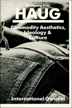
For others, the problem with the packaging was not enough package: Wolfgang Fritz Haug, a now-retired professor of philosophy, took issue with the lack of payoff. In his book 1986 book Commodity Aesthetics (Chapter 3: “THE PENIS ENTERS THE COMMODITY ARENA”) he writes:
“whoever buys the record, purchases with it a copy of a young man’s fly, the package identified by the graphic trick which stresses the penis and stylizes the promised content. It is a reversal of the tale of the Emperor’s new clothes: the tale of the buyer’s new bodies. They buy only packages which seem more than they are…..the buyer acquires the possibility of opening the package, and the zip and finds… nothing.”

These criticisms notwithstanding, the graphic is now considered one of the best album covers of all time. A Rolling Stone Magazine readers poll in 2011 voted it the 6th best album cover of all time. Warhol appeared twice in the top ten, the other being the tenth pic for his Velvet Underground and Nico cover. The recording itself made the #63 slot of another Rolling Stones Greatest Albums of All Time list and in 2003 the design was named by VH-1 as the best album cover of all time.
Jagger called the cover “the most original, sexy and amusing package that I have ever been involved with”
Andy Warhol was paid 15 000 pounds remuneration, which (using a crude conversion of currency and inflation) would amount to approximately $126,000 CDN today. The figure seems on the high side for album cover design, but he was apparently dissatisfied. Warhol biographer David Bourdon writes “In April the album sold a half-million copies, and Warhol liked to think that his cover contributed greatly to the success. ‘You know’, he later complained, ‘that became a number one album and I only got a little money for that’.” With the Stones being one of the biggest bands in the world at the time, and the record including the hit songs Wild Horses and Brown Sugar, it is doubtful that Warhol’s cover disproportionately contributed to the financial success of the record. His equally acclaimed peelable banana cover for The Velvet Underground and Nico did not propel that record to any financial success – it spent only a few weeks on the Billboard charts, peaking at #171. It’s influence would not be felt for years to come, leading Brian Eno to quip “The Velvet Underground‘s first album only sold a few thousand copies, but everyone who bought one formed a band.” Warhol also complained about not receiving compensation for his production and cover graphic for that disk (“I never got a penny for that first Velvet’s album”).
The promotional photograph may have inadvertently invented what would later become the Sleeveface internet meme, with fans posing with album covers obscuring parts of their body.


