 Robert Indiana on coach with Andy Warhol in Warhol’s studio, Vogue, March 1965. Photo: Bruce Davidson
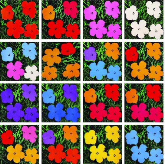
At the helm of the Pop art movement were Andy Warhol and Robert Indiana. The two artists exhibited work together at the same gallery and even posed together holding their cats in a Vogue photo spread. Indiana has been a theatrical set and costume designer, such as the 1976 production by the Santa Fe Opera of Virgil Thomson’s The Mother of Us All, based on the life of suffragist Susan B. Anthony. He was the star of Andy Warhol‘s film Eat (1964), which is a 45-minute film of Indiana eating a mushroom in his SoHo loft. But while Indiana embraced Pop, the movement didn’t suit him in many ways. He wasn’t interested in the personality cults or media attention that swirled around Warhol, and Indiana shied away from the sex, drugs, and fame.

Indiana first public commission—a 20-ft.-tall, light-studded “EAT” sign for the 1964 New York World’s Fair—referenced his mother’s years working in roadside diners, as well as her last words to him, “Did you have something to eat?” But the flashing EAT sign so resembled familiar cafe signage that people flocked to it, assuming it was a restaurant. It wasn’t the last time Indiana’s work would become simultaneously popular and misunderstood.
 Book of Love Poems, printed in 1996
Robert Indiana’s experiment with LOVE started in 1958, when he began playing with poetry, placing the letters “LO” above “VE.” He translated the idea into paintings, and in 1965, he hit pay dirt when the Museum of Modern Art commissioned him to do a version of LOVE for a Christmas card. His simple composition of vibrant red letters against a green and blue background became one of the museum’s most popular items.
The first serigraph/silk screen of Love was printed as part of an exhibition poster for Stable Gallery in 1966. A few examples of the rare image, in bold blue and green with a red bottom announcing “Stable May 66” are known to exist. Twenty-five of these, without the red announcement, were signed and dated on the reverse by Indiana. Sculptural versions of the image have been installed at numerous American and international locations. In 1977 he created a Hebrew version with the four letter word Ahava (אהבה “love” in Hebrew) using COR-TEN steel, for the Israel Museum Art Garden in Jerusalem, Israel.
 In time for the holidays, the O of the famous love sculpture by Robert Indiana was lowered. November 29, 1971.
Although it wasn’t a critical success, LOVE was so popular with the general public that NBC televised the exhibition. In an era of love-ins and peace protests, the image struck a nerve with the spirit of the 1960s. Hippies were all about love, and for the next decade, so was Robert Indiana.
As Indiana’s LOVE spread, his name didn’t. “Everybody knows my LOVE,” he told an interviewer in 1976, “but they don’t have the slightest idea what I look like. I’m practically anonymous.” Because Indiana hadn’t wanted to disrupt his initial design with his signature or a copyright notice, he had no legal protection against imitators. He also enjoyed little financial gain as his image was ripped off in countless ways. One company sold a line of cheap cast aluminum LOVE paperweights in bookstores on college campuses; another offered LOVE and HATE cufflinks. As the number of parodies increased, Indiana eventually copyrighted some variants of his creation. But by that time, it was too late to file suit against the flood of false LOVEs on the market.
Indiana’s best known image is the word love in upper-case letters, arranged in a square with a tilted letter O. The iconography first appeared in a series of poems originally written in 1958, in which Indiana stacked LO and VE on top of one another. Then in a painting with the words “Love is God”.
LOVE is an iconic Pop Art image by American artist Robert Indiana. It consists of the letters LO over the letters VE; the O is canted sideways so that its oblong negative space creates a line leading to the V. Its original rendering in sculpture was made in 1970 and is displayed in Indiana at the Indianapolis Museum of Art. The material is COR-TEN steel Indiana’s LOVE design has since been reproduced in a variety of formats for rendering in displays around the world. Versions of the sculpture now exist in Hebrew, Chinese, Italian and Spanish as well as the original English.
MoMA historian Deborah Wye describes Indiana’s image as “full of erotic, religious, autobiographical, and political underpinnings” that make it “both accessible and complex in meaning. Megan Wilde offered more detail about the autobiographical origins in an article for Mental Floss magazine, “The word love was connected to [the artist’s] childhood experiences attending a Christian Science church, where the only decoration was the wall inscription God is Love. The colors were an homage to his father, who worked at a Phillips 66 gas station during the Depression.” She quotes Robert Indiana as describing the original colors as “the red and green of that sign against the blue Hoosier sky.”


The image has been rendered and parodied in countless forms. The original book cover for Erich Segal‘s novel Love Story alluded to the design, and the TV series Bridget Loves Bernie included a shot of the Sixth Avenue sculpture in its opening credits. The United States Post Office issued an eight-cent stamp in 1973 featuring the image. Parodies of the image appeared on covers of records by Rage Against the Machine (Renegades), Oasis (Little by Little single) and Acen (75 Minutes). Evan Greenfield’s sculpture “I’m Lovin’ It” alludes to Indiana’s image.
The first serigraph/silk screen of Love was printed as part of an exhibition poster for Stable Gallery in 1966. A few examples of the rare image, in bold blue and green with a red bottom announcing “Stable May 66” are known to exist. Twenty-five of these, without the red announcement, were signed and dated on the reverse by Indiana. Sculptural versions of the image have been installed at numerous American and international locations. In 1977 he created a Hebrew version with the four letter word Ahava (אהבה “love” in Hebrew) using COR-TEN steel, for the Israel Museum Art Garden in Jerusalem, Israel.
 In 1995, Indiana created a “Heliotherapy Love” series of 300 silk screen prints signed and numbered by the artist, which surrounds the iconic love image in a bright yellow border. These prints are the largest official printed version of the Love image.