“They knew exactly where they were all the time, and were simply waiting to be found!”
Peter Webb, on his lost Sticky Fingers session negatives.
 The big yawn (above), shown alongside a contact strip of three negatives, showing its place in the sequence. Note Peter Webb’s excited handwritten confirmation that the original negative of his classic album sleeve image has been found again.
It’s a story that would give any photographer sleepless nights. A classic photo-session for one of the biggest bands on the planet, The Rolling Stones, for the cover of one of their most critically acclaimed albums. Anyone who owns the Sticky Fingers LP ( the one with the Andy Warhol zipper sleeve) will recognise Peter Webb’s black and white image, which Peter calls The Big Yawn, from the inner sleeve. What people don’t realise is that this photograph is one from a complete lost session that came to light after a gap of almost 40 years (negatives went missing soon after the shoot, on may 1971).
Peter made a name for himself in the seventies as a multi-award winning advertising photographer, and was then head-hunted as a director for Ridley Scott’s commercials company. He later established his own company Park Village Productions, based in the magnificent Victorian Riding School and Stables in Regents Park, lovingly restored and converted by Webb himself. Park Village remains a leading production company, with Webb and his colleagues having set the bar by winning all the premier awards in the business over the years, including the Palme D’Or at Cannes as the top Commercials company worldwide twice. His 1971 session to photograph the Stones for their Sticky Fingers album took place at his Park Village Studios.
After graduating from university in the mid sixties, Peter took an extended trip to New York. During his stay, Webb’s brother-in-law, Bill Pierce, (himself a NYC based photographer) taught him enough of the rudiments of photography for Webb to blag his way into a job assisting the legendary photographer and director Howard Zieff. It was while he assisted Zieff, that he was entrusted with the construction of an extraordinary 20 foot “walk-in” strobe lighting bank, the concept of which Zieff had conveniently borrowed from his good friend Irving Penn. It was this enormous lighting bank that Peter would later employ himself in the intricate construction of his 1971 session with the Stones.
Webb returned from the USA, and subsequently was introduced to the Rolling Stones by David Puttnam, in his previous incarnation as a photographers’ agent in the early 1970’s. Puttnam had seen Peter’s plate camera portraits and had mistakenly thought they must be the work of Penn or Zieff, little realizing they were produced by a then unknown UK photographer who had assisted Zieff in New York some years before. Puttnam said the band were “looking to do some shots for a forthcoming album”, and that Webb should set up a meeting at their office in town. He duly appeared at the Stones office and was ushered in to meet Jagger, a daunting milestone in itself.
Peter explains: “I presented my concept for the session, based around the ‘surrealist’ type of advertising work I was in to at the time, heavily influenced by Magritte. I envisaged the band dressed in Victorian boating attire, posed with oars primed in a beautiful wooden rowing boat. However the boat would not be on any river, it would be in a Victorian Photography Studio, with an elegantly painted backdrop of a period Henley, their oars resting on a wooden studio floor. Alarmingly however, during the course of my presentation, Jagger produced a series of wide-mouthed yawns and seemingly by way of dismissal suggested I pitch my ideas to Charlie Watts in the next door office, and who was “into Art”. I was duly ushered in to meet Watts, whose monosyllabic responses made Jagger’s seem wholly enthusiastic in comparison.”
Webb duly retired to lick his creative wounds, and to consider another option ASAP. He had been hugely impressed by Irving Penn’s classic B/W studio portraits of Haight-Ashbury hippy families and Hell’s Angels for Life Magazine some years earlier, and decided he would photograph the band “as they were” on a suitably neutral studio constructed backdrop.
Webb continues: “I had also been advised by a photographer friend that the band “were trouble” to photograph and could end up throwing “V” signs etc. to the camera – an attitude I thought I would encourage with a moody distressed grey-toned backdrop, to capture the brooding streetwise image I presumed the band would like to project.”
Webb spent many days extensively testing both lighting and background tones. He adapted an extended ‘walk in’ lighting bank similar to the one that he had constructed for Zieff, and constructed of a large hand-painted backdrop. With the preparation all in place, the Stones showed up on the appointed day at Webb’s studios, the converted Victorian Riding School and Stables next to Regent’s Park in central London.
“They immediately registered disappointment that they were going to be photographed in their own clothes, and that there was no “idea” anywhere in sight. And far from being “trouble”, the band stood like lost schoolboys on the over-scaled backdrop, and were not only compliant to my instructions in arranging them, but even seemed somewhat camera shy – which was totally unexpected.”
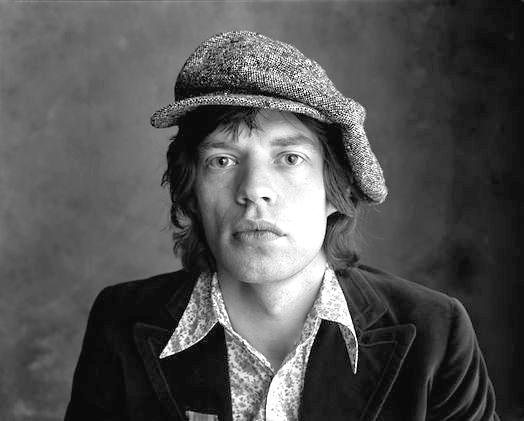
Andy Warhol and his Factory designer Craig Braun came up with the Sticky Fingers “Zipper” concept, which relegated Webb’s intended album cover image to a grainy dupe on an inside sleeve. Despite the shoddy reproduction on the sleeve, it is instantly recognisable as a classic Stones group portrait, showing Jagger standing to the left of the frame, yawning, while the other four Stones gather on the right, Bill Wyman scratching his nose. Webb christened the image “ The Big Yawn”.

Falling Stones, a colour portrait shot by Peter on Kodak Ektachrome 120 transparency film, is one of the most famous photographs from the Sticky Fingers session – and this image, kept separately from the black and whites, has its own unique survival story. At some point in the shoot, Webb asked the Stones to act a little more threateningly, and Mick, Keith and the band duly obliged. Finally things loosened up to a degree, and as a one-off idea he lined up the band shoulder-to-shoulder, like a younger Dad’s Army, and encouraged them to lean sideways. Thankfully the 1,000th second exposure time-captured this one-off event, and the resulting image was “Falling Stones”.
Falling Stones survival is thanks to a completely random two frame laboratory exposure ‘clip test’. Peter explains: “I forwarded the bulk of my (relatively few) colour shots from the shoot to the Stones office, and onwards to my good friend Braun at Andy Warhol’ s Factory. I never saw them again, and as far as I was concerned, these colour images were truly lost and gone forever. However the procedure of taking a random two frame “clip test” from an unprocessed roll (to adjust the processing of the remainder), meant some unnamed and forever heroic lab technician had sliced the obligatory two plus inches from the tail of the exposed roll, a mere half an inch clear of this shot. And so it was saved – but only just!”


After the group session was completed, Webb invited the band individually to an upstairs studio set up with a 5×4 Sinar plate camera, whose depth of field was so slight that a wooden rod had to be placed at the back of each band member’s head, so there would not be the slightest movement backwards.
After more searching enquiries from the various band members as to the purpose of the portraits – “Passports, is it now mate?” – Webb photographed Jagger in a number of extreme close ups, with and without a stylish Irish cap and a long-collared paisley shirt, fashionable at the time. In between another serial attack of yawns, Mick enquired politely, “So… what happened to that great idea about the boat?”


In early 1972 Peter entrusted his photographer brother-in-law with the safe keeping of an unmarked folder of negatives, which was, as Peter recalls now, “…an essential detail which I had conveniently forgotten, in the excitement of being hired by Ridley Scott to direct commercials, and the dark room became a cutting room overnight.”
Webb continues “Bill stored them in the attic along with his own negatives, and only revisited them recently while hunting for negatives of a portrait of Joan Didion he had shot in the early ‘50’s. He called me to say he had found an unmarked bag of negatives amongst his own which “…could be the Rolling Stones” …
“I made him lock the doors and not let anyone in the house, and then I asked him to look for someone who could be shouting or yawning, standing aside from a group of four, one of whom was scratching his nose. After an anxious half hour, an email popped up, I opened the attachment, and as if in slow motion the group of four were revealed, with Bill Wyman adjusting his nasal passages, and Jagger standing apart from the group with a wide mouthed yawn. Eureka!! The Prodigal Stones had returned to the fold after an absence of almost forty years”
Contained in their pristine negative sleeves, were the strip containing the actual album sleeve image, all the best group shots from the session, and also an unexpected further delight: some individual plate camera portraits of Jagger and Richards which had never been seen before.
Now almost 40 years on, and with the Stones still touring, Webb has been persuaded by a younger generation of photographers, musicians and Stones fans alike, that photographing the Stones “as they were” at that exact moment of time, free from any overriding “concept”, was the best idea he never had.

 Movie still from Le Ballon Rouge.
 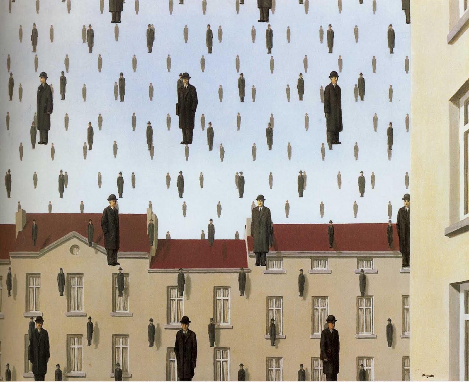 Golconde, René Magritte, 1953


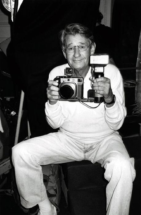


 Lester Bookbinder


 Truman Capote portrayed by Irving Penn, 1965
